← Big Ideas Lab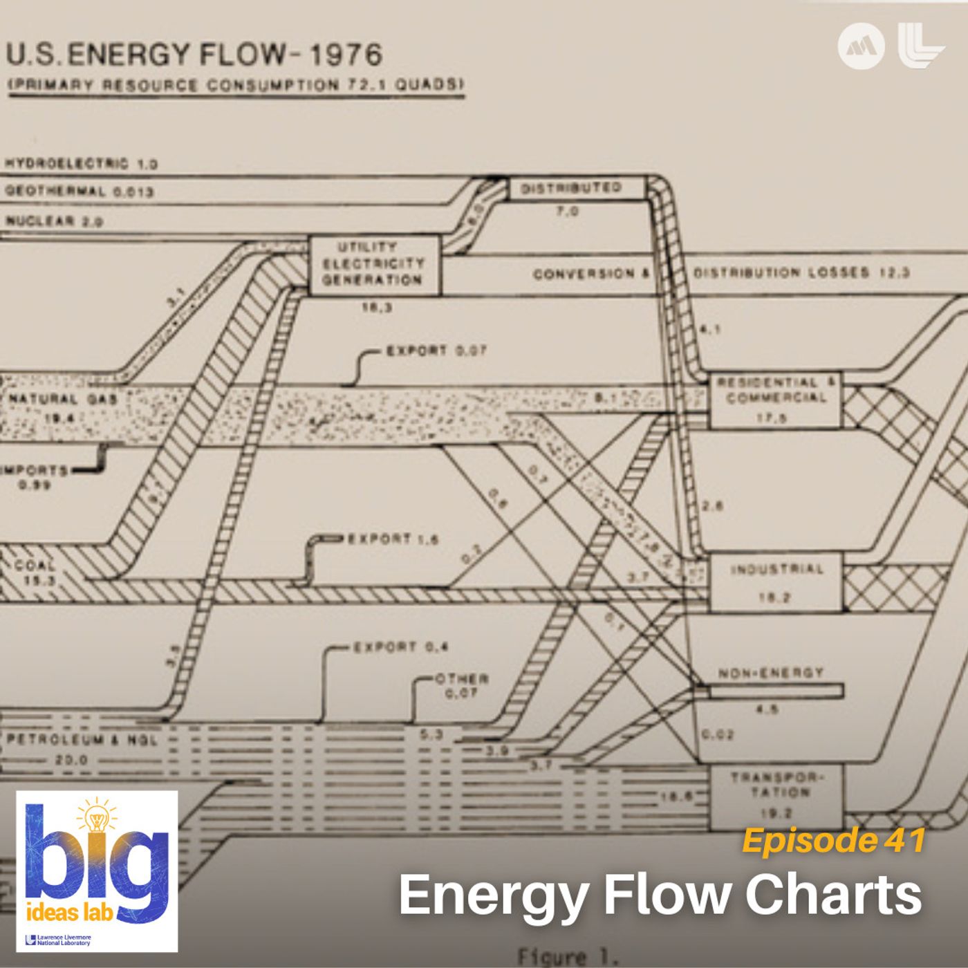
Big Ideas Lab
Energy Flow Charts
00:15:27
Discover the charts that show where America’s power comes from and where it goes.
Loading summary
Transcript53 lines
- [00:02]
A
Inside a sixth grade classroom, a teacher dims the lights and directs the student's attention to a projector.
- [00:09]
B
Okay, good morning class. I want to call your attention to the screen up front.
- [00:13]
A
On the screen appears a brightly colored chart featuring thick twisting bars extending from left to right.
- [00:20]
B
We'll start on the left hand side and move to the right.
- [00:23]
A
Some are as wide as rivers, others as narrow as threads.
- [00:28]
C
This is energy in the boxes. They're all different colors. Solar is yellow. Natural gas is a light blue. Hydro is a darker blue. And then you can follow them all the way through.
- [00:40]
A
All the way through to what's used and what slips away.
- [00:45]
B
That is one of the most interesting underrated boxes.
- [00:48]
C
That's the rejected energy.
- [00:50]
A
A few kids lean forward for the first time. They can slowly energy where it comes from, where it goes, and how much of it disappears along the way. Hundreds of miles away in Washington D.C. analysts are leaning forward in front of the exact same charts they've waited all year for the vital information it provides to decide how secure the nation is and where to take action.
- [01:22]
B
That is why Lawrence Livermore National Laboratory was tasked with it. Because for a nation to be secure, you also really need to be secure in your energy infrastructure as it is, as well as your energy resources that power it.
- [01:33]
A
From lessons in a classroom to decisions in the capital, the truth behind dependence, trade offs and innovation is revealed through the energy flowcharts. Welcome to the Big Ideas Lab. Your exploration inside Lawrence Livermore National Laboratory. Hear untold stories, meet boundary pushing pioneers and get unparalleled access inside the gates. From national security challenges to computing revolutions, discover the innovations that are shaping tomorrow. Today, Lawrence Livermore National Laboratory is hiring. If you're passionate about tackling real world challenges in science, engineering, business or skilled trades, there's a place for you at the lab. Right now, positions are open for a field engineer, safety basis analyst and an electric utility distribution electrician. These are just a few of the more than 100 exciting roles available at Lawrence Livermore. You'll work on projects that matter, from national security to cutting edge scientific advancements. Join a team that values innovation, collaboration and professional growth. Explore opportunities@llnl.gov careers where your next career move could make hit history. The 1970s. Cars were big. Polyester was bigger. If you were lucky, your living room had wood paneling and a shag carpet that would swallow your shoes. And gas was cheap until it wasn't. Gas lines at many stations were a lot longer than normal gasoline dealers will. Beneath the glitter of disco, something else was happening. Heading Toward the most acute shortages of energy since World War II. America was running on energy it didn't fully understand. The oil crisis of the 1970s made energy suddenly visible. Visible in the long lines at gas stations, in headlines about OPEC with the oil embargo and existing gasoline shortage, and in the worry that the United States wasn't as secure as it thought. America's energy demands have grown so rapidly. That's when a group of scientists at Lawrence Livermore National Laboratory were asked to help their assignment figure out exactly how the nation used energy. This was the origin of the first energy flowchart.
- [04:22]
C
The lab started creating them in 1970, around when the oil crisis was happening.
- [04:27]
A
That's Hannah Goldstein, the system and policy analysis group leader at the lab. Let's keep this simple.
- [04:33]
C
They used to be hand drawn and they were just energy flows. Very simple. On the left you had hydroelectric, natural gas, coal, petroleum conversion, residential, industrial, non energy, and then transportation, and then rejected and used energy. And that was it.
- [04:51]
A
The data was pulled from the Bureau of Mines, typed up on sheets of paper, and mailed across the country to the scientists at the lab. From there, lab researchers used pen and ruler to create a blend of art and science. The very first energy flowcharts. Politicians and security analysts used these charts to inform their decision making. But over the decades, the diagrams made their way into laboratories, boardrooms and classrooms.
- [05:20]
C
I actually used them when I was at Carnegie Mellon in one of my classes, actually in several of my classes as just like tools. We learned how to read them, we learned what they were telling, telling us. We use them as sources for information to argue points.
- [05:35]
A
What makes these charts powerful isn't complexity. It's restraint. No jargon, no thousand page report. Just a picture you can read in seconds. Where energy comes from, where it goes, and how much is lost. They're Sankey diagrams. Charts that use flow lines to visualize data. Lines that look almost like a subway map for America's energy. Bright colored lines run left to right across the page. On the left, they depart from their sources. Oil wells, wind farms, solar fields, gas pipelines. As they move across, the bands, split, merge and branch, Just like train lines at a crowded station. Some peel off into electricity generation. Others flow straight into transportation factories or homes. And at the far edge, every line arrives at one of two final stops. Energy we actually use, or the gray box of waste.
- [06:35]
B
There is no such thing as a generator that's 100% efficient. That wasted energy, for the most part, is representative of heat losses.
- [06:44]
A
Kimberly Mayfield is a research scientist at Lawrence Livermore National Laboratory.
- [06:49]
B
If you were to take a look at a power plant, you'd see through an infrared camera, it'd be quite hot. You would see a lot of wasted energy just coming out. I think we've all heard that said just driving around in our own cars. Nobody says their car is 100% energy efficient. And so that is a wasted energy that's being captured in that rightmost light gray box.
- [07:08]
A
That box tells a sobering story. America loses more energy than it uses. About two thirds of all energy generated is rejected as heat, noise, or unused electricity, according to Lawrence Livermore's charts.
- [07:25]
B
It's something that people don't see. It's something that I wish people saw, though. I wish that each state had a little landfill where wasted electrons would go, because then you could actually see the importance of energy efficiency.
- [07:38]
A
Rejected energy tells one story, but if you keep looking, the charts reveal others. Stories about how we live, work, and adapt when the world changes. Take the COVID 19 pandemic in 2020.
- [07:54]
B
We all remember being sequestered in our homes, and when all that happened, everything was shuttered. And the energy needs of the United States and state by states overall just came to a crawl. So we watched this deep nosedive of energy during the COVID 19 pandemic. You can see it in the flowcharts. And then you can also how immediately come 2022, everything goes up and roaring. This is an example of the comparison that we get to do year over year. So every year we learn something.
- [08:23]
A
The energy flowcharts also help states understand impacts during extreme weather or national disasters. In 2021, reservoirs in the Western U.S. ran low.
- [08:33]
B
Tonight.
- [08:34]
A
There is no relief in sight from the devastating Western drought. The hydroelectric lines on the chart got skinnier, and something else had to fatten up to take their place.
- [08:44]
B
When the major droughts were happening across the western United States, we kept seeing hydropower decreasing year over year. And you watched how hydropower decreasing made it so that other energy sources, particularly natural gas, had to expand in order to make up that load that was missing. And so you really get to see how shifts in energy availability could be motivated by factors that have absolutely nothing to do with things that are within your control.
- [09:13]
A
The charts even capture surprises. In 2021 and 2022, when demand surged again after the pandemic, the obvious expectation was that natural gas would fill the gap, like what happened during the drought years. But in many states, the comeback story actually belonged to coal. As the coal industry looks to make a comeback, coal production is up a Major increase.
- [09:36]
B
For the most part, coal energy is something that the United States is not relying on as heavily as it used to. That said, I mentioned that we all decreased our energy usage by quite a lot during the COVID pandemic. It's not that easy to spin things up right away. And so what was the energy source that actually came out to help get several states back online after the COVID pandemic? It was coal. Several states, they turned back on coal power plants that had been operating at a very low capacity for a while. So that was a increase in coal that was unexpected.
- [10:11]
A
That's the power of a visual. Instead of combing through spreadsheets, you see one line thin out, another one grow, and a whole system shift in response. Sometimes a single facility makes all the difference. Like when the team saw a spike in natural gas and we, of course.
- [10:31]
B
Had to go dig deeper. Well, we ended up finding was that it was really about certain nuclear power plants that were going offline across the nation and the impact of one highly concentrated power plant going offline. Whether it was from planned decommissioning or a planned maintenance schedule, when those electrons are not available to the grid, you gotta replace it with something. And so in all of these cases, we saw natural gas power plants were the ones who stepped up to fill that void. And we saw this across every single one.
- [11:01]
A
A single nuclear outage, a single drought, a single pandemic. All of it shows up in those multicolored ribbons on the energy flowchart. But the charts don't just showcase the past. They make way for the future. Lawrence Livermore National Laboratory is hiring. If you're passionate about tackling real world challenges in science and engineering, business, or skilled trades, there's a place for you at the lab. Right now, positions are open for a field engineer, safety basis analyst, and an electric utility distribution electrician. These are just a few of the more than 100 exciting roles available at Lawrence Livermore. You'll work on projects that matter, from national security to cutting edge scientific advancements. Join a team that values innovation, collaboration and professional growth. Explore opportunities@llnl.gov careers where your next career move could make history. The energy flowcharts allow us to ask, what if?
- [12:21]
C
So right now, they're just a snapshot. It's just a picture. We want to make them dynamic in the future so that you can see changes over time. Do what if scenarios. What if we run out of oil? What's going to happen?
- [12:33]
A
This scenario planning isn't just a future need. It's something the US is using right now.
- [12:40]
B
It was as sudden as it was brutal and relentless.
- [12:44]
A
Ukrainians woke up to find themselves plunged.
- [12:47]
B
Into the midst of war.
- [12:48]
C
When Russia invaded Ukraine, we were asked to look at what would happen to our oil imports if Russia was just to like disappear. And we created a diagram of the petroleum specifically looking at where does our petroleum imports come from. And we have that diagram that shows who are our biggest supplier and part of imports.
- [13:08]
A
Public companies study the energy flow charts too, using the data to decide where to build, where to invest and how to plan for the future.
- [13:17]
B
Say that you are a solar, geothermal, nuclear energy developer. Maybe you want to go to a place that already has a lot of that energy online because you know that the workforces are there and when there's skilled workforces available in an area, then that means that you can probably hit the ground running, right? If you've got a state that's already been bringing on year over year 10x the amount of wind turbines, you can best believe that there's probably a few people on the ground that know how to get those installed.
- [13:45]
A
And permitted at the highest level, these charts help shape national million dollar decisions. And at every level, they're a wake up call.
- [13:54]
C
We drive cars every day, we turn on lights, we cook, we clean, we do laundry. Right. Where can you cut back to lessen your use? So is it that you carpool to work instead and then that's one less car on the road or is it that you turn off your lights when you not in the room? We know oil is a finite resource. We know that we're going to run out of it in the future. You could see that where we are dependent. And then if you take a look at yourself as an individual in your home, where are you dependent?
- [14:23]
A
Fortunately, much of the solution is in front of us in the form of smarter choices and existing tools we already have access to. While Lawrence Livermore National Laboratory makes energy flowcharts for the US as a whole, the lab also creates them for every individual state.
- [14:40]
B
The Hawaii State Energy Office, they actually saw the energy flowcharts from LLNL and they said, wow, these are so helpful.
- [14:48]
A
The Hawaii State Energy Office's analysts reached out with the idea of refining and customizing state utility data showing all the sources of energy flowing into the state of Hawaii and all energy consumed.
- [15:02]
B
And so we worked together with the Hawaii State Energy Office to support them in their development of a Sankey dashboard where you can go through and actually see year over year how Hawaii's energy sources have changed, but also how they're looking at changing these Moving into the.
- [15:17]
A
Future the live dashboard can be viewed on the Hawaii State Energy Office's website, published as the Hawaii Statewide Energy Flowchart. The result is a powerful tool that can be understood by legislators, energy stakeholders and the general public. It reflects the present while also serving as a modeling tool that quantifies change. And Kim said it was a fun project to work on.
- [15:42]
B
We love it when state agencies reach out to us. If you're a state agency energy administrator listening to this podcast, my email mayfield8llnl.gov we love hearing from you.
- [15:53]
A
In the end, these flowcharts aren't just diagrams. They're time machines, mirrors, and even crystal balls. And tucked away in her files, Kim keeps copies of the very first energy flowchart, a reminder of just how much our energy story has changed.
- [16:10]
B
This flowchart from 1970 there is no solar energy on here. There's hydroelectric, there's nuclear, there's geothermal, natural gas, coal, petroleum, and then imports. And that hydroelectric, that nuclear, that geothermal. They are barely visible on here. And nowadays you sure can see them. They're also growing. They're growing pretty quickly. And so year over year, decade over decade, we get to see how technology is directing impacting the energy systems that we rely on day over day. And I love seeing that. I hope that in the future I am still working on these energy flowcharts the day that we get to put a nuclear fusion line on that flowchart. Now wouldn't that be cool? We'll take a vote for what color it should be.
- [16:54]
A
Thank you for tuning in to Big Ideas Lab. If you loved what you heard, please let us know by leaving a rating and review. And if you haven't already, don't forget to hit the Follow or Subscribe button in your podcast app to keep up with our latest episode. Thanks for listening. Lawrence Livermore National Laboratory is hiring. If you're passionate about tackling real world challenges in science, engineering, business or skilled trades, there's a place for you at the lab. Right now, positions are open for a field engineer, safety basis analyst, and an electric utility distribution electrician. These are just a few of the more than 100 exciting roles available at Lawrence Livermore. You'll work on projects that matter, from national security to cutting edge scientific advancements. Join a team that values innovation, collaboration and professional growth. Explore opportunities@llnl.gov careers where your next career move could make history.