Loading summary
Transcript181 lines
- [00:00]
Jess
Hello, everyone. Welcome to Dear Alice. Today we have another remodel masterclass for you. This one we titled Field Rose. This is a project that we took on in 2019, was one of those Covid projects, and we do not have final finished photography, so this doesn't live in the portfolio. So those of you that are tuning in are getting a sneak peek, a front row seat at a project that we've never talked about and we've never shown. So we're excited to finally unpack this one.
- [00:30]
Suze
I know we do. We have a lot of behind the footage, like, behind the scenes footage on our iPhones. And we were looking at it. I was sending Jess an example of a color drench the other day, and I'm like, my gosh, like, the people have to know about this project because it's beautiful. And so we're like, we. Yeah, and here we are. We're unveiling it to you for the first time. Yeah, there's Field Rose.
- [00:49]
Jess
There's so many learnings on a remodel, and you guys might be embarking in new projects for the new year.
- [00:54]
Suze
And.
- [00:54]
Jess
And so we just want to be able to show you what we kept and what we got rid of, what we worked with, because those are always the questions, like, do we throw the baby out with the bath water? You know, what can we save? What can we not save? And this home was one that was probably built in the 80s, I would say. And here we are 2026. And so what would we keep from the 80s is. Is one of the questions today. And we'll be driving you through those answers. We'll be hitting up four different spaces is what we'll have time for today. Just really beautiful spaces. I love how these turned out again, cell ph. But really, really worth sharing it with you. So I'm excited to take you through it.
- [01:31]
Suze
I feel like this is the footage that you would, like, I don't know, sent to your best girlfriend and just be like, so, yeah, case in point. Yeah, yeah, it's gonna be a lot of fun.
- [01:40]
Guest
Can you give us a little bit of background on it? Like, yeah, who just mentioned it was 2019, but.
- [01:45]
Suze
Yeah, yeah, the circa 2019, it was a family of five. They had three little kids, and they had relocated to Utah. And. And they just wanted to, like, have a beautiful. A beautiful home, beautiful property. And sometimes you just. You want the neighborhood, you know, and so you find the neighborhood and then you find whatever house is available. And that was this case. They love the neighborhood, they love the schools. But the house was dated. You know, it was, you know, 40.
- [02:10]
Guest
Some years old, and they were a younger family, so probably, yeah, have, like, more. Yeah, more modern taste in what their home was.
- [02:16]
Suze
Modern, super fashionable. Like, fashion was important to them. Color was important to them. That was a big thing. As we walked into this house, that was just kind of felt just like, I don't know, unbaked rolls. You know, it was just kind of boring, and it felt really dated. And it was definitely someone else's dream home. No doubt about it. Like, this is a dream home when it was built. But the shell of it was beautiful. And we knew that, like, there was enough square footage to, like, be had enough rooms for their kids. It had enough room to grow. It had enough room to entertain. And so it checked all those boxes, and really, it just needed. We just needed to scrape off the onions and the pickles and. And redress it in something a lot cuter and tastier. So. Thank you. Yes. We're really, really excited.
- [02:56]
Guest
So should we jump in?
- [02:57]
Suze
Let's jump into it. And I. I feel like whenever we're starting a design for anybody, we always start with the kitchen. I feel like the kitchen is just. It's like the nucleus of the house. Once you can figure out what your kitchen should look like and what, like, as far as your ethos is, like, I think it's the most functional, but there's also an. A lot of opportunity for style points, and a lot of those finishes bleed onto the general spaces in the house. So your paint colors, your wood flooring, you know, the general, like, vibe. If you can figure that out, then answers start to present themselves. So it's a really great. If you're embarking on a remodel, the kitchen is a really good spot to kind of, like, figure out who you are. If you're wanting to pull some, I don't know, some. Some tricks and things, and then, I don't know, I think it teaches you a lot.
- [03:41]
Guest
I think that's a great tip because I think people. If you're just, you know, in a silo, looking at your primary or something, you can probably get a little. Feel a little lost as far as direction goes.
- [03:51]
Suze
Yeah.
- [03:52]
Jess
And kind of siloed.
- [03:53]
Guest
Yeah.
- [03:53]
Jess
You know.
- [03:54]
Guest
Yeah.
- [03:54]
Jess
Yeah.
- [03:55]
Guest
The kitchen, everyone, I think it has ideas for, like, what they want in a kitchen. I think some people need to be pulled, you know, a little bit further in a certain direction. But, yeah, I think that's a great point. So.
- [04:03]
Suze
And it's fun because the kitchen, it can. It Takes a long time to implement. So even when you start searching for kitchen ideas, you're inspired. Like, oh, I like that. Ooh, like that. And the more you start to look, the more you see and the braver you get. So I will say majority of kitchens, when we start with what the client wants to, what we finally end up on is a lot braver than they would have ever thought that they would be. Not because, like, we pushed them uncomfortably, but just because they. They got excited and they started to see things with more open mindset, and they just realized how fun they were. And so. And then after the kitchen, then it's just like, you know, hats off, like, we're getting into it, and. No. And then. Then we're getting. We're going to show you some really opin needed spaces. So I'm really excited to dive into it. So should we get going?
- [04:47]
Jess
Let's show them the before.
- [04:48]
Suze
Okay. Here is the before kitchen. This was again, it was a classic white kitchen. I'm sure this had, like, probably seen some remodels since the very, very beginner. Maybe not.
- [04:58]
Jess
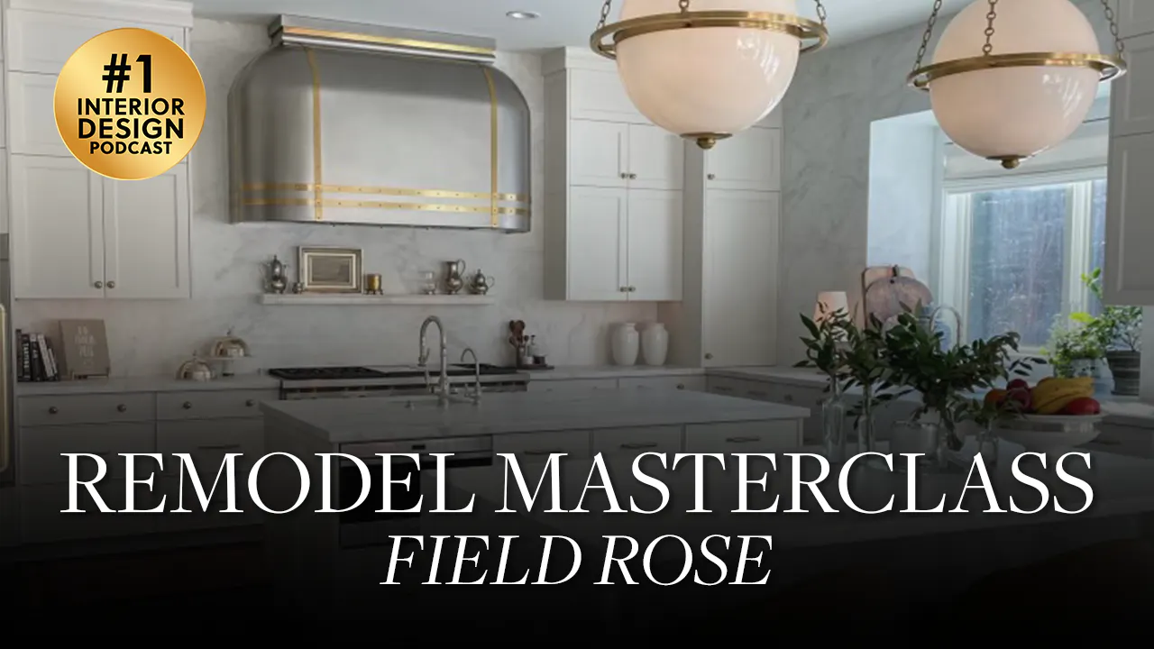
Well, you can tell if you're tuning in on YouTube or Spotify and you're watching this, you can tell. I feel like a kitchen for sure in this era, because they didn't take the cabinets all the way to the ceiling. So you're looking at your uppers are all hanging on the wall, and they're probably at least 18 inches or 2ft when you say Corey, off the ceiling. So today we bring cabinets all the way to the ceiling, and y' all are gonna be surprised, but we replaced a white kitchen with a white kitchen. But you'll be able to see the difference. And it might be hard to justify maybe to your partner to be like, why am I putting in another white kitchen? But the difference is extraordinary. Even the cabinetry styles and how dated they look, even though you are replacing it with a white kitchen. But one thing that we rescued and kept from this kitchen and is we love that they laid the hardwood floors on a diagonal. These are oak floors. I think the stain color looks great. It's just kind of that medium sort of walnut tone, which is always classic. This never this sort of walnut color, never really trends. And the diagonal thing is such a power move. I'm so happy that they dared do this in the 80s 90s, you know, so we kept that.
- [06:06]
Suze
Yeah, we kept this. The one thing when we looked into this kitchen, we're like, where's the range? They have an induction range, I believe, on their island and, and then they had some wall ovens. But really, when we were like designing a kitchen, the range is like, it's the most expensive appliance. It usually has the most fashion points. If you're going to get a French range or a 60 inch, like, it's like expensive, expensive line item. And that's like the, that's what we want to see. That's like the hood and the range.
- [06:29]
Jess
Yeah, that's our money shot.
- [06:31]
Suze
The money shot. And so anyway, we're like, okay, if we, if she's giving us free reign, like, let's reorient the kitchen completely and repurpose a really beautiful range moment where on that back wall where the fridge is kind of hiding back there, you can also see on this, you know, just escape where you were up, then you were down, then you're up, then you were down on your cabinetry again. We're going to take it all the way to the ceiling. And we're actually. She's a big entertainer. We had a lot of vacancies here. And so we're like, we could actually get two islands into this space.
- [06:59]
Jess
If you're not able to see, there was an L shaped island in the middle of a pretty big kitchen. The countertops do cantilever on one side, which would allow you to have bar stools. But it's this sort of perpendicular island that's cutting right through the middle of the kitchen. Instead of being horizontal with the width of it and making it feel wide and grand, this makes the kitchen feel so much smaller. So when you see the afters, I think one of those biggest take homes is orienting that island so that it's going to really make you feel sort of the breadth of the kitchen. It's just such a more grand shot. You really, I don't know, you really want to orient your kitchen the way that you're going to enter the most. And I know there might be more than one traffic pattern, so. But orienting that island so that it's parallel with your range is usually what you're going to do. And it's just going to just make it feel so grand.
- [07:51]
Suze
Yeah.
- [07:52]
Jess
So this just isn't doing it any favors. And I love it because it's a really great before.
- [07:55]
Suze
It's a great before. Well, I was going to say it's kind of like when we tell you the bed should be like, we should be able to see the face of the bed, we should be able to see the range because right now I feel like I'm walking to the side of a messy nightstand. I agree. You know, and so you're walking into a mess, and it doesn't feel organized. So we're look at your kitchen like that. Even on a messy day, look at it and be like, is this the shot that I want? People walking. Is this the shot I want to walk into after a long day with kids and all the things and really, like, consider, like, what. What will hide the mess the easiest?
- [08:26]
Jess
Amazing how far kitchen design has come.
- [08:28]
Suze
No, just, you know. High five. Yeah, high five. Because I'm like, even functionally, like your work triangle, like your fridge to your range to your sink, having that right across, I think, right across the. You know, the sink in the window. And it's just so much better than how this is laid out. Like, this is, like, kind of a stretch. You have your ovens here, you have an induction. You have, like, two sinks over here. I don't know. And then, like, over here, this is a catch all completely over here on the left side, which all. I think all of our mom's house had that catch all thing that they realized this is not. This is not where, like, the command center should be for my office. Right. So.
- [09:04]
Guest
And then, like, on the prep side of the island, you're staring back into the side of the kitchen as well. So it's just like. That doesn't. I don't know.
- [09:11]
Jess
The vantage points are all wrong.
- [09:12]
Guest
Exactly.
- [09:13]
Suze
In this.
- [09:13]
Jess
In this before kitchen. Let's show them the after.
- [09:15]
Suze
Okay. Let's get there. Okay. Here are some aftershots. Again, these are iPhone shots. So, like, patient with us. But you can just see just by orienting, like, those islands in a more organized way, giving that wall something, like, beautiful to focus in on with that range in the hood. And is everything that also. This hood is probably one of my most favorite hoods that we've ever done.
- [09:37]
Guest
Super cool.
- [09:38]
Jess
You never see a soft shape as a hood, and so you have this big bullnose as the top of the hood shape. And then it comes down. The sides are also. They also arcuate back to that. To that slab wall. And then I think the straps, the brass straps on this beautiful stainless hood is just so beautiful. I love how this turned out. It's so atypical.
- [10:02]
Suze
And I want to say, like, even the production was, like, process was awesome because this was like the metal worker working with an auto body shop to make sure that the arcuation was exactly as it should be, because it's floating. It's not sandwiched with. So also, I think that it's a creativity moment too, that you don't have to sandwich it flat with your like your actual cabinets on the side. Because storage was an issue, we needed to have like uppers and things to like get everything that we needed to store in this kitchen. These were tall ceilings and so you can see that we even we brought that soffit down because functionally it didn't make sense to have cabinets go all the way up. And so we put it to like a really normal height. I think at the top of this was at nine feet. I think we were like ten and a half total height here. But it just made all the difference. It's super functional. It's beautiful. And you know, I see that's one a couple things I'm going to go to a couple more after pictures for you is I want everyone to notice the scale on these pendants.
- [11:01]
Jess
Yes. And let me just really quickly say we searched in the chandelier category for this. This is not a kitchen pendant. And I just wanted to pay this forward to all of you designers and any of you embarking on a remodel. Sometimes pendants can be a little underwhelming. And when you're working on a grand sized kitchen, especially if you have 10 plus feet like we have here to work with, you have to go, you have to employ a new scale to be able to get a big gorgeous result. And and I have to say this is a light that we've used in entryways before. This is a great entry chandelier. And using two of them, I actually have this in my home office. I have a barrel vault ceiling in there. I have this same fixture in bronze. And I just think it's so handsome as a pair over a kitchen island. It just breaks all the rules. And I just wanted to pay that forward. If nothing else, listening to this episode. Do that trick and you're going to get grand applause for it.
- [11:54]
Suze
A couple another trick too I just love. You have this just suit is the shelf.
- [11:59]
Jess
Yep.
- [11:59]
Suze
I love that even like styling it. I was like, this is like the best kept secret that like everybody should know about is the little shelf above your range that can hold your salt and pepper, your oils. And like in this case, we put a little piece of art with some of the things just to kind of build and get her started as she moved into the home. And I know you use yours all the time. It's like one of your favorites.
- [12:21]
Jess
What we did was we used her countertop material, which is marble. We use that on her Counters. And then we did a whole slab wall as a backsplash that went all the way up to the ceiling. You use that same exact marble as a shelf above your range. And I really think like 6 inches just projecting off the wall. What they did at my house was they had to use rebar and that was sticking out of the wall. And then they made a sleeve of marble to go over the top of it. And that supports it as deep as you can get it. Because as you know from styling, you do like to layer things, but mine's probably only 4 inches. So mine ended up just. You just lay. They don't layer in front of each other. They're just more in a row. But all of my olive oils and, you know, vinegars and salt and peppers and that kind of favorite stuff is right there. And it looks so culinary. I love this trick.
- [13:07]
Suze
Yeah, Minimize. I would say like four, no less than four. Six is awesome to do the layering thing. Also to keep in mind, if you have like big stock pots, like, what is going to be sitting underneath it too. So like really work with your person to make sure, like how you cook is like the steam and everything, like where it hits height wise, the projection there, it's not going to hit into anything. So that's just like one thing. To just like have a note of like 4 to 6 inches. It's like money. So anyway, so I love that if.
- [13:37]
Guest
You'Re going to do a tile backsplash, like, what material would you use for that or you just wouldn't do it?
- [13:43]
Suze
I would take my countertop material probably and put it up there.
- [13:45]
Guest
Okay.
- [13:46]
Suze
Yeah.
- [13:46]
Guest
Cool.
- [13:47]
Suze
I mean, you could tile up and over it, but yeah, it gets more complicated. But I'd probably just use my slab material. I do love the little detail too that we added on this, like little shelf.
- [13:57]
Jess
It looks like furniture.
- [13:58]
Suze
Yes.
- [13:58]
Jess
So beautiful.
- [13:59]
Suze
Yes. Definitely tune into this visually if you're listening to it, because I think it's just turned out beautiful. One fun thing is we went slab shopping and we initially had a more wild vein in here. Client, last minute, she's like, I think I want to go to something calmer. So we chose a Chaldea, which is beautiful and it's calm. I feel like this is a very timeless look.
- [14:18]
Jess
Also. It was 2019.
- [14:19]
Suze
2019.
- [14:20]
Jess
And so the wild slabs weren't quite as prominent in Vogue or. Or prominent. I mean, we could feel that thunder coming. And we were.
- [14:28]
Suze
And we wanted it.
- [14:29]
Jess
And we wanted it, but the client hadn't seen it. And so she Went with this. Sorry, sue, continue.
- [14:35]
Suze
No, and. And I just asked him just like, is there anything that you would change? And she's like, I wish you went with the Balder slab. So isn't that interesting? I'm like, this 2019, 2020, that, you know, you. You may, like, feel a little bit scared, you may feel a little nervous and be like, am I gonna get sick of this? But if you love it, if you love it, then you should do it. If it's in here, if it's in your taste. And, you know, I. I don't know. I just. I. I wish that we. This is beautiful. I wish we went the Balder slab. I'm with you. I'm with you with a client.
- [15:08]
Jess
And this might go without saying, but I'll just say it anyway. For those of you maybe that aren't designers, or maybe you designers, you probably already know this, but once you choose that slab, then you're going to get your paint deck out and you're going to choose your shade of white, if you're going with a white kitchen or the tone that's going to look best with that slab. So you can see here, now that we're up close, even though these are iPhone photos, this kitchen is actually not white. This is a really neutral shade of kind of a taupeish gray tone that looks really beautiful with that Chaldea slab. Had she gone with the wilder marble, we would have used probably a slightly different neutral, you know, shade that still felt like the white kitchen that she always dreamt of, but in a tone that relates really beautifully to the slab. So keep that in mind as. And, and also, if you're doing your bathrooms, you're going to get your paint deck out and choose your color. Once you choose your slab for your cabinetry, if you're going paint grade, that.
- [16:00]
Suze
Can always be shifted, which is really great. One last little corner, I'm like, we got to put this in. Is she had this window where, like, her main sink looked out over, and she has this amazing backyard that's like, that's the nice thing about buying an existing home is your landscaping and your trees are mature. And actually, you can go into our portfolio and look at their exterior spaces, because that was featured in a local magazine Here, it's under our field rows, under portfolio. You'll see that backyard, and it's stunning. But the thing that I loved about this is that we made sure to, like, utilize that space. We have a window in front of the sink, and I. I love it. I love it. When actually the actual window sill runs in with my countertop completely. This was existing so we didn't move the window. But just having all that space is amazing because we were able to like put her herbs there. Planters, we have all these cutting boards. I just this spot where you can just like have extra footage to like actually have things on your countertops and have it not feel like clutter. I think it's so beautiful. Yeah. I love this.
- [17:01]
Jess
Those of you that aren't seeing it, what we're talking about, there's probably almost two feet behind the faucet before you get to the window.
- [17:08]
Guest
It's a pop out window, I'm guessing, right? Yeah.
- [17:10]
Jess
Even there isn't a window casing around the opening it. We ran the slab, we turned the corner around the slab all the way into that depth, both on the countertop as well as on the wall. And so you've got this huge depth of beautiful window lit space that you can grow an herb garden. You can layer in all your cutting boards. It's just a beautiful depth of surface that nobody has. I've never seen this before. I just love it so much. So if you are embarking on a remodel, this is a really great trick.
- [17:41]
Suze
Yeah. Maybe add a pop out.
- [17:43]
Jess
Yeah.
- [17:43]
Suze
On your window. Architecturally it makes sense on the outside. Like consider because this, this is a.
- [17:49]
Guest
Good point of like taking the arch architecture. Architecture that you have in your home and just using it to the. To the max. Right. Like that. I feel like you guys did the best job on that.
- [17:59]
Suze
Celebrate your assets.
- [18:00]
Guest
Yes, exactly.
- [18:00]
Suze
Celebrated these so well.
- [18:02]
Guest
Okay, Suze, have you ever given a gift that felt more like an experience rather than a product?
- [18:07]
Suze
At the end of the day, all I want if showered, the kids are in bed. I'm going to go to my sofa and I'm going to grab my bubble cuddle blanket because that's all I want. At the end of a good one or a bad day, you just want to wrap yourself up in a blanket. And no one does it better than Cozy Earth. The bubble cuddle is my absolute favorite.
- [18:25]
Guest
You can get that bubble cuddle blanket risk free because it comes with a hundred night sleep trial and a 10 year warranty. Give the gift of everyday luxury. This holiday season. Head to cozyearth.com and use our code Dear Alice for up to 40% off. Just be sure to place your order by December 12th for the guaranteed Christmas delivery. Listening after the 12th. Don't worry, our Code Dear Alice still works year round for 20% off. And if you get a post purchase survey, be sure to mention you heard about cozy Earth right here. Give the gift of comfort that lasts beyond the holidays and carries you into a cozy new year.
- [19:00]
Suze
I'm so excited about the next room. Are we ready? Okay. Drumroll. Dining room. Okay, so one fun thing about this family too, is that they love to entertain. They. And they have, you know, little girls that just wanted something like, really, really fanciful. And the mom was so fashionable. And so this. Okay, here's the befores. I'm getting ahead of myself. Here are the befores. You have again, that wood floor running through. That's great. You have this really pretty parquetry border, which, you know, is fun. You see that in that era.
- [19:30]
Jess
Totally.
- [19:30]
Suze
You know, a little bit more of those borders, which we didn't want to get rid of. I thought it was beautiful. We have finished work that, like, they were still really happy with. It was in great condition. They had a lot of really great, like the moldings and things around, like their windows.
- [19:43]
Jess
Originally built, this home. Went for it.
- [19:45]
Suze
They did.
- [19:46]
Jess
Was a dream home, I have to say. The finish work and level of detail is really high, especially for this time frame. And the parquetry floor, like, amazing that they went that they went to that. To that extreme. And even the medallion on the ceiling where the chandelier is. So these befores are not dreadful in this living room. The windows, I think, are beautiful and interesting. I don't know. I. I feel excited. I know what it turned into, but I'm like, excited to get to work with this house, you know, when you're walking through it for the first time.
- [20:17]
Suze
Yep. Okay, so those are the befores. These are some. Here's a picture of as we start, whenever we're, like, working on a space, we're like, trying to cue into, like, this the client's style and like, what do we want to feel? And she loves wallpapers. Or like, and she loved a mural. And so we went to Gucci. And because, like, historically, you can kind of get those scenes from Gucci for not as crazy of a price point. You can't really custom at all and you can't get samples of them. P.S. you just have to buy a roll. And so we loved this scene from Gucci. And we're like, okay, we have an interesting thing here is that we did have a wainscoting that we were keeping in this home. And so we're like, okay. I still think even if we had a trim off a little top and the bottom, we're going to do some, like, major color drenching moments and have a lot of heroes to celebrate in here. I don't think anybody's going to notice that we clipped a little bit off.
- [21:05]
Guest
The bottom and the top to fit the.
- [21:07]
Suze
To fit the mural in that pocket.
- [21:09]
Guest
Yeah. I mean, you lucked out because it's.
- [21:10]
Suze
Like a one third now and then here process picture. We. And because she wasn't afraid of going colored and, like, doing more color drenches and painting her trim, like, we went for it. And so, again, inspired, you find your. Just like you find your slab before you pick out your cabinetry color. You find your wallpaper before you pick out the rest of your color drench. So we had this. We ordered our roll sample. We started throwing paint at it, and we realized, like, how fun, because she had, you know, three little girls, how fun it would be to just, like, go like a really, like, I don't know, fashionable. Think that you wouldn't get sick of this, like, tone of, like this almost. It's like rose, raspberry, mauve. Just that color that we're all crushing on. That looks so, so good with the paper.
- [21:51]
Guest
Did you go through, like, multiple colors for the trim and the ceiling off of the mural? Okay, cool.
- [22:00]
Suze
Yeah.
- [22:00]
Guest
That's rad. I feel like this is one of the bolder ones you could have chosen.
- [22:04]
Suze
I know.
- [22:04]
Guest
I think it's super cool.
- [22:05]
Suze
I think it's really, really cool. And I think even with the warmth of the floor, it's everything. Okay, let's get to the afters. Let's just go. Okay, here's the after. You can see, because I want to show you here that on the ceiling we went with, again, it was a strip of paint. So when you're picking out your paint, like with your wallpaper, whatever the hero in that space is, you can kind of like, from the darkest at the bottom to the lightest. You can kind of pick what are the ones that are working the best with the wallpaper and make your heart sing. And you start to sample those. And that's what we did for this dining room. So with the darkest color on the. On the string, we went that for that on the trim and on the wainscoting. And we even, like, matched it with our drapery. You can kind of see. We just wanted that to be a continuation on those panels in the space. And then we decided to go to a little bit more lighter coral color that you still see in the wallpaper for the ceiling, which I love. And then Even on our chandelier, they allowed us to do a custom spray. That's so fun when you do find a vendor that, like, will custom the spray powder, coat it, get the shades the right color. We did that same color from the ceiling onto the chandelier.
- [23:06]
Guest
So cool.
- [23:07]
Suze
And again, this used to be a very, like, traditional. I feel very home alone about the befores of this home. And I feel like the transformation is into a secret garden.
- [23:16]
Jess
I just feel like this is so editorial and this space alone is the one that haunts us, that we're like, oh, I wish this, I wish this could be shot because it feels like the COVID of a magazine. And we felt like it was worth sharing it with all of our closest friends on the podcast just to see how this, this very traditional 80s 90s house turned out in 2020. 2021, you know. Yeah, this would still be so extraordinarily relevant. I would choose these exact same choices today.
- [23:43]
Suze
I would too.
- [23:43]
Jess
Yeah. It's so great. And I think paired with the chair, with the yellow upholstery just also brings another one of those hits out of the Gucci wallpaper. Yeah, your Gucci wallpaper in this scene is like your rug. It's so foundational. You're going to continue to choose, you know, paints, upholsteries, everything off of this palette. It's so good.
- [24:02]
Suze
Yeah, it's fun to color block. But then it was also fun when we were trying to find the right rug for this house because it's one of the main things rooms that you see off the entry when you walk into the space. So first impression was really important to the client. And so we wanted to bring some of that antiquity, you know, and so between like the floral on the wallpaper and the antique, you know, rug that we. That was vintage. I love that. But then I also love the color blocking. Like you said that camel yellow with the double tone pink, like, it just, it feels very, very in vogue, very, very fashionable. And I cannot be happier with how it turned out. So that's the dining room. Super cool. Not to mention that convex. Let's talk about a preach for that with those gold buckles. So even like when you're like a mirror would be lovely, you don't always have to go traditional. Try and twist it a little bit because I think you're going to get a lot more points. And people might not be able to put their finger on it when they walk into a space, but they'll know that, like, the mix is what's making it so Dynamic. So.
- [24:56]
Jess
And you know what? Back to the. I loves repetition.
- [24:58]
Suze
Yeah.
- [24:59]
Jess
The back of these chairs have a circular shape on them. The cushion is a circle. And then that convex mirror lives above the. Lives above the console, and it's a circle. And I just think the play. It's a dimensional circle. And I think that those. Those two playing together just really echoes this beautiful soft shape along with all the soft bending boughs of the Gucci paper. You get all of this organic movement, movement in the space. Not to mention a nod back to those windows, which are a true arcaded, arcuated window, not just an eyebrow, which is. Which is really great.
- [25:32]
Suze
So rare.
- [25:33]
Jess
Yes. We kind of hate the eyebrow, but we love the full arcuated shape of this true art, which. True arch. Yeah, we're dealing with a true arch.
- [25:41]
Guest
Here, which you didn't really get the full payoff with those when they were just all in white.
- [25:45]
Jess
Yeah.
- [25:45]
Suze
Like, that's exactly celebrating your assets. Like, if you're inheriting this architecture, point it out to people. Draw that bold line around it.
- [25:55]
Jess
Don't you feel this feels more historical? I think they did true arches back in the day in castles and all of the big, beautiful homes on the east coast and in Europe. You're not dealing with those little funny eyebrows. And I just. I just had to point that out, that the circles and the arches in here are just lovely and celebrated.
- [26:11]
Suze
And when you, like with your moldings and things, I know that there's a time and a place to do it, like classic white, and it feels very, again, classical. But when you do, like, beautiful moldings like this in a darker color, in that semi gloss, in a gloss, you actually feel it so much more. The depth and the shadowing of each one of those hand carvings and the turn of that. So much more celebrated.
- [26:30]
Guest
Yeah.
- [26:30]
Suze
So I love. Thank you for pointing that out. That's actually beautiful. Okay. That is the dining room. Okay, let's hop into the living room. So the dining room and the living room mirror each other on the floor plan. So when you walk in, you get. You see this beautiful staircase, and everything's kind of basted and, like, finished work, but it is, like, lighter, like most general spaces are in homes. Right. But then when you get into these spaces, you know, that are experiences like a dining room or like a formal living room. We were lucky that they had such beautiful, like, finished work to really, like, isolate a mood and a whole scene. And so that was the same kind of thing. When you walked in, it was, like, neutral, but you had open casing into a dining room and into a living room. And we want to feel something that kind of pulled you into those spaces. So here's the before of the living room. Again, you have that on the exterior. You see those three repeated true arches on the front. This kind of takes you. We had this really strong. It was a cast mantel with an overmantel. That wasn't like. It was still beautiful. Very federalist. Just wasn't the client style. They want something more fashionable. So we tore it out.
- [27:30]
Jess
Quick shout out to the light fixture.
- [27:37]
Suze
Maybe they have one over here. If we're lucky, we got two.
- [27:39]
Jess
But, you know, this is just the difference between what happened back in the 1980s 90s versus what's available today. You know what I mean?
- [27:47]
Suze
Yeah.
- [27:47]
Jess
Like, these guys didn't stop. Look at the finish work in the before. They went for it everywhere. They did. Not just the mantle, but the over mantle. You know, uh, it's just like the details were there. It's just so funny that this is the lighting that ended up in this house.
- [28:00]
Suze
Boy, am I grateful to be alive.
- [28:01]
Jess
I know. Sorry. I know not to talk about, But I just had to give it a shout out. If you're watching, you'll get a good.
- [28:07]
Suze
A good giggle on it. I love that. So those are the befores. This is kind of the process of. You kind of felt the colors and things that we did in the dining room. So that was designed before we did the living room. I think we kind of did them in tandem just because they were kind of mirroring each other. And so you can feel some similar tones and happening here. But we did want it to be just, like, more. Since we had the pattern happening over there, we want it to feel a little bit more like a suction cup of color, just kind of like pulling you in. And so again, we went deep and dark and moody. Moody. We started with our rug. You can see the dining room wallpaper here. Just so we made sure it talked to the space with the paint colors. But we had a rug that we wanted to like. We did a really traditional vintage rug on the other side. We're like. It'd be really fun to do something that felt a little bit more abstracted or exploded from a traditional motif. And so we brought in this, like, oversized plaid with all the colors that we were using. Even, like, almost to. There's a corally piece in here, but it almost feels like a little neon orange. Orangey, which is so fashionable. Also, you have, like, a little Gucci tag on one of your Bags that. That. The handles like the neon orange and. Oh, gosh, I feel like you got that around the same era of this. I was just like, oh, we need to bring, like, just a little bit of those highlights.
- [29:19]
Jess
It feels fresh. Yes. In a traditional space. Space. You can make a traditional space feel fresh through color. I feel like. I mean, we've talked about this before, but it's like, you know, the. The Tory Burch scene, where everything's English rolled arms and everything, but she's doing it in a lime green, and that's what makes traditional feel like new trad instead of your grandma's.
- [29:40]
Suze
Yeah.
- [29:40]
Jess
Your grandma's house. And I feel like we were taking. Her style was traditional, but it was so much more global and fashionable. And I think through the colors and the patterns, that's where we were able to really achieve sort of this level. This was a little mock up we did on her wall because it was Covid. Everybody was in masks, and we were giving more space to be able to work rather than bringing her into an enclosed conference room. So we mocked this up on her wall with all of the different elements, taping it so we could all just sort of stand back and make decisions.
- [30:11]
Suze
Together, which is always smart. If you're in the middle of a remodel, start taping things on the wall. You do this a lot when you're, like, mulling over ideas. And like, once you. I'm doing, like, on my primary bedroom, I'm kind of doing that right now. It makes me alive. I feel like it's something like this.
- [30:25]
Jess
Living gallery, like, not just stuck in your computer. Yeah, yeah. So if you're in the middle of a remodel, bring things home, print things off, tape it up, overlap it, get paint strips, look at it at different times a day. I know you've been working on paint for your bedroom, and so you're coming home at night and it's dark, but then you also want to see it morning light. You. These things need to be considered at all times, different times of day. And this is just a really fun, fun way to see it.
- [30:51]
Guest
Plus, I think it gives you a sense of, like, how it's going to feel living with it.
- [30:54]
Jess
Yes.
- [30:54]
Guest
A little bit. You're like, oh, is this really what I'm attracted to every single day?
- [30:58]
Jess
It's physical.
- [30:58]
Guest
Yeah.
- [30:59]
Jess
Yeah.
- [30:59]
Suze
And anybody else that's living with you can, like, object or just be like. Just so you know, this is what you look like in the morning. You're welcome. Yeah. So beautiful. Okay. Hello. So that's process. Now let's go to the after. One thing I just want to know about those befores is that it was a really long room so we had to be right. Really clever with our space planning. So we're going to show you some afters, hopefully start to capture. You can't even like get the whole thing because it is such a long room. But this is showing you just some pictures I was taken at Christmas but shows you that rug of just again that kind of exploded scale which is so, so cool as it stretches. We had mirroring sofas, one on one end and one on the other end with two swivels that kind of shared. They could swivel over to the conversation on the right. They could, you know, swivel to the conversation on the left. Again, not your typical space planning like in front of a mantle but like experiencing it lie. Don't you feel like it was just. It was really creative and I'm like, I could see a party happening here and like you know, chairs being shimmied over here to like whisper secret to this person or you know, orders being served over here while there was a. Kids were working on a puzzle over on the right. So we had a little pull up table on the right. So it was a little more like a study. Like if you were just there by yourself, you could sit over here by the window, have you know, a drink, read a book, whatever. But when you are having a party and you're hosting a lot of people, you can really, I don't know, seat everybody. Yeah, I think it's fantastic.
- [32:22]
Guest
And I think this space planning the way you laid like. Yeah, space plan. The furniture is amazing. Like they're in the befores we were talking, it kind of looked like they're. They were storing furniture in that room and everything was too far apart. It's like you're having a conversation like 30ft away from someone, you know. So I. That's. Yeah, you did such a great job and just creating two different like spaces almost in one big room. Looks amazing.
- [32:46]
Suze
Yeah, I want to move in. Yeah. And large art and just we. It was fun because the client loved antique so we went antique shopping. So even this, these little notes. I'm going to go to some of these continued afters. Here's some more of those. At nighttime we did pattern. She wasn't afraid of doing pattern shades custom. And then we like match those shades to like additional pillows on the sofas. And it was just, it was a really fun. Especially before this like era of like everybody's loving. Pattern on pattern on pattern. We were feeling it then that we're just like, we need to embark in more of these English traditional moments. And so vintage lamps with pattern shades, with matching pillows. And again, just these antiques. This, like, little stool nestled underneath this cocktail table is like one of my ears too. Like our favorite little moments.
- [33:33]
Guest
If you're like going shopping for something like that and you like, do you. Do you see cool stuff and you find a spot for it or you're. Or you're like going looking for something.
- [33:42]
Suze
Specific, you never know.
- [33:43]
Jess
It finds you.
- [33:44]
Suze
Yeah, yeah.
- [33:45]
Jess
And you're. You're admiring it. I know when we were just barely at High point, an antique shop, they had this little triangular mohair ottoman. It was tiny. The cushion on it was only like an inch thick, but these really long iron legs. And I was like, yeah, you just buy those and then you find places to tuck them in, Whether it be under a center hall table or next to a bathtub or nestle it in next to a cocktail table or in between chairs. Like, these are the things that make a scene and everybody comments on it. It's like your cool earrings that were vintage. Like, where'd you get them? Like, I'm so sorry, I. They're vintage. It's. There's only one. You know, these are one of one. This feels like a very one of one thing. And when I think of the living room, I oddly think of this little brass table nestled under the coffee table, poking out as another layer for books.
- [34:28]
Suze
It's a memory point.
- [34:29]
Jess
It really is a memory point.
- [34:30]
Suze
Yeah, I love that. And even you can't even see the whole view of this chair. There's like an acrylic moder modern chair next to it too. So I'm just like the juxtaposition again, that tension. People might not be able to put their finger on it, but it's the combination of the old with the new that like makes it pulse in a space. And it's just. It's so good. And she was cool with like doing sculptures and pedestals and just all the layers, like, really added to the whole vibe of this space. So here's some more up close. Here's those pleated shades. Just so much fun. And again, this was like facing the exterior. So like she's like, when the lights are like at nighttime, when people are walking by, she's just like, I just want them to see a scene. And so this was like a front facing scene, which is so much fun.
- [35:14]
Jess
Those of you that can't see it. It's. We had candlestick lamps that are like palms, brass palms, and the palm fronds are all out of brass. And the lampshades is what we continue to talk about. They are in a really beautiful kind of a mustard floral, and they have a peacock tape on the top and the bottom of the shade in this room that's like a mulberry color. So it's just such a scene and really beautiful from the back and from the front.
- [35:42]
Suze
Also the art. We had this like some really beautiful, like modern photography of classical locations around the world. And so anyway, just such such a scene. Both like walk into a space of living in the dining room. You just. You immediately know that you're about to experience something special in that evening, you know? So anyway, I love those. Okay, now we're gonna go to the office.
- [36:03]
Jess
The office will be the last space that we're going to talk about in the home. So we're entering into this really a dream office. If you think about the time frame we've got, it was very successful. Oh, for sure. And a reader. Look at the built ins in this. We've got a lot of stained mahogany in here.
- [36:22]
Suze
Cherry or mahogany? What do you think?
- [36:23]
Guest
That's probably cherry.
- [36:24]
Jess
Yeah.
- [36:25]
Guest
But it is probably with like a mahogany stain on it, which is red.
- [36:27]
Jess
It's that sort of really dark merlot color. And it's on. We've got ceiling treatment in here. It's not quite a coffer. Or maybe it is kind of a shallow on the ceiling. We've got a room full of built ins with books. All of the woods match. We'll say that including this chair.
- [36:45]
Suze
They picked the desk before they picked the stain on the molding. Exactly. Yeah. Yeah.
- [36:50]
Guest
Good for them.
- [36:51]
Suze
Okay, Good for them. So here's some more corners of that. Again, not the best before and after, but at least gives you the whole vibe. We've all felt this office.
- [36:57]
Jess
Again, we did not decide to keep any of the built ins. We ripped all of this out. I know you're going to ask this because in the afters there are some built ins, but these are not those built ins.
- [37:07]
Suze
Yeah. Honestly, when you think about just like how we like the computers are different, you know, like how we work, we need a zoom backdrop. We need more like square footage for just like, like seating. It's not just like one person's one desk anymore. You usually want to have a couple more seating options there. So it was just. It wasn't important for them to keep those built ins at all. And like kitchens, you revise those, you revise built ins most often. So just know that when you, like, buy a house, it's likely that the old built ins aren't going to function the way you need them to look or need them to work. So here's a little video. So we want to do another color drench. Something a little bit more masculine. Go a little bit more in the blue tones than the reds and the pinks. And so we picked this color, Sherwin Williams Tempe Star, and we just drenched the place. The built ins, the walls, the ceiling still.
- [37:56]
Guest
Did you refinish the floors in this or no? We did okay.
- [37:59]
Suze
Yeah.
- [37:59]
Guest
They feel a little darker because we.
- [38:01]
Suze
Were pulling so many things off. We had no choice but to refinish because it went underneath the cabinetry and we reallocated stuff. So, yeah, we did go a little bit darker. We played with it and just again, once you sanded it, like, to absorb the correct color, we did have to go a little bit darker than it was previously.
- [38:16]
Guest
Make it more even.
- [38:17]
Suze
Yeah. Because we had to replace stuff too. So whenever you do that, like, it's just different wood at different times and temperatures. Just note when you're sampling, you're gonna have to, like, make some adjustments to the previous stain color. So, yep, it's a living, breathing, breathing thing. So here we are in a little video. This is just the rug down and. But you can kind of see just the walls, the ceiling still kept a shallow coffer just so we could, you know, feel that finish work going up.
- [38:46]
Guest
It looks great all being the same color, though.
- [38:48]
Jess
Yeah, agreed.
- [38:49]
Suze
It is. It's not as nervous. And then you can get more interesting furniture frames on top of that, which is what we did. I like that you pointed out just like, with like the yellow shade in the living room, that use of that color being used throughout in different temperatures is a nice continuation, you know, as you go from space to space. This is just a little corner showing that Tempe Star. This isn't night, but a really amazing Hunt Sloan and Parrot custom framed with this, like, really modern kind of this mustard yellow velvet chair. It was like that. That moment was just so good. Like one chair and a piece of art and it, like in a small space, it's so memorable.
- [39:24]
Jess
And the drapery is also the same color as the wall, so you get that continuation much like we did in the dining room in the living room.
- [39:32]
Suze
Exactly.
- [39:32]
Jess
Yeah.
- [39:33]
Guest
Then the applied molding that's on the wall, but also on the side of the built ins, too.
- [39:37]
Jess
Yes.
- [39:37]
Suze
And it carries on. All that line work goes onto the ceiling, and so you still create all these intersections. So the mouth was really smart. So make sure you're, like, noting that, like, if you're doing finished work on the wall, how does that, you know, communicate what's happening on the ceiling with what's happening on the windows with what's, like, you have to kind of stare at all those lines together and see how they match up. And I think that that's what, like, sets you apart from being, like, really smart about it. Like, just do it once. Don't like. Because afterward you're like, especially your OCD mother's gonna look at it and be like, those don't match up.
- [40:08]
Guest
Or you will.
- [40:08]
Suze
You will.
- [40:09]
Guest
You'll see the imperfections in it every single time. Yeah.
- [40:11]
Suze
Anyway, so here's just a couple more corners of the space again, Just a handsome chair again, I love. We always talk about this, like, the temperature. And before you make something too cold or cool, you just need to make sure that you're, like, equaling out the temperature. Make sure that there's, like, enough warmth in the pink color, enough warmth in the other things that you're countering with it so it doesn't feel like a frigid environment or a hot environment. You kind of have to do this, like, balancing act. Yep. That is all we have for you from this house from Field Rose.
- [40:41]
Jess
So beautiful. I just love these spaces that we're able to highlight and taking that. That 90s dream home, that 80s dream home, and bringing it into 2026, it looks so great. And I would still choose these decisions today, even though we completed this almost five years ago. I think it turned out really awesome. You guys, thanks so much for watching today. And remember, you can sign up to be an insider and get early access to our upcoming launches. We have a lighting launch that is coming for you just in a few days. So if you want early access to that and any launches, actually make sure and sign up and you'll get in early and have first pick of the litter. Big thank you to our listeners. We're so grateful for all of you guys. And were you gonna say something, Sue?
- [41:24]
Suze
I was gonna say you definitely wanna be an insider on this lighting. It's so good you guys are geeking out. Yeah.
- [41:30]
Jess
Well, and fun fact, too, a little behind the scenes is we're shooting it mostly in Suze's house, so you're gonna want to tune in to see Suze's house. And we're shooting a few in my house. So this launch is actually super personal for us.
- [41:43]
Suze
I know. Yeah. We're very excited. We're excited for you to see.
- [41:46]
Jess
We are very excited. Thanks so much for tuning in, you guys. We'll catch you. Hey, thanks for listening. If you like our show, please leave a five star rating.