Loading summary
Transcript126 lines
- [00:00]
A
Hi, everyone. Welcome to Dear Alice. We are going to be doing another remodel master class today. Yep, y' all are liking this series, so I'm really glad that you are. And when we see that, that a lot of people are watching and listening to this and learning and the reviews are really good on it, then we're like, let's keep it going. So give the people what they want. I think this is our third remodel master class, right?
- [00:20]
B
Yeah.
- [00:21]
A
Yeah. So this is House of Kennedy. This is a home that has been on our portfolio since about 2019. So I'll bet we started this work in 2017.
- [00:29]
C
And.
- [00:30]
A
And this is a remodel on a 90s rambler. It was beautiful, all brick. We've got a main level and a basement, and we really concentrated all of our efforts on the. On the main level, but then also on the interior. This client wanted to put all of her budget into the interior, which I totally love and agree with, because if you have to share your budget with exterior remodel, then you can only do half as much. So if you. It was really fun to go all in with her. She was really in the mood to do something special and unique and fashionable. And I'm so excited to see you. Just. I'm so excited to show you some of the tricks that we came up with on this house. And I know all of you are going to relate to this. You either grew up in this house.
- [01:12]
C
It's your mother's house.
- [01:13]
A
Yes. You either grew up in this house or you're living in this house, or your friend has a house like this. And you won't believe the difference. Some of these tricks we did that really expanded the space, made it feel more continuous and just made it feel super designer with eight foot ceilings. So I hope you're going to love this episode. But first up, I wanted to say our Black Friday collection sale is on right now at Alice Lane Home. There are discounts up to 30% off in. In the collection. So go check that out at Alice Lane home dot com.
- [01:43]
B
Let's just jump into it today.
- [01:45]
C
Okay. All right. This was such a fun project to tackle, and we're going to be showing you again. I wish we had, like, hours to just go through every room and I go through all the details because we love this. We love talking about this. We're going to focus on the entry, the family room and the living room, kind of those main public spaces and how they relate to each other. I think we're the most dynamic and the most Memorable for all of us. So.
- [02:08]
A
Yeah.
- [02:09]
C
All right, so let's get into it.
- [02:10]
A
Let's do it.
- [02:11]
C
Okay, so I'm going to show you some befores. You've seen this, you've seen this real estate posting again. 1990s, this home was built and it.
- [02:19]
A
Almost reads like the 80s, because if it was built in 1990, then these ideas were all in the 80s. So what we're looking at is we've got an eight foot ceiling. We're looking at a front door that's honey oak. We have a honey oak banister. And even the windows are trimmed in honey oak. That's right. Not paint grade, not white. But they went for it. They did stain grade. And then we've got a really beautiful swaggy drapery that's, that's got some fun.
- [02:45]
C
Pleats, Empire swags right there.
- [02:47]
A
Totally. And then we've got a patterned carpet that's kind of a, a royally navy blue with some medallions in it. And a small tile pad for the entry with a coat closet with bifold doors.
- [03:00]
C
Yep. I'm call this the gas station tile.
- [03:02]
A
Yes. This is a, this is a. That's flying ceramic tile that mimics kind of a travertine look. Yeah, yeah, Yep.
- [03:10]
C
And the thing when we walked into this house, there were again, when, especially when you first occupy a house that's not yours, you didn't build it, you kind of want to just like take everything away. Yeah. You're just like, let's blow this place up. And. But often our budgets don't always allow for that to take everything away. You kind of have to like, balance, like, where do I want to invest my money? Where do I want to, like, see what we can make with what's been given to us with this inherited architecture. And so when we looked at these before pictures, a couple things that we immediately felt was just like this kind of hopscotch of flooring materials. You had the tile and then you had like this carpet that was again, like kind of splitting the shallow brick road before you get to honey oak in the kitchen. And so you have so many different things happening in front of you. And we're like, okay, first and foremost, like, we can unify the tile or like do a tile feature here. But then let's take it into the hallways so we'll do something really cool there. What are other things that like, immediately like stood out to us was just trying to see. We had a coat closet, which a coat closet is great, but when you're this client, you want to have like a really fashionable, like, landing spot to be received. Received and like this kind of entry reception because there really wasn't any. You can see there's no walls and.
- [04:19]
A
There'S no sense of. It just feels like a front door, a small pad to come in with your wet boots, hang a coat up, and then continue walking. So we wanted to really delight and surprise in the entryway.
- [04:31]
C
Yes.
- [04:31]
A
And I have to say, a really great trick for you, if any of you are embarking on a remodel or looking around at your existing home, is when you chop up the floor. Like Suzanne just said, you are creating these little tiny spaces, right. Your. Your eye just kind of goes to that footprint, which is often why we'll tell people, go with the bigger rug, because your eye expands to the size of the rug. Same thing here. If we're going to do continuous flooring like we're about to do, then all of a sudden the space reads as one big one. Instead of the entryway just feeling like that little spot of tile. Now all of a sudden, the entryway encompasses all of the railings. It, it, it encompasses the hallway. And we were able to take out the coat closet and give ourselves a moment for a console.
- [05:14]
C
Okay.
- [05:15]
A
Yeah.
- [05:15]
C
Okay. Another thing that we did, I'm showing right now an elevation drawing showing finish work. Again, didn't have finish work before. It just had like those weird oak casings and things that got along with everything. We thought it'd be really, really lovely to do some of these designer tricks because the client loves, she loved a fashion moment. So we're very inspired by just kind of like this blocky paneling. And you'll see it in the after pictures. But we, I think, created a lot of grand grandness in this full stairwell, which was just like drywall and honey oak railing.
- [05:46]
A
So it gave some height to the space. Even though we're still enclosed in an eight foot ceiling, it brought you down into that staircase with this large paneling. That was one of those space expanding tricks too.
- [05:58]
C
Okay, now we're going to show some afters, actually process pictures we wanted to show you. This is a picture showing some of that finished work where it is just more of like this block, block on block applied molding versus like an actual carved panel, which I think, like, it felt young. This client also was young. She had a young family, super hip, loves interior design. So she was willing to go for it and like, really reflect her style and like embrace that totally.
- [06:23]
A
She's in homes all day because she's a Realtor. And so she really wanted, you know, her own sense of style. And I love that she found this home in this really great neighborhood that probably everybody would have looked past on the MLS because you saw the befores. And what she does with it is gonna make it, like, the most desirable home. Yes.
- [06:42]
C
Another thing that we ended up doing, again, we. I think we showed her different railing options, iron options, you know, ways to update the space. And the price came in high, so we kind of went back and we looked at what the current balustrades were doing, which they were actually really like, a beautiful form. You know, the selection wasn't bad.
- [07:03]
A
It was just.
- [07:03]
C
You couldn't see past the oak. Like, that kind of hijacked the space. And so we're like, what if we painted it? Which in like, a home like this, it would be kind of fun to see something, like, high lacquered and painted. And so that's what we did. We painted this whole railing, stair railing, going all the way down in this high gloss black. And I think all of us were just, like, mesmerized with, like, how different. Like, it made the whole space transform.
- [07:26]
A
And it connected back to. We ended up doing. Those of you who can't see. We end up doing a marble entryway, and we use three different marbles to complete this look. And one of the. The dark marble in it is this beautiful, like, antique oscuro. It's got little white sort of fissures and. And. And veins in it. And so that black marble within the pattern, it made this black railing really connect to it. I think we ended up using a shade of black that was almost a little bit more charcoal y, which connected perfectly back into the marble. And it all just felt intentional, and it updated everything all at once. And I think that more modern version of paneling also. And. And the flooring just made it all just more modern or transitional. It just looks fantastic. Look how big that entry.
- [08:12]
C
I was about to say, now that you're not chopped up between the tile, the carpet, like, it's so continuous, and it feels like an entirely different space. So in here, some. A little bit more showing that again, that entry tile and how it bleeds into this hallway. And again, I think occupying that coat closet was like the biggest win.
- [08:31]
A
Yeah.
- [08:32]
C
Of this space.
- [08:32]
A
So we removed the coat closet, took that square footage, made a jog in the wall where we could set an entry console, a mirror, a lamp, and it just made the entry feel that much bigger. We kept that marble floor flooring going all into that Cavity. And then we took it also down the hallway and it made that room or that house just feel so much larger.
- [08:53]
C
So.
- [08:54]
A
So the trick here is continuous flooring visually enlarges your overall footprint.
- [08:59]
C
Yes.
- [09:00]
A
So if you're in a remodel or you want to remodel, keep those things running. Don't just replace a tile entry with a tile floor. That's new today. Really, like rip it out and continue how far your eye can stretch. That's going to make your home feel so much grander.
- [09:16]
C
Yes. I love that. Okay, okay, now. Okay, let's hit the kitchen.
- [09:21]
A
Yes. Moving into the kitchen. This is probably the biggest to dominate.
- [09:25]
C
Oh my gosh.
- [09:26]
A
We're looking at a honey oak kitchen from it feels like the 80s. We've got a wall oven that's all of our appliances are white stuck into honey oak cabinetry. We've got a white fridge, a white microwave, a white stove, dishwashers, everything. So. And then we've got the classic sink with the window above it and the blinds and this. And the flooring matches the cabinetry. Everything's honey oak as far as the eye can see.
- [09:51]
B
They loved it back then. And then a ton of uppers too, which I think.
- [09:54]
C
Yes.
- [09:55]
B
I wanted to point out because what you guys did with it afterwards, it just makes it feel so much lighter. Especially because it is an eight foot ceiling.
- [10:01]
C
Yes. So that's a great, great tip.
- [10:03]
A
Yeah. Those uppers make it feel like everything's caving in on you. Yeah. And you really. You can't reach up above the refrigerator and.
- [10:10]
B
Yeah.
- [10:11]
A
And that's back when fridge depths were deeper. Were would hang out of the cabinetry. But it looks like a full foot right there.
- [10:18]
C
Like It's a solid 48. I don't know why this feels so giant. One other thing I just want to mention, and again, I. I know I've seen aunt. My aunts and uncles, like so many homes I've seen, do this where they actually took that eight foot ceiling just like did like this tiny little tray. They either popped it up to 86 maybe, or they actually lowered that cabinet height to like seven, six, I don't know. Anyway, but we went ahead and like filled and leveled all that out because.
- [10:43]
A
There was no need 4 inches and added it to our overall height.
- [10:46]
C
We did. Yes. Also just tell us about this.
- [10:50]
A
Yes. They had a kitchen island that made a shape of an L. And in that island they had a white stove with a little vent above it. And then, you know, the cabinets that go above the vent and we've got drawers on all sides of it. Mom's just standing in the. It feels like the hallway. Cooking. Cooking Thanksgiving. I cannot believe. Leave the space. Planning on this. But it also gives you a really good overall shot of the before and that family room that we're gonna talk about next. So this was a fun one to get our hands on. You just knew anything after would look good. So we're practically cheating by showing you these befores.
- [11:25]
C
Isn't this fun to think about? Like, when this was, like being conceptualized and like built. They're like, this is good.
- [11:30]
B
Yeah. Like, they thought that was a good. Like, let's do hang. Yeah, let's do like hanging uppers in the middle. That sounds like a good idea.
- [11:37]
A
Thank you for mentioning that, Corey. I didn't give credit to the fact that uppers are just hanging in the middle of a ceil. Yeah, I'll just look.
- [11:44]
C
Cute forehead right there. Okay.
- [11:46]
A
So we did obstruct the exterior a little bit. In the kitchen, we had the one big, if you remember, above the sink there was the one big kitchen window. And we said, I'll raise you one window and I'll take two. And I'm going to flank this. I'm going to put the stove where the sink was, and we're going to put windows on both sides to get more natural light into our kitchen and bounce, you know, all around in that space. So we did that little bit of exterior repair, But I think it was well worth it. We went with a really beautiful European 48 inch range here.
- [12:18]
B
And which is now like the centerpiece, I feel like.
- [12:21]
C
Exactly.
- [12:21]
A
Which. Can I just say, if you're going to embark on a kitchen remodel, your range is your money shot. That is what you're trying to solve for is to get that range in the middle of your kitchen. I can't tell you the amount of kitchens I walked into and I don't know where the stove is, and I can't ground myself. So today our range hood. And our range is kind of that. That if you will, if you're going to propose to somebody that diamond ring, it's that that crown jewel in the prongs is the stove and the range hood. So that's what we were solving for is how do we get this thing so that it's the money shot. And then flanking it with windows and. And then the storage solutions and this are so good.
- [13:00]
C
I can't wait to get to those. And the client, actually, I remember this was one of her first requests. She's just like I want to lock, renew. So like she knew that she was gonna like throw down because like not only is the, it's the diamond, but it costs the most.
- [13:13]
A
Yeah, we took that thing, we took that railing money.
- [13:15]
C
Yeah, we did.
- [13:16]
A
And we said we will put it in a stove.
- [13:18]
C
I'm getting arrangement.
- [13:19]
A
I know the stove money in the stove, the railing money in the stove. We're gonna get that.
- [13:23]
C
We're gonna get that stove. Because that's what you want client, that's.
- [13:26]
A
What you're solving for though in a remodel is like what do you value most? And I love that she knew that about herself. Yeah.
- [13:32]
C
And Corey, to your point, we took all those uppers that we had, you know, been given instead of like again putting them up in front or like adding more on this range wall, we actually like utilize our trick that we talk about all the time of just this tall tower storage, especially on that fridge wall. So you can kind of see in this next image, you can kind of see where originally we had like counter all these like cityscape of uppers. This is where we did that tall storage where we had. You can see where the fridge and freezer are before they got their panels on. And then tall pantry storage on each side, which is so smart because then we don't have to like obstruct our window and like, you know, the actual prize view of the kitchen.
- [14:12]
B
Yeah. And then it elongates the entire room too. Like if you were to look at those back to back, like you would swear like that's a foot taller that ceiling height.
- [14:21]
A
It's like the kitchen has stilts now.
- [14:23]
C
Exactly. It's got stilettos.
- [14:25]
A
Have you ever given a gift that's instantly become someone's favorite, the one that they can't stop using? I'm here to tell you the bubble cuddle blanket is on my list. It has this really cool high pile faux fur midweight construction. I've never seen a faux fur blanket do this before, but it's instantly luxury. So fun to snuggle with. Great for movie nights, great for family. And I just really want that for my mom and dad, for my brothers and sisters. I know this is going to be a hit with anybody I give it to. And they have a risk free purchase at Cozy Earth. So you're going to be able to get a 100 night sleep trial. You can try anything out. If you don't love it, you're going to return it hassle free. They also have a 10 year warranty. Because once you feel the level of comfort, you'll want it to last a decade. Black Friday has come early at Cozy Earth. Right now, you can stack my code Dear Alice on top of their site Wide sale, giving you up to 40% off in savings. That's cozyeart.com code Dear Alice for up to 40% off savings. These deals won't last, so start your holiday shopping today. And if you get a post purchase survey, be sure and mention you heard about Cozy Earth right here.
- [15:38]
B
I'm going to say this too about this picture here. Corner cabinets are not a thing anymore. They went away with the, with the hanging uppers. You know what I mean? We don't do those.
- [15:46]
C
That's. Yeah, you do a solid 45 there, guys. Yes. I mean, sorry, solid 90.
- [15:51]
B
90 out of that.
- [15:52]
C
Like, don't do the 45. We're taking away the clip.
- [15:54]
A
And look how cute pocketed in there. It's like an appliance garage. It's all marble. And you've got your KitchenAid plugged in, your toaster plugged in, and you just pull them forward when in use, they remain plugged in and then you push them back into that little pocket above it. A little shelf with all your cookbooks.
- [16:10]
B
Can you imagine having to take that out of like a spinning, lazy, lazy Susan in the corner or something like that?
- [16:15]
C
Half the time is broken or chipped or cracked, like they're no good. Another thing that we did just, again, give her storage. And she loves design and she loves, loves display. And, you know, the utility of it is we did floating shelves over those windows. You have this in your kitchen too, Jess. Like, it's just such, like a great way to just like, not obstruct that window light, but to still give you some storage solutions.
- [16:34]
B
And then the layering feels designer.
- [16:36]
C
It totally does. Okay. One interesting thing too, like, just with actual function of this space, is that when we were kind of plotting it all out on cad, we had, like, spot for the kitchen. We had the spot for the family room. She's like, where can I fit, like, a dining table? Or can I fit some dining solutions so that, like, we can still eat together? And with the space given, we're like, gosh, we really can't fit, like a round table. We can't fit a rectangle table without your island continually getting smaller and smaller and smaller. And so we came up with this really great solution, which I think is so, so chic and cool, where we actually had that banquette integrated into the island. And then we Pushed a table with chairs around it, and I just think.
- [17:16]
A
It turned out so, so good.
- [17:18]
C
So chic.
- [17:19]
A
Yeah, it's this channeled cognac colored banquet that just feels like, oh, so expensive car. Vintage but modern. The other thing that I love in this kitchen, besides that bank built in banquette to the island trick is we didn't use cans. We use four pendants. The pendants center over the dining table and they center over the island. And I just think this looks so, so cool. I love it. The floor to ceiling storage solution. Also, you know what we did here that we've never done before? Automotive finish on cabinetry.
- [17:52]
C
That's right. She wanted a high lacquer and like. But she also has all these young kids too. So we were working with the contractor who. He's a magician in itself, and we're like, what can we do? Like, can we. Could we do metal cabinets? He's like, you could. He's like, but we. He was just like, so willing. When you start to, like, propose some of these ideas to these brilliant craftsmen, and he's like, you know what? He's like, yeah, I can, like, I can do an automotive finish on this metal cabinet. Yeah, like, let me work this out. I think we can do this. And they're like, can you. I'm going to one up you again. And can we do a gold inlay striping on that with metal? And he's like, you betcha. So that's what we did.
- [18:25]
B
And you took that inlay and it runs top to bottom. It's not cut off in the doors. So again, elongating that cabinetry so those.
- [18:33]
A
Elongated cabinets read like. I mean, all four doors have. Excuse me, four. Is it four or is it six? All six doors.
- [18:42]
C
There's four double door units.
- [18:43]
B
So technically, because there's four on one side, four on the other, they all.
- [18:47]
A
Have appliance poles on them. So you get this look of like this bank of long doors. And it's just an absolutely space expanding stretching trick to give that entire wall of storage. But what's fun is when you're. When you're walking into the space from the entry, that wall is kind of behind you and you see the banquette situation first. And so you've got all of this great storage back there, but you turn around and you're like, oh, my gosh, that is so arresting. And then, of course, the cabinets being in metal, you just haven't seen that before. But then you get this gleam of the high gloss that's really, really durable for the kids. So it's a great solution.
- [19:26]
C
Another I think, great tip that we did here is on the island, we did the automotive paint on the actual perimeter cabinetry. But. But then we changed the finish on the island to this kind of like cerused charcoal blackened wood grain. Which again, I think when you talk about like the dark marble in the entry and the black banister and railing, feeling that like anchor to something deep right there, I think it's just such a cool connection point.
- [19:51]
A
Yeah.
- [19:51]
C
Like in these homes, I. I've heard.
- [19:53]
A
Some designers say that like every room needs black. Like it needs something to anchor it. And like we continue to use these black elements throughout the home that anchored it, gave it depth and gave it sophistication.
- [20:05]
C
Yeah, absolutely. And when you do, when you can do a ceruse finish like this, it is more forgiving. Like with kids with scratches. With all those things, you'll see all.
- [20:12]
B
The fingerprints as much.
- [20:14]
C
And yeah, for all you mamas and papas out there, you can live beautifully. So. Okay. All right, now we're gonna go into the family room, which is just on shared in that kitchen space in that cavity. So here's the before of the family room. There's those honey oak banister balustrades. Again, we have the picture that we're looking at right now. Just has a sea of carpet with those honey oak balustrades. And then we have a brick fireplace which isn't broken. But the client was like really trusting. She's like, let's do something cooler. We also have some. Gosh, they just loved a floating built in. Not really tied into anything, but it looks like we had an existing. Again, hits that tree right there.
- [20:57]
A
This feels like an armoire, an oak armoire that's. That's made out of cabinetry built in. And then next to it is kind of a hanging chat of a desk. It's like a built in desk with two file drawers and then kind of one triangle that's holding up the oak top.
- [21:12]
C
You know what they're doing?
- [21:13]
A
Probably an intercom system sitting above. Remember those?
- [21:16]
C
There's a central vacuum.
- [21:17]
A
Popular kids had those. Yeah.
- [21:20]
C
Awesome. Okay, so with this, this is where we went. We started to go with it. We decided to do a cast fireplace. One thing we're going to show you the living room also when we're doing like replacing a fireplace or we have a new build and we're like planning for a fireplace, cast is a really great option that's going to keep your price point a little bit. Like give You a really cool solid. The whole thing is like, you know, non combustible. It's going to give you a really, really cool look and it's going to be less expensive than a carved marble. We saved the car carved marble for her living room, which is a more elevated postured space and in a more relaxed space like a family room. Oftentimes we will do the cast because it brings the price point down from a carved marble and it does give like this really uniform look which you know, supposed to look like limestone. This is an actual concrete that's formed, but it gives that look of limestone and it's just really cool. We wanted to show you this because we did replace the firebox. We dropped that down to the ground. We didn't have the raised hearth anymore, which again I think feels just like more expensive unless you're in the mountains.
- [22:21]
A
But also if you have an eight foot ceiling, getting rid of that raised hearth didn't make it feel so short. So that's another trick. And today we are not loving the hearth as much. We. Unless you said unless you're in the mountains and you want to sit there and dry your ski coat and all of that, I think that's really charming. But today we're taking fireplaces to the ground. Yep, exactly.
- [22:42]
C
Okay. And so like just with that, with painting and with a new fireplace and new lighting, this is where we came. You can see the balustrades again. You can see they were painted black. So we didn't tear out anything. Like there was like very little cosmetic to this like full rip out. But you can see it changed it completely. We did that honey oak floor that you saw in the kitchen. We did new engineered wood floors like in just kind of this warm medium.
- [23:08]
B
Carried them into the.
- [23:09]
C
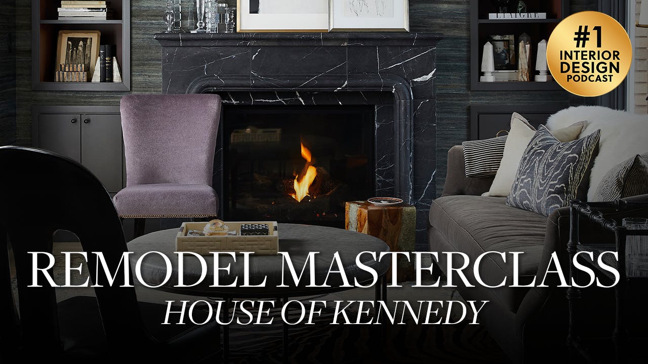
Yeah, I carried it in here just again to try and like continue and stretch the eye to make the spaces look larger. So. So that's the family room and it just looks so chic and like it's right in front of that kitchen. So such a good entertaining space with having both of those open to each other. Okay. The living room. This is where we saved our marble saved for our marble mantel. So in the living room, this is a space. I don't have great befores, but this space, when you walked through that entry, this is directly in front of you. So again it probably had, you know that maybe it had that blue carpet with those fancy medallions going in there. I bet you it did smart of them. But we took that out and she just wanted to have Again, we were gifted a fireplace. So we got rid of it and we did our own. And we did this really, really great kind of in that antique oscuro again.
- [23:59]
A
And this one, I just want to point out is it's in sections, it's in pieces. So this whole thing wasn't carved. We, you could install this. You can see even the, the ground, how it's in tiles. So it was a little bit more affordable than the entire thing being carved. But the overall look feels very, very similar. And I think this is a great trick.
- [24:22]
C
Yeah, I think it's so beautiful. A nice thing about like homes of this era, I know because I have one of them is they like really did all those like integrated cabinets. Like just the door would be flush with the wall and you'd have these cavities. And so I imagine that that's what we had here on both sides. Because this, the built ins on each side of this fireplace. Tore them out and did our own thing. But we utilized that cavity so that it could just stay complete so still stay completely flushed with the wall. And so you have, you're not taking up additional space into the footprint of the room. So I think that's such a hot tip. And we added sconces. Add sconces when you can. Like I think on a fireplace it's just such a gorgeous glow to just like have those going.
- [25:01]
A
Agree. And then we told you that black was sort of this common, this sort of common thread throughout the spaces to really ground it. So you can imagine walking in on that new three, that tri colored marble floor and seeing this staring you back in the face. We did a black grass cloth on the walls. We did the integrated built ins, painted those black on the face frames. But then the interiors, we went with this really pretty kind of rusty color just to give it a little bit of pop. Black marble, vintage rug. We've got some really beautiful charcoal like mohair type sofa and then purple in the occasional chair. I just think the space turned out so chic. I mean this was completed in 2019, so we were working on it 2017. 2018. And I still love this space right now.
- [25:51]
C
So it's still relevant.
- [25:52]
A
It's so great. And you know what else is really fun? I love it. Whenever you can find a flush mount. Not a flush mount, a semi flush mount for these, these houses that don't have tall ceilings, but they're like, they're like have. They're like ceiling branches almost. Yeah, those are so necessary in the marketplace. It's not super Tall, but it's wide and it makes an impact in a shallow space.
- [26:14]
C
Yes.
- [26:14]
A
Yeah. Such a winner.
- [26:16]
C
So those are the three spaces we want to share with you. Just like our best tips for working with the older home with short ceilings. That big design can still happen and should still happen with an eight foot ceiling. Like, don't limit yourself. And like, I think what you said, you said this before. Whatever space you're living in, if it's older, walk around and say, what could I do to this space to make it better and to make it more you? And so I walk into this and like, it wasn't her before, but it is 100% this client and I'm so proud of that work.
- [26:46]
A
I agree. Yeah, I think it was really good too.
- [26:48]
C
Yeah.
- [26:48]
A
Few standouts are continuous flooring is going to visually enlarge the footprint in the kitchen floor to ceiling. Those cabinetry stretches are going to make it feel really, really tall. Put your budget into the interior if you can not have to split it wherever it is because then you can really finish a project in full. So I thought that was a really good tip. Yeah. I also really like that you pointed out that the cast fireplace is for the family room and the living room is where you do marble. If you're trying to decide where to use what, that's just a pro tip from us that we'll often do. Obviously, if you can go marble everywhere.
- [27:28]
C
That'S, that's a luxury go you.
- [27:31]
A
Yeah. But your cast fireplaces, you can still get a look. And I feel like that family room was so chic.
- [27:37]
C
Those cannonball insert.
- [27:38]
A
Yeah, definitely. Well, I hope you guys have enjoyed this episode of another episode of Remodel Master Class. This was House of Kennedy. Thanks so much for watching. If you guys have questions for us, please send them to Dear Alice alicelanehome.com and just another reminder that Black Friday sale is going on right now. So go get some great deals or up to 30% off@alice lanehome.com and we'll catch you next time. Hey, thanks for listening. If you like our show, please leave a five star rating.