Loading summary
Transcript281 lines
- [00:02]
A
Welcome to how to Decorate from Ballard Designs, a weekly podcast all about the trials and triumphs of decorating and redecorating your home. I'm Caroline. I'm on the marketing team.
- [00:11]
B
And I'm Taryn and I'm a product designer.
- [00:13]
C
I'm Liz. I head up the creative team.
- [00:15]
A
We're your hosts. Join the expert team at Ballard Designs for tips, tricks and tales from interior designers, stylists and other talents in the design world.
- [00:22]
B
Plus, we'll answer your decorating dilemmas at the end of each episode.
- [00:25]
C
We love answering your questions, so don't forget to email us@podcastallardesigns.net now on with.
- [00:31]
A
The show.
- [00:34]
D
Limu Emu and Doug. Here we have the Limu Emu in its natural habitat, helping people customize their car insurance and save hundreds with Liberty Mutual. Fascinating. It's accompanied by his natural ally, Doug. Uh, Limu is that guy with the binoculars watching us. Cut the camera. They see us. Only pay for what you need@libertymutual.com Liberty Liberty, Liberty. Liberty Savings Fairy underwritten by Liberty Mutual and insurance company and affiliates, excludes Massachusetts.
- [01:04]
A
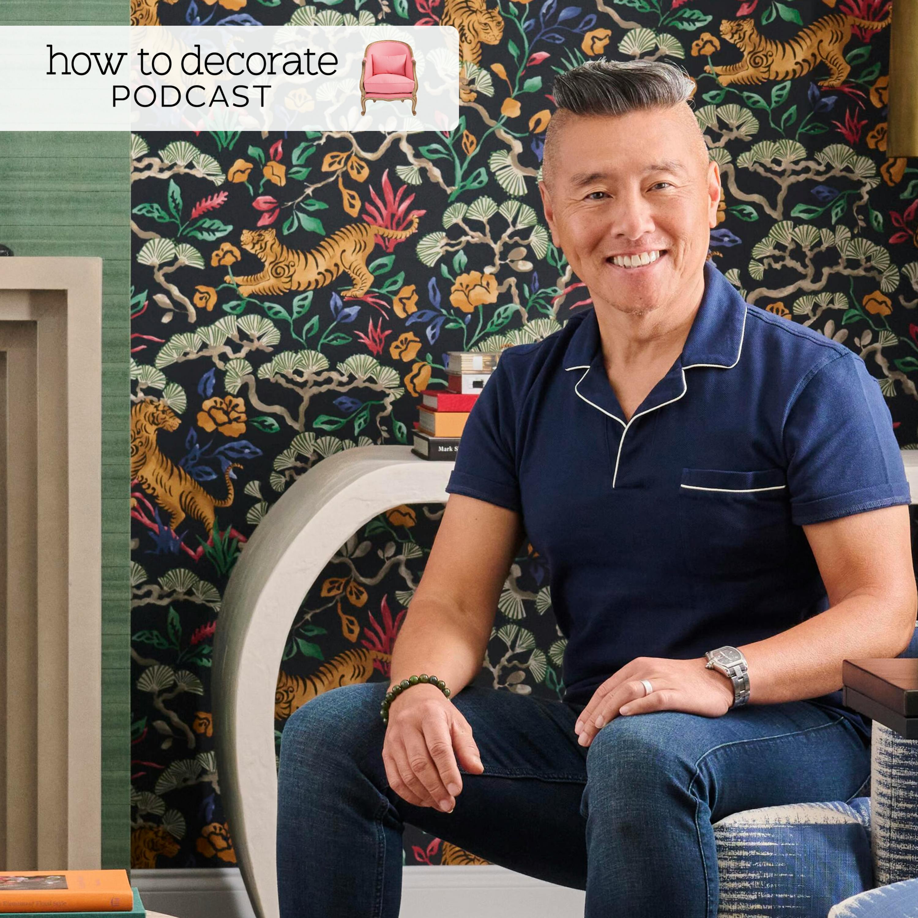
Today we are delighted to welcome Vern Yip, acclaimed interior designer, TV personality and three time author. Based in Atlanta, Vern is known for transforming spaces of all budgets from frugal makeovers to high end projects and for his warm, sophisticated approach to design. Today we're talking about his latest book, color pattern texture, the foundation to make your home your own as well as your new show, home reimagined.
- [01:26]
D
Yes. Thank you for having me. I mean, so nice to be here. And like I totally forgot that we're now like also waist down. So I was like, I'll wear shorts, it'll be okay. So forgive me. They're nice shorts though. They're tailored.
- [01:42]
A
You're all good.
- [01:43]
B
Yeah, they are nice. And I think last time we were at a table weigh the tablecloth. So this is truly unfair to you. You didn't know.
- [01:51]
D
No, this was a setup by you guys to make me look bad. So congratulations, you did it.
- [01:57]
B
Look at this casual guy over here.
- [01:59]
A
Oh my gosh. I mean we of course, Liz, brought in your second book, vacation at home.
- [02:05]
C
Yes.
- [02:05]
A
We had you on the show after your first book, design wise. So we're, I think this is your third time on the podcast. So we're thrilled to have you back and loved getting to read the new book. Color, pattern, texture. It has so many elements of what was great about the first two books. All of like those sort of foundational nuggets of information Broken down in a really simple, easy way to digest. But then you also added those color, pattern, texture conversations that sort of like kick off the, the whole sort of premise. So talk to us about, like, what was the goal for the third book? Like, where do you, where were you? Like, I need to say this and I haven't done it in the first two.
- [02:52]
D
Yeah, you know, it's, it's funny because people will always ask me to put out more books. And the thing is, I don't like to put things out into the universe unless they have a purpose, unless I know that what I'm going to put out actually solves a problem. Because we have plenty of stuff. We don't need more stuff just to have more stuff or because I want to show people my projects. So for me, I, you know, I, I put out books because I feel like there's a vacuum and there's a need and that they could really, really help somebody. And in this particular instance, you know, color, pattern and texture, these are the three most powerful tools every designer has at their fingertips. And it can be complicated. You know, it's not as simple as, you know, just picking out a paint chip and then throwing with that pattern. I mean, there's a process to it. But if you go through the book and you kind of learn about color, pattern and texture and how you can apply them to your own home, you know, ideally you'll have a home that truly reflects you, that's tailored to you, that services you in the way that you want to be serviced in that home. And you know, we talk about this in the book. Not everybody reacts to, you know, color the same or patterns the same, or even textures the same. For example, you know, I, I normally think of velvet as being lux and, you know, beautiful and, you know, a really nice material. I have a client who the touch of velvet gives him the heebie jeebies, like, you know, like, for him, like that, like, makes all the hair on the back of his neck stand up. And so that's what this book is about. It's really about helping you to figure out what you respond to and how to introduce that into your home. Because hopefully we are way beyond the point of having our homes designed to please other people, to please the people who will be coming into our home as guests or our in laws or whoever. Our homes should be designed to please and service us. Um, you know, and, and the people you share that home with because it is the most important space in your life and you share it with the most important people in your life.
- [05:14]
A
Yeah. Yeah, you're right though. The color, pattern and texture are like, I feel like.
- [05:24]
D
When did making plans get this complicated? It's time to streamline with WhatsApp, the secure messaging app that brings the whole group together. Use polls to settle dinner plans, send event invites and pin messages so no one forgets mom's 60th and never miss.
- [05:41]
A
A meme or milestone.
- [05:42]
D
All protected with end to end encryption. It's time for WhatsApp message privately with everyone.
- [05:48]
A
Learn more@WhatsApp.com Things that separate, maybe designers from, you know, us normal folk where like, you can get like your layout, right, and you can get all of the, like the furniture pieces. Correct, but the color, pattern and texture is what takes it to like that more designed place where it feels more fully realized and fleshed out. So I'm glad that you focused on those things. What, what are some like, things that you feel like people misunderstand or maybe don't grasp about those three powerful tools?
- [06:24]
D
So, I mean, we have a lot of things that we talk about in each one of those chapters. So there is a chapter that's dedicated to color, one dedicated specifically to pattern, one dedicated specifically to texture. But you really need to think about them together. And so, you know, some of the tips in the color section, for example, you know, we tell people, like, looking at a tiny little paint chip isn't going to be the same as doing the sample on your wall. And that's not even going to be the same as actually taking that final leap of faith and putting it all over the room because it's, it's always going to be more saturated, you know, in an entire space and you gotta wait for it to dry. But it's, but it's also like telling people to look at things, whatever it is, whether it's a paint chip or a fabric or whatever, looking at it in the room that it's going to be used in. So often people like, look at things like flat on a table and they're trying to put a room together. But the thing is, everything changes depending on how it receives light. And so to be able to look at a wallpaper vertically against the wall in the room with the actual light that you're going to be receiving is going to be a much more accurate barometer than just looking at the table. When you're looking at a rug sample, put it on the floor, actually, you know, walk on it, make sure that it's comfortable. If you're looking at reupholstering a Sofa. Take that fabric sample, put it on the edge of the sofa, where maybe you're. If you happen to be wearing shorts like I am today, you know, how does it feel, you know, against your leg? There's so many different ways to kind of approach it when it comes to pattern. For example, many people feel like they can only really do one or two patterns in a room and that the rest of it has to be solid in order to, you know, give some space and give it a little bit of respite. But you can actually layer a lot of different patterns if you change the scale of the patterns. Right. If you go from extra small to small to medium to large to extra large, having that change in scale allows you to really incorporate more layers of pattern in a room. And when you do that, it even more specifically reflects who you are and what makes you happy and what makes your heart sing than color. Because pattern is. Is by its very definition, it's repeated items. It oftentimes is multicolored. So, you know, it just. It's a. It's a more specific thing even than just picking a paint color.
- [09:13]
A
Yeah. You mentioned in the. In the color pattern or, I'm sorry, the color chapter that you should, like, resist the urge to pick that first. Don't go to the paint store yet. So talk to us about where in the process you should be, you know, zeroing in on your paint color.
- [09:30]
D
Yeah. So you can go to the paint store first. And it oftentimes is, you know, an easy way, an easy entry point to sort of figuring out what you like. But the point really was that don't narrow down your paint color first. Get a vast array of things that you're thinking about and you're considering for the room, and then just keep it out there. Don't zero in on the specific paint color until you've picked more of the restrictive items in the room. And the kinds of restrictive items I'm talking about, for example, a rug. You know, if a rug is. Is multicolored, you're going to have far fewer options if you start with a paint color and then try and figure out a patterned rug to go with it. Wallpaper is also a great way to start, but also, you know, artwork. And. And the point that I really was trying to hit home in the book is meaningful items. That, to me, is really the ideal place to start.
- [10:35]
A
Yeah.
- [10:36]
D
You know, instead of trying to, you know, inject those meaningful things at the end and trying to make them work, use them as jumping off points. And it doesn't have to be just a beautiful painting. I mean, it could be. It could be a beautiful painting that you got on your honeymoon or that you inherited, but it also could be a little jewelry box. It could be anything that has real meaning to you, because that's what makes a design endure. And last is when it. It actually has real connection to who you are and that you actually really love it. So when you start with those. Those more specific items that you have far fewer choices from, you can then expand into things like paint, because you virtually are limitless. Right. When it comes to paint chips.
- [11:32]
A
Tell everybody about your idea about the. It's inspiration box. Wait, do you call it. You call it the inspiration box? Yeah, because I loved that whole sort of anecdote.
- [11:41]
D
Yeah. So obviously, we all live in the digital age. It's so easy and convenient to do everything on a screen, whether it's your phone or your laptop. But, you know, you still have to make that leap into a real room, and the screen can only do so much. I. I understand how it's a great initial tool to kind of, you know, cull down the. The vast, you know, array of things that are out there. But when you are making real choices, you want to be able to hold them in your hands. You want to be able to understand what they feel like, what their texture is like, what their real color is like, because colors on a screen are not exactly how they are in real life, and they're certainly not going to be how they'll look in your room. You oftentimes can't tell the scale of a pattern, for example, from, you know, the screen. You oftentimes completely lose texture, especially if texture is subtle. And all of these things are important to get right. You know, if you want your home to be really supportive of who you are and to be really reflective of who you are. You know, when you. When you make that effort to finally get those physical samples and to hold them and to see how they go together, it really is sort of the best guarantee of what lies ahead.
- [13:09]
A
You mentioned something in the book about, like, collecting things over time and just sort of, like, stowing them in your inspiration box. You don't necessarily have to know where they're going to go, but just keeping them. What sort of things have been in your inspiration box that you've turned into a room?
- [13:28]
D
Oh, my gosh. The craziest thing. You know, I mean, and. And truly, the inspiration can come from anywhere, and it can be anything that just really delights you. I think that has to be the Marker. That it makes your heart sing and that you really love it. You know, as we talk about in my last book, Vacation at Home, it's. It's not good enough to just, like, something. If it's going to go in your home, you should love it. Like, that should be the feeling. I really. I really love it. I remember being in Athens and going to the Acropolis Museum and being in the gift shop, and there was some, like, child's paper folder that was in the gift shop, and it had, like, this really interesting depiction of animals and the. In the pattern, the way it came together. I mean, this was probably, like, 15 years ago. I still have it in my box, and I carry it around. There was. I think I talked about this in the book once I was down in Brazil, and there was, like, a can of nuts in my, like, hotel room. And it was just the most beautiful canister of nuts. I mean, I polished off the nuts in, like, one day flat. But then I was like, I'm going to hang on to this canister. I still have it. There was a. A little carton that sort of gourmet chocolate bar came in, and it had the best depiction of a polar bear. It just made my heart sing. And so I kept that little box. I still have it. So the point is, it doesn't have to be something precious. It doesn't have to be something expensive. It can be anything that really you're responding to. And it's always better, I think, to try and respond to things in person. You might respond to something that you see online, but it might completely transform, you know, when you finally get it. I mean, how. How many of us have actually ordered something online and then gotten it home and been like, ugh, you know, disappointed? I mean, occasionally it delights you. It's even better. But, you know, the. The point is that, you know, seeing things in. In person really does make a huge difference.
- [15:45]
A
Yeah. The other thing I loved about the color in the color chapter was something about tonal variations. You mentioned using variety of the same color in different. You know, maybe one's a little bit lighter, one's a little bit darker. And talk to me about why that is so important and why it's better than matching. Exactly.
- [16:09]
D
You're absolutely right. I mean, first off, designing a room tonally that's small will visually expand it. If you have a small room and you use just tones of the same color, you keep it fairly monochromatic. It does visually expand the space because your eye doesn't stop at all. The Places where there would be contrast. But what you're referring to is this idea where, you know, things are more layered and more rich when we don't have colors that are exact matches but are within the hue. And it's because our eyes are really complex pieces of machinery and we are so used to the natural world and how we look at the sky and how we look at leaves and how we look at a blade of grass. And if you look at any of it, it's not actually one color. It actually has, you know, subtle variation and nuance to it. And introducing that into your space will make it feel more three dimensional, will make it endure longer. You'll be less tired of it, and will, will give the room more visual interest.
- [17:28]
A
So many times we worry about matching. So I love that you're kind of giving everybody permission not to do that.
- [17:34]
D
Yeah, it's not about matching, but it isn't also like, hey, throw anything together, it'll be fine. You still, at the same time, you want to be able to work within the general hues of where you are. Things have to be friends and go together. And that's something that again, you really only can understand and see when you have actual samples. I always say to people, you know, get samples before you commit to anything because, you know, you don't want to make those costly mistakes. It's not like ordering a, a pair of pants online and hoping that it goes well with the top. And then, you know, if it doesn't, oh, well, you know, just put it back in the box. You order a sofa and a rug and they don't work together. It's kind of a pain and it's there. Right. Or sometimes it's even more permanent. Like you order tile and you put it up and you're like, oh, that's disappointing. Well, you're not just going to like, take that tile off the wall and ship it back to the store. Right. I mean it. So when you're talking about high cost items, when you're talking about your home, when you're talking about really, like difficult to, to ship items, you want to make sure that you're making the right decision.
- [18:49]
B
I think that's why the samples are, like you said, so helpful and available, is because companies know we want you to know what the fabric looks like before you buy yardage that you can't return. Yeah, it's like very important to see it.
- [19:00]
A
Yeah.
- [19:00]
D
I mean, your stores are great, but not every person lives, you know, within distance of a Ballard Design store. So, you know, the ability to order samples is a huge help.
- [19:12]
A
Yeah. And we all do it.
- [19:14]
C
I mean, oh, I buy yards of fabric because we sell it by the yard. So I'll get a yard full of fabric and drape it over my existing sofa and be like, okay, that's going to work.
- [19:25]
D
And one of the things that I was realizing when I was putting together this book, when it comes to talking about color, pattern and texture, anybody who works in the design industry or design adjacent industry, or in the home decor industry, anybody who works in a related field has this common language that we all understand. But if you don't work in that field, I think it can be. It. It can be really daunting. And so after the color chapter, there's what I call a color dictionary. After the pattern chapter, there's a pattern dictionary. And after the texture section, there's a texture dictionary. And they aren't just words. There's actually physical, like, pictures of what we're talking about. So, for example, after color, the color chapter in the color dictionary, we have a bunch of colors that, you know, terms that we use all the time, like chartreuse or fuchsia or straw, you know, like. And I think for people who, you know, aren't as used to working with those kinds of elements, they can be like, I'm not exactly sure what chartreuse or fuchsia or straw really refer to.
- [20:43]
A
Yeah.
- [20:44]
D
Or camel even, you know, like. And I think a lot of people can say, well, it's up for interpretation. And so I asked Sue Wadden, who's director of color marketing at Sherwin Williams. She has one of the, and it's been scientifically measured, one of the most precise eyes in the world for determining exact shades of color. She's literally, she's 0.0001%, which is why she has the job that she has. And I said, okay, I'm not gonna pick those colors. I'm gonna ask sue to pick the exact pink chip that would be labeled for each one of these colors. And even I was a little bit surprised. You know, I was like, okay, I, I didn't exactly know that that's what, you know, chartreuse is like. I. I thought it was a little greener, but you might think it's a little more yellow. So it's. It was really good to get a super professional like that to give us those paint chips. And so, you know, in the back of the book, you have the exact Sherwin Williams paint chip number, but then you also have equivalents across the other major brands. So there's a Benjamin Moore equivalent, there's a bear equivalent, there's a, you know, so it's, it's there for you as well. After the pattern chapter, for example, we always say, you know, damask. And we all know what we mean when we say damask, but not everybody knows what damask is. And so there's a little picture of damask. And then after the texture chapter, the texture dictionary, there's, you know, and getting the pictures of the textures was really.
- [22:25]
B
Yeah.
- [22:27]
D
Hard.
- [22:27]
C
Yeah.
- [22:28]
D
Right. Like when somebody says hammered, what did they mean by a hammered texture versus a brushed texture? You know, I mean, so having, having that back there was, you know, it was hard. I think we got it done. But, you know, so the book is really designed to, to be useful and to be helpful and to really help people own those elements so that they can design their homes in. In a way that best reflects them.
- [22:55]
C
Yeah, this is so such a helpful guide. And you go into such detail in every, in every category. I mean, you even give a page that's just dedicated to finding the perfect white paint. And you not only give the paint color, but you give a really beautiful, subtle description of each one. And there are 12 different whites to choose from just from their descriptions, which I think is just. I know that's one of the questions that we get all the time, like, you know, what color is that? Or what white should I use? And it's, it's just so great to have that resource.
- [23:34]
D
Thank you. I like specific information. You know, as we were saying in the beginning, I don't like to just put out stuff to put out stuff. So if I'm going to put out a book, I want that book to actually be not only beautiful to look at, and there are lots of beautiful pictures in there. You just want to, like, run through them for inspiration. But I also want them to have a ton of useful information. I want that information to be, you know, presented in a really accessible way, but I also want it to be very specific. And, you know, these, just to be clear, these are my best whites. These are my best white selections. They, you know, may not be everybody's, but, you know, after being in the business for three plus decades, you know, my experience has shown that these are, these ones really work. So I wanted to, I wanted to share those with, with folks. And then, you know, I really thought about, like, how the book is laid out and how to lay it out in a way that would be useful and interesting. And we went through this process during this podcast where we were talking about, you know, starting with something inspirational or something multi pattern or whatever, and then building from there. And so there's a chap. There's a chapter in the book where, you know, we show you visually block by block how that happened. Like, we started with this painting, then we found this table that, like, pulled those colors together. Then we found this fabric that, you know, pulled from the painting in this table. And then, you know, gradually, you kind of just see how we end up with paint and we end up with solid colored things and. But it shows you, like, visually block by block, not just with words, how that room came together.
- [25:19]
C
Yeah, it really demystifies the process.
- [25:22]
D
Yeah, I mean, I think that's always the goal. I mean, our lives are so complex already. You know, we were kind of talking about that earlier, you know, raising kids, you know, trying to just juggle all the stuff that we have to do as humans. Just even sometimes getting food on the table can be difficult. And so, you know, I want to make life easier and better and richer through design, because that's what I do. I suck at everything else. This is the one thing I don't suck at. This is how I can help people.
- [25:56]
A
Well, it is.
- [25:57]
B
It's so empowering. I think that's the. You have made it. It's such a daunting task to pick a paint color. And I think a lot of people do feel very intimidated. And your book makes it very much like, don't be intimidated. This is the lilac family, if that's what you are gravitating to look for something with more gray, or do you want more of a pink? I think it's wonderful that you've given this. And it's like all your books, you've. You have so many point by point. So.
- [26:23]
A
And I like at the end how you recap the chapter. It's so helpful. And you have, like, even little numbers where it's like, you need to go back and reference. Yes, it was on this page. So it's. It's nice that, you know, you can read the book cover to cover, but you can also use it as a reference book, which is helpful.
- [26:40]
D
And at the very end of the book is what I call cheat sheets. And it's like all the most critical things from the book just boil down, like, you know, color, pattern, texture for dummies. Just like, if you just want, you know, all of those things right in front of you, they're there. So, you know, for me, that's what it's about as a parent to two, you know, teenagers and to six dogs, I need my life to be straightforward. Like, if, you know, if I don't know something, I need somebody to just look me in the face and say, this is how you do it. So that's what this book really tries to do.
- [27:22]
B
And speaking of kids, you did have a little section even on how to help kids pick colors. Can you talk about that a little bit?
- [27:28]
D
Yeah. You know, I mean, this is through a lot of real, real life experience. I, I absolutely believe that kids should have a voice in their room, but it doesn't mean a free for all. I mean, they don't have the experience that, you know, we have. And I'm not even talking about we as people who work in home decor or design. I'm just talking about as adults who have more life experience and who have made mistakes already with paint and. Yeah, whatever. But I think it's really important to, to allow your children to have a voice and to maybe begin to steer them into a room that's going to have more longevity. So, for example, our daughter's 14, our son is 15. They still have the same paint scheme, the same drapery, all the same basic elements, the same lighting that was in their nurseries.
- [28:25]
A
Um, and they've, that's impressive.
- [28:27]
D
Grown with them. And that's not to say that over time, you know, they haven't changed their minds about some things. Right. But the room has a great foundation that allows them to grow with it. And as they grow and they, you know, like new things, they, they can, you know, easily add them into the space. But I, I, I do think, I do think it's important to be a partner with your kids in helping them to achieve not just your vision of the room, but also their vision. A lot of kids want a giant Winnie the Pooh sticker on the wall or whatever. And I think it's about, hey, wouldn't it be great if we pulled variations of the color from Winnie that you can live with longer and put them in the room and then maybe we'll get you a Winnie the Pool Poo stuffed animal? You know, there's a way to have their voices be heard and at the same time, give them a room that's going to endure.
- [29:28]
A
Yeah. This episode is brought to you by Marshalls, where you never have to compromise between quality and price. The buyers of Marshalls hustle hard working to bring you great deals on brand name and designer pieces because Marshalls believes everyone deserves access to, to the good stuff. Visit a Marshall store near you or shop online@marshalls.com I was going to say. What, What? Yeah, what if your kids vision is like Pokemon or you know. Yeah, but that, that way the food example is perfect. Like it's, you can pick some things that maybe what they're looking for and have them be more, you know, objects or something that are not permanent staples.
- [30:12]
D
But also shades like, you know, you know, Pikachu, for example, you know, yellow. But like pick a yellow that still, you know, alludes to Pikachu, but pick it in a shade that's doable over an entire room. Yeah, yeah. And I, I had this actual thing happen with my niece where she picked the brightest, most neon highlighter yellow color ever for her walls. To the point where I was like, if you close your eyelids, you can still see the color. He's like, you know, you don't want to live like, like this. You're going to have to go to sleep with sunglasses on. But like toning it down several shades still gives the impact that she was looking for, but now it's, it's more livable.
- [31:02]
A
Yeah, yeah, yeah, yeah. And I just can't believe that your, your kids rooms are virtually the same. Like that's really speaks to your ability to pick something with longevity. And that really works because it's hard. I don't know. Kids needs change just so much.
- [31:22]
D
Yeah. But I think if, and people change a lot, you know, we all change. And that's the thing is we want our rooms to grow with us. And in order for that to happen, for you not to like design a room, execute it, which all of that can be very expensive. And then five years later look at the room and think, wow, I'm really tired of that. I'm over that phase of my life. You know, that happens because we aren't honest with ourselves. And that's something I really encourage in the book. And it's natural all of us to a certain extent start disliking things or liking things because we know that's what's acceptable. Instead of just really kind of listening to our internal voices and being like, okay, if nobody was looking, this is what I would do. And I think it's important, it's important to really get back to that. Because when you're honest with yourself and you have to remember you're not designing a hotel that has to appeal to thousands of guests every year, or a restaurant or any kind of public space, you're designing the most important space to you. It's the most intimate Space. It's the space that should be designed to restore you and rejuvenate you. And in order for it to do that, it needs to really be tailored to what makes you unique and special and what really delights you. So, you know, peeling back the layers and having those like, open conversations, open, honest conversations with yourself and whoever else you're going to be sharing that room with, I think is important.
- [33:05]
C
Yeah, that really spoke to me. That's one of the, one of the things I pulled out is to really just be honest about what it is that you want. And it was a really kind of beautiful passage that made me feel like it gave permission to love what I love and, and to bring it into my home. And then you also mentioned to take a look at your life goals. And that's something that you did around your beach house, where before you even had a beach house, you started collecting.
- [33:38]
D
I did. And you know, and the thing is, like, I wasn't just collecting like salad plates and napkins or whatever. I bought a dining room table for a non existent beach house. I mean, I bought major pieces of furniture for a non existent beach house. But, you know, I'm not saying that that's the extent that people should go, but what, what the, the point is that your home should, yes, reflect your history and where you've been and your life experiences. And it should be tailored to you in that way, but it should also be tailored to you for your goals and your aspirations, who you want to become, like really want to become, not who you think people think you should become. So that is the other way to really kind of think about spaces, you know, use them to, to help you get there from point A to B. To help you reach your goals.
- [34:42]
C
Yeah. To hold your dreams and your manifestations. That's great.
- [34:46]
D
Absolutely.
- [34:47]
A
Yeah.
- [34:48]
B
Okay, you have a section literally about pattern, of course. But you have one that's like a question, like, what if you just don't like pattern? Can you talk about that, like, for those who really don't want a pattern?
- [35:00]
D
Well, yes. So, you know, we first have to like come to an understanding of what pattern means. Are, you know, blades of grass repeating on a lawn? Is that a pattern you know, leaves repeating on a branch, is that a pattern? Like, so even the shadows that are created from your windowsill, like on your floor, is that a pattern? Or even how the windows are lined up in a room, they create a pattern. So, but I think in that particular section we're talking about people who are really averse to patterns that Are obviously complicated patterns, maybe patterns that, you know, you find in rugs and on fabrics and on wall coverings and things like that. And when you. When you are that kind of person, I think that's great first off, that you can be honest with yourself that that's what it is. But things like color and texture then really become even more important. And pattern can be in your room very subtly, but texture specifically becomes a really important element in a space. People who like neutral schemes, for example, neutral schemes really require an understanding of texture and mixing those textures because textures that come from opposite ends of the spectrum usually are really good for each other. So things that are rough, for example, look beautiful against things that are smooth. You know, things that are shiny look great against things that are dull and matte. If everything in a room is, you know, shiny or everything in a room is rough, like, there's no. There's no ability to really appreciate its uniqueness and what makes it special. And I think that that's a really important point. But, you know, if you're in a really neutral situation, for example, you're going to want to have, again, different scales of texture. You don't want finer textures next to textures that are a little nubbier and next to textures that, you know, may maybe even are coarse looking. So it's really important to kind of amp up the texture component if you're going to push down the pattern component.
- [37:24]
A
I loved when you were talking about why patterns are so great, you kind of had a little list, you know, hiding stains and all that. So what do you. What can you tell our audience about why, What. What does the pattern do for your room? You know, like, what is the. The real reason to incorporate them other than, like, the personality thing? Like, is. Is it. It's moving your eye around or.
- [37:52]
D
Yeah. So as we were talking about before, we are surrounded every day by patterns, whether we realize it or not. But I. I do think that patterns have that ability to. Because they are more specific than just a color. Patterns have that ability to really make a space reflective of who we are uniquely. It's much easier to get people to agree on a color or texture. It's much harder to get them to agree on a pattern because you're bringing together so many different elements. And when you bring those elements together, it's. It's going to be hard for everybody to land on the same page. But when you do, it's incredibly rewarding. And I think that that's what patterns really do for a space. They very. They help you very specifically target and hone, you know, who you are and what you love and how you want, you know, that to be telegraphed. But, but there are so many other practical reasons as well. Like you were mentioning, patterns are great for hiding stains, and they're, they're great for adding, I think, an element of focus and art in a space that maybe a room doesn't have a great view, a pattern is great for that, or, you know, you don't have the budget for, you know, high level artwork or artwork that you want to live with long term. You know, having a great wallpaper up is, you know, can often supplant that.
- [39:23]
A
Yeah, you, and you talk about a power piece. Can you tell, tell our audience about the power piece and some examples of what that is and why, why we need it?
- [39:33]
D
Yeah, you know, I, I, I think it's really great to first off have something that makes a statement about who you are, something that maybe can serve, can serve as a great jumping off point. It serves as a focal point to really kind of draw your eye into something. Because not everything in a room can be the focus.
- [40:00]
A
Yeah.
- [40:00]
D
And we've talked about this before. You know, every room needs a prim, a secondary focus, a tertiary focus. Because if everything in a room is a look at me moment, nothing is a look at me moment. And similarly, if nothing in a room is a look at me moment, then that room really lacks direction, it lacks specificity, you know, in terms of, like, who you are. So a power piece, like, it can be, it can be a myriad of things. It can be a statement light fixture, it can be a statement wallpaper or a statement rug. I mean, it can be a myriad of things. But letting that piece kind of like help you direct that room and its design, I think, is a great way to kind of leap into something.
- [40:54]
A
Do you like to have the powerpiece right at the beginning of the process? Do you like to know what the power piece is before you really start?
- [41:02]
D
I think it's helpful.
- [41:03]
A
Okay.
- [41:04]
D
I certainly think it's a helpful place to be. And again, make sure you really love it and you're not feeling pressure to include it because it's on trend or on sale majorly. I mean, make sure it's because it's something that you really, really love. And the other thing we talk about in the book is also, you know, mutual respect for the people that you share the room with. Meaning, you know, a family room is going to be used by you and your partner and maybe your kids and whoever else you know, is going to be, like, in that space. It's a more public room in the house. And I think it's great to get everybody involved and to figure out, like, where the intersection is on the Venn diagram doesn't mean that everything in that room has to please everybody, but it does mean that everybody should feel heard and that there are clever ways to kind of look at the intersection of where everybody is. And then some things go one person's way and some things go another person's way. But at least we've come to a compromised position that we're all really, you know, that we all can live with. And I always tell people the best design comes out of compromise. When one person gets their way, you know, to the detriment of another, it. It's never going to be a lasting, enduring, an enduring design. And that person who doesn't feel heard, that resentment is eventually going to come out in all kinds of, like, unhealthy ways. I've seen it many, many times. But then you talk about the more private spaces, like your bedroom. Do your kids need to be involved in the decision on the colors and finishes in your bedroom? No, that's your bedroom. And that can be, you know, more personally reflective of just who you. Who you are and what you want and, you know, who your partner is or whoever you're sharing that room with and what they want. So, you know, it's important to discern, like, what are the more public spaces that everybody uses and what are the more private spaces. And then to. To ensure that everybody, you know, is involved in that conversation and feels heard. And we kind of walk people through that in a step by step way.
- [43:17]
A
Yeah, you've got the, you know, kind of the first maybe half or two thirds of the book is the. The know how the. All the pillars we've talked about. And then in the end, you have real client examples of ways you did that. And I loved the example you had of the. The partners who one was, I want to say, like an arc, like, had a background as an architect and really liked geometric, like, clean things and one who was really into fashion and liked more feminine, like, bold colors and how you blended that together. So tell everybody about that client in particular and, like, what the room sort of ended up at to, you know, merge both of their.
- [43:59]
D
Yes.
- [43:59]
A
Their looks.
- [44:01]
D
So, yeah.
- [44:02]
A
Did I get all those details right?
- [44:05]
B
I don't know what you're talking about.
- [44:06]
D
These are. These are not the kinds of details that you can fake if you haven't, like, you know, really read the book, so I can tell you've actually read it cover to cover.
- [44:15]
A
I was actually an architect.
- [44:17]
B
I don't know.
- [44:17]
A
Something.
- [44:18]
D
Yeah, no, you're right. So he. He. His background is in architecture, and he does like things a little more straightforward, a little more clean lines. Definitely kind of prefers more masculine colors or more neutral colors. She could not be more polar opposite. She is a more. Is more. Is more person. Ultra feminine. Floral, like florals everywhere, if possible. Pink everywhere, if possible. And, you know, it's interesting because, like, you know, you. You want the house to really be reflective of the two of them. And so there were areas, for example, where she just went full out. We did a guest bedroom for her because it's mostly her mother who will be staying in that bedroom. And it is, you know, floral wallpaper, pink, you know, everywhere. Just really, really very, very soft and feminine. And then we did, you know, his room, which was like sort of a lounge for him that was like kind of those deeper, more saturated, masculine colors and was cleaner, lined in its approach. And the idea then really became like, how do we, like, marry the two of them? How do we design their bedroom, for example? And so we went with a floral pattern, but it was abstracted and it was done with line work. And so it was really like a great compromise that they both were excited about. So that's what I'm sort of saying is, like, you can find that compromise position, and it's important to do so because, you know, this. This very antiquated saying that a lot of men used to put out there. Happy wife, happy life.
- [46:13]
A
It's. It's.
- [46:15]
D
It's. It's really actually sad that that's a statement, because I think a lot of men sort of feel like, I'm not allowed to have a voice in this because society says I shouldn't. And, you know, they then end up waking up in a, you know, pink floral bedroom every day and at some point feel like, I hate being in this bedroom.
- [46:42]
A
Oh, my gosh. The great thing about this anecdote, too, is that there are endless options in today's world. I mean, we live in this time where you can. There's so many fabrics, so many patterns, so many rugs. So there's no reason why you can't find something that you both can agree on. So I love that you're sort of challenging everyone to do that because, like, they're. The options are out there. You can. You can find something.
- [47:10]
D
Well, and design is like anything else that happens in a. A relationship that you're really committed to. Right. You don't always get your way. But the most successful relationships are about, you know, giving that other person respect, hearing them out, and then figuring out how to, like, land on the same page on most of the major items. Like, you may have to live with a taxidermy head on your wall, but. But, you know, that other person will give in on something else. And it's about walking into that room at the end of the day and feeling like we respect each other. We hear what the other person has to say. You know, we do this in our relationships, at least in our healthy ones, in so many other ways. But it should also be done in terms of how you design and manifest the decor of your home.
- [48:09]
A
Yeah, And I like how that project you had, like, in the family room or living room, it was sort of a lot of gray pieces. There were some geometric shapes, and there were these fuchsia, hot pink velvet, I think, pillows, and, like, maybe drapery so you could really clearly see, like, okay, I can see how this is compromised. Yeah, exactly.
- [48:35]
B
Yeah, we did that recently. I was picking out drapery for our living room, and I was trying to figure out fabrics, and I had all my swatches, and I taped them to the, like, you know, and my husband narrowed a bunch down, and we got down to three. And then he was like, I really don't like this one. It was my number one. I was like, all right, that's fine. I like the other two I chose. I had gathered the samples to begin with. So then we buy a bigger swatch of the two, and I kind of pin them up to the top of the window, like, kind of pleated, kind of gathered to be like, all right. He's like, I don't like either of those. I think the one you like, the other one that I was like, okay, I'm listening to you. We won't do that one. But I thought that would be number one. He's like, I think that might have been the one. So then I bought a yardage, like, a yard of that, and I put it on. He was like, yeah, that's the one. And I was like, I didn't. I was. I was open to all of them, but I agreed. I was like, I feel like this one's the one. But, you know.
- [49:23]
A
So that was my.
- [49:24]
B
Like, it was a good learning for both of us. Of like, okay, maybe it was this one, though.
- [49:28]
D
What? A healthy marriage.
- [49:33]
A
Example. That.
- [49:35]
D
That's very textbook. And you even point out something that we haven't discussed. That we talk about in the book, which is, for example, if you are looking at fabric for drapery panels and it's patterned, do kind of pleated up, you know, just the sample or the yard or whatever. Because a pattern is going to look different flat than it's going to look when it's like, you know, hanging on your walls of drapery and pleated 100.
- [50:02]
B
Well, one of them did have a smaller stripe that was very spread apart. And as soon as I, like kind of pleaded it, it was like gone. It just looked blended and though. And the little orange stripe was gone. And I was like, well, this one isn't gonna work.
- [50:14]
A
So it was.
- [50:14]
B
It was a good test to be like, nope, too far apart there. So, yeah, it was a good. Yeah, didn't even know it. I didn't even read your book yet. I'm just that good.
- [50:25]
D
We co authored it together. Sounds like.
- [50:28]
A
Well, probably because I read your first.
- [50:30]
B
And second book, I was already like, cued.
- [50:35]
A
Well, should we talk about your new TV show? We haven't talked about Home Reimagined yet, but tell our, our audience about your new show. The pilot's out. The rest of the episodes are coming before the end of the year.
- [50:47]
D
Before the end of 2025, we will have new episodes out. So the show is called Home Reimagined. It's for Magnolia, and you can stream it on HBO Max, and also Discovery and I have loved shooting it. So we have been traveling the country following projects from beginning to end, and these projects are all projects that were never intended to originally be homes that are being transformed into homes. So the pilot, for example, shows you a early 20th century sewing factory in upstate New York near the Vermont border. And so interesting to see, you know, structures that never were designed to be homes, like what you do to them to give them that feeling of home, but at the same time, respect the history and respect, you know, what makes it unique. It's so much harder to transform something like that into a home than to like, renovate an old house, for example, are certainly much harder than building a house from scratch. Places that never really had kitchens or fireplaces or whatever. Like, how do. How do you inject those things in a skillful, interesting way while while preserving the personality of the space? So. So we follow the project from beginning to end. I get my hands really dirty. I've been doing a lot of demo. I've been doing a lot of jackhammering. There's been a lot of that. But. But then there's also a lot of design. And we always try to make sure that every episode is not only interesting and fun to watch, but that we're imparting a lot of good design advice as well that everybody can use.
- [52:40]
A
Yeah. Did it take you back to your Trading Spaces days where you were so hands on during the design process?
- [52:46]
D
A little bit, yeah. I mean, training spaces was like boot camp. Like you had to learn how to do it it all. And to a certain extent, this is similar, but not. Not the budget and the time component. We're really, like, you know, doing these projects. Right. It's taking months and sometimes over a year to kind of do these transformations and. But it's really worth it. And I love this idea of preserving some of these old structures and what makes them special rather than demoing them, because I think it would be so easy to just demo them. I mean, these are not structures, for example, that are protected by some kind of historical society or rule or anything. So you could easily demo them. But these are people who recognize, you know, the uniqueness and how special they are not only to them, but also to the community and are doing a wonderful job of preserving that while at the same time making it their own. So, like, we're transforming an old church, we're transforming an old brewery. I mean, it's like a lot of really, really interesting projects.
- [54:03]
A
You say all of those three examples of the fact the sewing factory, the brewery, the church. And I'm just thinking about the scale and like, the. The volume, like the height volume. And how are you making that feel like warm and cozy? Are they. Is that the goal? Maybe the goal is not to feel warm and cozy, but, like, how do you turn this huge, lofty space into something that feels livable? Yeah, yeah, yeah.
- [54:28]
D
And bringing human scale to it in all kinds of ways. You know, I'm not gonna reveal them here, but I will say one thing.
- [54:37]
A
You don't have to. You don't have to spoil anything.
- [54:39]
D
No drapery does wonders, but, you know, it's like making sure that, you know, the floor to ceiling drapes that really help warm up, you know, a really tall ceiling, getting the lighting down to human level, the scale of what you use, like, you know, all of that comes into play to. To then make, you know, absurd volumes actually feel advantageous versus, like, something that you have to contend with.
- [55:12]
A
Yeah.
- [55:13]
B
Imagine furniture to scale is also a big. In big areas challenge. Yeah, yeah, yeah.
- [55:20]
D
I mean, I. I think and artwork and, you know, the proportions of a rug, like, all of those things are. Are really important, but that's why I'm along for the process, you know?
- [55:32]
A
Yeah.
- [55:34]
D
Make it. Make it. Yeah. I'm not just free manual labor there to dispense design advice.
- [55:40]
A
Exactly.
- [55:41]
B
Exactly.
- [55:42]
A
Well, I used to always love Bang for your Buck. That was one of my favorites.
- [55:46]
D
Yes.
- [55:48]
A
Where, you know, have y' all watch Bang for your Buck that you, like, decide who made the wisest design choices. That was always a favorite of mine.
- [55:57]
D
Yeah. I mean, mine too. It's just so interesting to. To be invited into somebody's home. And in large part, that's what color, pattern, texture is about, is this idea that, you know, if your home is done correctly, meaning that it's a true reflection of who you are and how you want to feel in a space and how you want to live in that space. When you do invite somebody over to your house, it should be, like, for that person, the best invitation that they could get. Because what you're essentially saying is, I'm inviting you over to come to get to know me better. I mean, the. Even the books that are out on your table, on your coffee table, for example, on your bookshelves, it drives me insane. People who, like, have all their books wrapped in white, like, where you can't see the titles or flip them, you know, so that the pages are, like, facing out just because it looks nicer.
- [56:53]
A
Yeah.
- [56:53]
D
That drives me bananas. For me, like, you know, books are so special, and they do add so much to a space, and. And they should really reflect who you are and what your interests are. And, you know, even that simple thing of what's on your coffee table reveals a lot, hopefully, about who you are to the guests who come into your home.
- [57:16]
A
Not.
- [57:16]
B
Not day to day, I hope, because I think mine's covered in Pokemon and monster trucks from.
- [57:21]
A
But that's revealing, too.
- [57:24]
B
Very revealing. Anything can be a track if you.
- [57:27]
A
If you can put a. Yeah, well, shameless plug to the house tour that we just shot of your home. You have a fabulous book collection. There are books in every space, photography books and all sorts of books, and I loved seeing the way you display them and sort of use them to display sculpture and all sorts of things.
- [57:48]
D
I know I look at all of these books as I. I love books. And I just think, oh, my gosh, be. You know, before I leave this earth, I've got to do something with these books. I cannot leave these for my children.
- [58:01]
A
To have to contend with.
- [58:03]
D
Like, what are we gonna do with all of dad's books?
- [58:06]
A
I love it.
- [58:07]
B
You need your own little book estate, like, sale I know.
- [58:11]
D
It's just so hard to, like, say I find it hard to say goodbye to books.
- [58:15]
C
Yeah, yeah, yeah.
- [58:16]
B
That would be really hard.
- [58:17]
D
Yeah.
- [58:17]
A
But I feel like one day you can. They can auction them off at, like, a Sotheby's. Auction your book collection or something. You know what I mean?
- [58:25]
D
Like, yeah, well, maybe I'll. I'll give that suggestion to my kids, like, after I'm gone. Just auction them. Take what you want and then auction them.
- [58:33]
A
People buy those books by the yard. Like, it's the same. It could be the same thing.
- [58:37]
B
No, he has good books.
- [58:39]
A
Yeah, well, my point is that people buy them in bulk. Like someone out there is, like, that's true. Needs a whole library to fill so, you know, you don't have to get rid of them.
- [58:51]
D
Yes. I would say, though, rather than buy your books by the yard, take your time and gradually fill those bookshelves with things that really speak to you. If a home is done correctly, everything that anything that anybody can pick up should. You should be able to tell them why it's there and what the meaning is to you. It doesn't mean that we all start off that way. Most of us have to have placeholder items. It's just how it is. But, you know, as life progresses, start replacing those placeholder items with things that really have meaning. And again, that's what the book is really about, is like, when we talk about color, when we talk about pattern, when we talk about texture, have those elements really be meaningful to you? Because one person, for example, might be really energized by the color red, and you think, okay, well, red's for a high energy room. Somebody else might really respond to it differently. It might make them angry or agitated. It might put them to sleep.
- [59:56]
E
This episode is brought to you by State Farm. Listening to this podcast. Smart move. Being financially savvy. Smart move. Another smart move. Having State Farm help you create a competitive price when you choose to bundle home and auto bundling. Just another way to save with a personal price plan, like a good neighbor. State Farm is there. Prices are based on rating plans that vary by state. Coverage options are selected by the customer. Availability, amount of discounts, and savings and eligibility vary by state.
- [60:25]
D
So we're all different in how we respond to all of these things. And at the end of the day, it's about really honing in on what's meaningful to you and infusing your home with those really meaningful components.
- [60:37]
A
Mm. Well, Vern, we do have a design dilemma that we would love your assistance with. It's from Melissa. And you've got photos right here.
- [60:50]
D
Oh, I do. Okay. It's like a pop quiz.
- [60:53]
A
Yeah, exactly.
- [60:55]
B
It really is. This is a. Do you know your stuff? No, I'm kidding.
- [61:00]
A
You do. So I'm gonna.
- [61:02]
D
We'll see, won't we? The suspense.
- [61:05]
A
I'm gonna quickly read the question, and then you can take a stab. Hi, ladies. I have a little mountain cabin I'm redesigning with a comfortable Ralph Lauren vibe as the inspiration. The bedrooms are a good size. The kitchen is roomy enough, but the living area is strange. We really are only working with 124 inches by 100 inches and want as much comfortable seating as possible. We're going to paint the walls, fireplace around and ceiling, change the mantel, bring it down as it's too high, and put the TV above it. So as the current TV's position is in the entryway and doesn't make much sense, we think mounting the TV will free up space on the ground for seating. But any ideas on the best sofa chair combination to maximize comfortable seating in our tiny cabin?
- [61:44]
D
Oh, that. I mean, if you're mounting your television in your entryway.
- [61:49]
C
Yeah, yeah. Small living area.
- [61:52]
D
You have a small space. Oh, I see. It's like, right next to her front door.
- [61:58]
B
She's got, like, a stone fireplace with a wood mantel that is very high. She's got natural pine ceilings. It looks like drywall for the actual walls. And then the floor is also very kind of piney.
- [62:13]
D
Yeah, yeah. Did she say she was moving the tv?
- [62:16]
B
So she was. She's going to move the mantle down and put the TV on the.
- [62:20]
A
Over the mantle?
- [62:21]
D
Yeah. Over the mantel. Okay.
- [62:22]
B
On the stone.
- [62:23]
D
Yeah. Yes. Great. So what's really so many great things, first off, to love about this space, And I think it really underscores that you don't have to have a lot of square footage to have a really great, interesting space. So what I'm first noticing here is that you have this lovely fireplace that serves as a focal point. So I. If you're going to be mounting your television above your fireplace, first off, I think you know, that then even underscores more why that should be like a primary focal point. And I think it's important to talk about where the focal point is because it oftentimes dictates where the seating is. I am not somebody who ever likes having to turn their head to see the tv. I just think, like, that's not viable for your primary viewing screen. Secondary or tertiary, maybe. But if this is really where you're watching your tv. I think you should be able to sit there and you should be able to look straightforward. So that immediately says to me that what we should probably be looking at is either two sofas that are orthogonal to each other with a round kind of corner table or a sectional that goes in front of the window and then makes a turn to then face to allow people to face the fireplace and the television. Then I would look at probably a swivel chair, I think to the corner of that. That fireplace. So that that person who's in that swivel chair can pivot and be part of a conversation if we're not really watching tv. Or they can pivot and actually see the screen. But then, you know, having space between the end of that sectional and the swivel in order for it there to be an access point. So that's probably what I would suggest. When you have a small space, fewer pieces, but larger pieces will make that space feel more significant and visually expansive. So I think like a sectional makes a lot of sense in this particular instance.
- [64:48]
B
Also flip your page. So for Melissa's sake, this is the next page is her after. So she did start on a few pieces towards her Ralph Lauren. If you flip again.
- [64:58]
D
Oh, I didn't.
- [64:59]
B
She did. She had like a. She had added a few more.
- [65:01]
A
Just sort of a flue. It looks like an L shaped sectional like you suggested.
- [65:04]
D
I see.
- [65:05]
A
So are you. You're saying though the sectional should face the mantle?
- [65:10]
D
I think it should face the mantle if that's where her TV is going to right to be.
- [65:18]
A
But. And it seems like she could probably do that with this. With a sectional which looks like it kind of has a little chaise at the end. So it's like.
- [65:26]
D
Yeah.
- [65:26]
A
And those look like swivels that she's got.
- [65:29]
D
Yes. So yeah, she absolutely can still. I would say, I mean here it looks like her TVs on top of a hutch or dresser or something. A buffet maybe. If she's still gonna melt it.
- [65:42]
A
Yeah, I think that's an eventual thing.
- [65:44]
B
It sounded like their future is gonna move it down and put it there.
- [65:48]
D
Yeah, I would still say yes, you are. You are better off flipping your new sectional to face the mantle and then. And then having perhaps looking at your swivels flanking the fireplace. You know, we have to see if there's enough room, especially because that chaise is poking out. But I think that that's potentially a good solution. And I love the Ralph Lauren vibe. I think that's really returning. It's kind of very, very much trending up. So is it Melissa?
- [66:20]
B
Melissa, yes.
- [66:21]
D
Melissa, you are a trendsetter.
- [66:23]
B
And she painted the ceilings.
- [66:25]
D
Yes.
- [66:26]
A
I feel bad.
- [66:27]
B
I was like, oh, oh, now I see. Okay.
- [66:29]
D
And you have a cute dog.
- [66:31]
B
Oh, my gosh.
- [66:31]
A
The dog is so cute.
- [66:32]
D
So much dog.
- [66:33]
B
There's this little pug just standing by.
- [66:35]
A
The front door looking out. And also, y', all, look, she used our Francis floral pillows. Those pillows in the chair. Love those in there. It's sort of like a brown background with these, like, florals on the front. I love them. They look great.
- [66:49]
D
But, you know, in this particular instance, you can see that Melissa has this great patterned rug, and it works with this American flag art that she has. And those two elements really serve as wonderful jumping off points to. Then pull in the blue on the sectional to come up with a striped fabric. I love the pattern on pattern. She has this striped fabric on top of this Bokhara rug, and they're all pulling from the same color palette. But it just shows you very specifically and more precisely who Melissa is and what her point of view is. I feel like she's done a good job of introducing us to her.
- [67:29]
A
Yeah.
- [67:30]
D
And she has great taste in dogs.
- [67:32]
A
And it feels cozy. Great taste in dogs. Like you want in a mountain house. Okay, well, great job, Melissa. It sounds like you're on the right track.
- [67:40]
B
I know. I think we just told her.
- [67:42]
A
What?
- [67:42]
B
Guys, there's.
- [67:44]
A
There's keep. I. I didn't get all the way to the back page. Yeah, okay. Sorry.
- [67:49]
B
I know we had. She did a great job including photos, and I stopped at page one.
- [67:54]
A
No, there were. There were a lot of pages.
- [67:55]
D
Yeah. There's an after.
- [67:56]
A
Yeah, there's an after.
- [67:57]
D
And I think she can use all the components in her after. I think it's just a matter of pivoting where the furniture is.
- [68:03]
A
Yeah.
- [68:04]
C
I think that's going to be really interesting, too, if she does move the sofa to face the mantle, because that means that the. The sofa is going to end up creating an entryway.
- [68:15]
D
Yeah.
- [68:16]
C
Because it. Because of where the door is placed. So it might. It might totally transform the whole space and how she walks into it.
- [68:24]
D
Yeah.
- [68:24]
C
And uses that.
- [68:25]
D
I think that's very true. And I also think when you. When you move that sectional off of the window, you'll now be able to sit and actually look out the window.
- [68:36]
C
And enjoy that view instead of it.
- [68:37]
D
Being just behind you the whole time.
- [68:40]
C
Yeah. Just because you're in the cabin doesn't mean you need to put all of the outdoors. Keep the outdoors outdoor, you know?
- [68:47]
D
Yeah. Normally, like, if you.
- [68:48]
C
You want that view.
- [68:49]
D
You want that interaction with nature.
- [68:53]
B
How hard. I'm just. This is a question I have for you, Vernon. How hard is it to take. This fireplace is, like, up. There's, like, a step. You know, you have a hearth. The hearth is so tall. I was like, without that hearth, she would get back like you.
- [69:10]
A
But what if she put, like, a little. Okay. You know, those. Like, maybe this is a terrible idea. I don't know. You're. You're the designer. But what if she put, like, little cushions and you could. I always. Like a hearth that. A hearth that, like, has a step because it's. Yeah. It, like, becomes a little spot for seating if you.
- [69:26]
B
You know, I was trying to get her an extra foot in there. That was.
- [69:28]
A
What. Yeah.
- [69:31]
B
I mean, it looked like too much work, probably because the box. It looks like it's a firebox, and then you'd have to bring that down and stuff.
- [69:37]
D
But, yeah, I mean, it's. It would be a little bit of work. Probably too much, but at the same time. Yes. I completely respect. If you're. If you were starting from scratch, you wouldn't have necessarily.
- [69:49]
A
Yeah.
- [69:49]
B
If you were gonna.
- [69:50]
A
Yeah.
- [69:50]
B
If you were gonna make a small, little living room, you might take the hearth out just because it's all stone and it takes away another foot out of the room.
- [69:56]
D
Right.
- [69:56]
A
Okay.
- [69:59]
D
Very nice.
- [70:00]
B
So nice.
- [70:01]
C
What a great space. Right?
- [70:02]
D
Yeah. Little mountain home and great pillows. Like, she is not afraid of pattern, which I love, so.
- [70:09]
A
I know.
- [70:10]
B
I think she just came on to brag.
- [70:12]
A
She's really got it. These.
- [70:13]
C
These are.
- [70:14]
A
Yeah.
- [70:14]
C
These are all Ballard pillows.
- [70:15]
A
Yeah.
- [70:16]
B
She really is bragging. I think she's just like, look how great I am.
- [70:19]
A
And she did. She did.
- [70:20]
B
In a good way.
- [70:21]
D
Fine. Melissa, you're great, actually. You're great.
- [70:24]
B
You're fantastic. It is.
- [70:27]
A
It's a really cute. So, so cute burn. Can you tell everyone where they can find you, follow you and pick up your new book and. And watch your show? Don't forget that.
- [70:35]
D
Yes. Oh, my gosh. Yeah, you can absolutely. Follow me on Instagram, on Facebook, earnyupdesigns. The new book, color, pattern, texture. Publication date is October 14th, but please pre order now. It's sold everywhere where books are sold, and the new show is home, reimagined for Magnolia and streaming on hbo, Max, and Discovery. Watch the pilot now, and then we'll have new episodes out to you before the end of the year.
- [71:09]
C
That's exciting. And you're planning on being at our Atlanta store for a book signing.
- [71:14]
D
Coming up for a book signing October 23rd.
- [71:18]
A
Yes. Yes. I love the confirmed yes.
- [71:22]
D
Right?
- [71:23]
A
Yes. Yeah, it's underway.
- [71:26]
D
I think it's like six to eight.
- [71:27]
A
I. I believe so.
- [71:28]
D
Yes.
- [71:29]
A
Six to eight.
- [71:29]
D
Because I have on my calendar 5:30, get there early.
- [71:35]
A
You know what, sometimes we get a little, we get some early birds. So. Yeah.
- [71:39]
D
So early birds. If you, if you're there at 5:30, I'll be there too. You'll have one on one time.
- [71:45]
A
Yeah.
- [71:46]
D
Maybe we'll have a personal shopping session.
- [71:49]
A
I love that.
- [71:50]
D
Yeah.
- [71:50]
A
Yeah.
- [71:51]
B
Don't offer listeners. There you go. 5:30 person.
- [71:55]
D
I'll be there. So I'm, I'm happy to help you.
- [71:58]
A
Yes.
- [71:59]
B
Bring your pictures of your house that you need help.
- [72:02]
A
Yeah. All right. Well, that's our show. Thanks for stopping by so much.
- [72:07]
D
Thanks for having me.
- [72:08]
A
This is great. And that's our show. You can find all of the show notes on our blog howtodecorate.com podcast to.
- [72:16]
B
Send in a decorating dilemma, email your questions to podcastallarddesigns.net so we can help you with your space.
- [72:22]
A
And of course, be sure to follow us on social media. Alard Designs.
- [72:26]
C
Don't forget to subscribe wherever you get your podcasts so you never miss an episode.
- [72:29]
A
And please leave us a review.
- [72:31]
C
We'd love to hear your feedback.
- [72:32]
A
Until next time, happy decorating.