
Podcast
The Macro Compass
Hosted by Alfonso Peccatiello (Alf) · EN
The 10.000 foot view of Global Macro and Financial Markets, such that you don't miss the forest for the trees.
themacrocompass.substack.com
themacrocompass.substack.com
12episodes
Episodes
Newest firstAll episodes
Run It Cold Now, Run It Hot Later
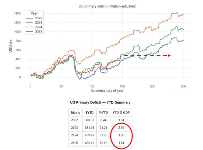
Oct 800:07:06Tap to summarizeHi everyone - this is Alf.I hope you’re having a great day.My macro models have been suggesting a bi-modal framework to approach markets for the near future: Run It Cold Now (growth My Run It Cold Now theory has been increasingly vindicated by labor market data, and markets are often busy trading what’s in front of them rather than looking through a potential reacceleration in 2026.This is why it’s vital to figure out:1. How early/late do we sit within the ‘’Run It Cold Now’’ period;2. How much has the market priced in by now;3. Consequently: is it still worth getting engaged in Run It Cold trades, or shall we look at Run It Hot Later ideas already?As a reminder, my macro models suggest tariffs will act as a fiscal tightening mechanism until year-end.By early 2026, the OBBB fiscal impulse will offset and Trump’s new initiatives alongside lowered Fed Funds and private money creation should propel a Run It Hot Later period.First, some evidence that US labor demand is really weak: extrapolating benchmark revisions from April 2025 onwards, the US has been consistently shedding jobs!To get a broader perspective on the labor market we can rely on unrevised data which incorporates demand and supply for labor: for example, unemployment rate and its important subcomponents.The chart below shows the number of long-term (27+ weeks) unemployed Americans as a percentage of the total labor force. At 1.14%, this number is already as high as in 2002 or summer 2008 – in both cases, a recession was already visibly hitting America:Why is US labor demand so weak?Due to tariffs, the US is going through a slowdown of its primary fiscal impulse: the 2025 primary fiscal deficit sits almost 20 bps below last year and markedly below the 2023 pace.Tariffs are effectively acting as a tax on US companies and consumers:This seems to be confirmed by ‘’the best economist Druckenmiller knows’‘: the internals of the stock market.The chart below shows (in white) the ratio between an index of the 5 largest US payroll processors companies and the equal-weight SPX, plotted against 2-year Treasury yields (in green).If there are no new jobs, the largest payroll processors companies in the US will suffer - and indeed, their stocks are trading very weak.This is an example of how the internals of the stock market suggest the US labor market is very weak, and that the Fed will be soon called to ease more:The US economy is ‘‘running cold’’ now, yet stock markets are roaring and risk sentiment remains very aggressive - why?The private sector money printer is going BRRRR, led by AI.The chart below shows the big-tech announced capex spending as a % of their EBITDA – it’s already over 65% on average, exceeding the AT&T spending of 1998. To keep up this pace next year, companies will have to resort to debt-funded AI capex:AI Capex mechanically adds to US GDP even before we get to talk about the ROI.But the biggest issue with AI Capex is that it doesn’t really add jobs for the median American for now, and hence we are left with two economies: a hot AI-related economy, and a broader labor market struggling under the fiscal tightening induced by tariffs.The stock market is not the economy, and the gigantic AI capex effort coupled with large global fiscal stimulus programs continues to support risk sentiment.Our global real-economy money printing index is very strong.We tracked the YTD pace of inflation-adjusted $ money creation around the world, and this year we have scored an impressive 5.77% increase in real-economy money printing around the world.This comes after 3 weak years led by the gigantic Chinese housing deleveraging, and the YTD pace in 2025 is in line with the ‘’concerted global growth’’ pace of 2017.The global pace and acceleration is quite robust, and its mainly driven by China which has restated its credit engines after 2-3 years of robust housing deleveraging.Despite being crippled by tariffs (e.g. a large tax), US money creation is accelerating led by the AI-related debt-funded capex spending on data centers.And money printing is only set to accelerate going forward.From a fiscal standpoint, we are 100% sure that from early 2026 we will see:- Germany adding to money creation via a large increase in primary spending;- The US OBBB kicking in with its fiscal stimulus offsetting tariffs money destruction;- Korea, Sweden, and many other countries kickstarting deficit spending programsWe might be looking into a scenario where the Fed cuts rates but global money printing accelerates.If we dust off my TMC Quadrant Asset Allocation Model, that puts us in the top-right quadrant:In short, historically the best asset allocation for such an environment involves selling IOUs and paper assets, and buying tangible risk assets.Basically:* Sell USDs and bonds, * Buy stocks and assets linked to nominal growthThe most painful outcome for institutional investors would be an equity rotation towards EM/Value + a commodity rally.These are very underowned asset classes, and they could rally right when standard portfolio hedges such as USD and bonds would fail to deliver.And the Market Gods enjoy inflicting the proverbial Pain Trade every now and then…Thanks for reading! This is a public episode. If you would like to discuss this with other subscribers or get access to bonus episodes, visit themacrocompass.substack.com
Transcribe →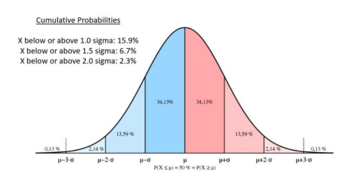
May The Odds Be Ever In Your Favor
Aug 2500:18:33Tap to summarizeHi everyone - this is Alf. I hope you're having a great day.‘’I compile statistics on my traders. My best trader makes money only 63 percent of the time. Most traders make money only in the 50 to 55 percent range. That means you’re going to be wrong a lot. If that’s the case, you better be sure your losses are as small as they can be, and that your winners are bigger.’’ – Steve Cohen.This is a hard truth to accept for many macro investors: we will be right only about 50-55% of the times.If your win rate is much higher than this, I suggest you extend the sample of trades you are analyzing or assess whether you are not trading macro but rather just selling optionality – short vol/option strategies have win rates as high as 90%+, but they wipe you out completely when you are wrong.In the last 10 years, I scored a 52% long-term win rate on my directional macro trades. Once I realized that and given that the year-end P&L formula can be written as follows:I knew I’d better make sure the size of my losses doesn’t get out of control.This can be achieved in two ways: sizing trades correctly and designing a system that lets your winners run. We are going to talk about my approach to both angles in a second, but first another important remark.To step up the win rate on macro trades from 50% to say 55% over a long period of time, you need to gain some edge over other macro investors.What could that be?- A data-driven approach with superior macro models- The ability to assess the gigantic amount of cross-asset market signals via quantitative tools- A particular edge in a niche market that you have learnt to navigate well over time- Be less stupid than othersMacro models help a lot, but my ‘’don’t be stupid checklist’’ adds value too:Points 1-3 keep my emotions in check and ground me to a more rational assessment of the trade.Points 4-6 are about implementation.A warning: short carry trades (and long options) are expensive to hold over time if nothing happens.A reminder: in very choppy markets, you can get quickly stopped out with linear trades even if your thesis proves to be correct – consider whether the market regime favors linear or option implementations.Don’t be stupid: check whether the trade you are about to add is not just another expression of a trade you already have on – I have seen people blow up as the 10 trades they were running were just…the same trade.But it’s point 7 that sticks out: sizing and risk management define most of your P&L at year-end.Here is how I approach them through a practical example. Say you think that the S&P500 will keep marching higher over the next month: how many SPYs do you buy?You could be in the right or left 50% of that distribution: when you pull the trigger, you don’t know that. And because you don’t know that, you want to standardize your ex-ante sizing.One effective way to standardize the sizing of each tactical trade so that they don’t excessively weigh on your year-end P&L is to do volatility-adjusted sizing: let’s go through the SPY example.You could be in the right or left 50% of that distribution: when you pull the trigger, you don’t know that. And because you don’t know that, you want to standardize your ex-ante sizing.One effective way to standardize the sizing of each tactical trade so that they don’t excessively weigh on your year-end P&L is to do volatility-adjusted sizing: let’s go through the SPY example.Let’s set our stop at 1.5 standard deviations, and our defined time horizon in this example will be 1 month. For the SPY, using a 5-year lookback the typical 1.5x monthly negative sigma event would be a -7.6% decline.You can play around with the lookback period if you want more history and/or assign different weight to more recent periods if you think today’s vol regime is more relevant (grey boxes).If returns are normally distributed, we will be stopped out 6.7% of the times in our defined time horizon. But as returns often follow other distributions, it’s good practice to check the actual empirical probability of being stopped out against the theoretical 6.7% probability (orange boxes).Finally, define what’s the fixed % of AuM you are willing to lose on any given macro trade.A fictitious $1 million trading account willing to lose max $20k per trade which is bullish on SPY with a 1- month horizon would buy 571 SPY shares at $437 and be stopped out at $402 (-7.6% = 1.5x sigma event) hence losing $20k (= 2% of AuM).Congratulations, you just applied volatility-adjusted position sizing!What are the advantages of this approach?1) You remain agnostic to ‘’volatility luck’’: if you size all positions the same, being right/wrong on the most volatile assets will make/break your P&L at year-end and that’s all about luck. Don’t gamble.2) You remain agnostic to your ‘’conviction’’ level: the truth is that ex-ante you don’t know when you’ll be in the right or wrong 50%, so why would you over or under size a trade based on your ex-ante conviction levels? You shouldn’t.3) This approach is really flexible: you can use it as a day trader or as a tactical macro investor, you can set stops looser/tighter depending on your approach etc.The truth is that this volatility-adjusted position sizing approach helps you avoid your ex-ante biases: you’ll be right ~50% of the times and don’t get to know on which trades – so, size appropriately.Ok so now you have a data-driven macro approach, tools to help you digest action in global markets, and a ‘’don’t be stupid checklist’’ to help you push that 50% win rate higher plus a vol-adjusted position sizing system to avoid big losses by design.How do you actually make money?First, you place profit targets in an asymmetric way to your stop losses.If your stop loss is at -1 standard deviation, your profit targets should be at over 1 sigma: if you are able to preserve a 50% win rate, that will help you making more money on winners than you lose on bad trades.Most importantly though, you must have a system in place to let your winners run: the best hedge fund traders I know only score 2-3 outstanding trades per year which account for 80% of their yearly excellent P&L.To improve the odds of achieving that, I use a trailing profit target strategy:Say you set a stop at -1 sigma and first profit target at +1.5 sigma: when you hit the first target, you do not take profits – rather, you enter a trailing strategy.Your new profit target becomes +2.5 sigma, and your new stop becomes 0. You hit 2.5 sigma?Great! Extend again: +3.5 sigma target, +1.5 sigma stop. And so on and so forth.These rare but outsized gains make the difference at year-end.In short, here is a sensible approach to tactical macro trading:- You want to recognize you’ll be right only about 50-55% of the times;- To skew the odds towards 55% you want to have a data-driven macro process, quantitative tools to screen markets and a ‘’don’t be stupid’’ checklist before pulling the trigger;- You want to follow a volatility-adjusted sizing process as explained above;- You want to religiously respect your stop losses and have a system in place to let your profits run.Thanks for reading! Feel free to share this piece with a colleague or friend. This is a public episode. If you would like to discuss this with other subscribers or get access to bonus episodes, visit themacrocompass.substack.com
Transcribe →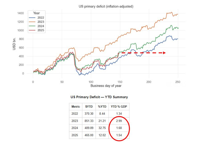
Plumbing Risks Ahead
Aug 1300:05:54Tap to summarizeHi everyone - this is Alf. I hope you're having a great day.The US economy and markets might face a double negative whammy over the next 2 months: a large reduction of the fiscal impulse and the aggressive rebuild of the Treasury General Account (TGA).A slowdown in real-economy money creation (primary deficits) could result in an economic slowdown, which will coincide with a drainage of bank reserves (TGA buildup) from markets.Our US primary deficit tracker stands at 1.54% of GDP as per last week, already lagging behind the 2024 pace and way behind the 2023 staggering pace.Tariffs came in at almost $30bn in July, and were this pace to continue we’d effectively face an additional $150bn of fiscal drag until the end of the year.That alone means the US primary deficit might shrink by 15% from $1 trillion in 2024 to $850 billion in 2025:As a reminder, primary deficit spending = money being injected in the real economy.Literally, we are talking about money printing.As step 1 the US government spends money (e.g. cuts taxes) which increases the bank account of households which receive an injection of net worth – they pay less taxes, hence their bank accounts are fatter. Bank deposits grow at commercial banks, which as a result see their reserves at the Fed grow too.Step 2 describes the bond issuance pattern: the US government issues bonds to ‘’fund’’ deficits, and banks swap reserves for bonds at auctions.This slide comes from my Monetary Mechanics course, in which I cover all the plumbing topics and variations you can ever imagine – take a look here if interested:So the private sector will receive a smaller injection of wealth from the US government going forward.Money creation will still happen, but at a reduced pace – but how should we think about the TGA rebuild?When the government wants to rebuild its Treasury General Account, it issues bonds but not for the purpose of ‘’financing’’ money creation – rather simply to rebuild its coffers at the Fed (TGA).As you can see from the T-Accounts at page 2, a TGA rebuild ends up with a reduction in bank reserves (steps 2 and 3) and no creation of money for the private sector.TGA rebuilds are not uncommon, but as we sit at $421 billion now and the Treasury targets $850 billion by the end of September, the $400bn+ increase in 8 weeks would be one of the most aggressive TGA rebuilds over the last 10 years:Bank reserves are currently sitting at $3.3 trillion, and given the ongoing QT and large TGA rebuild they could drop below $3 trillion soon. That would be the equivalent of less than 10% of nominal GDP:The last time we experimented with bank reserves below 10% of nominal GDP was in 2018-2019, and this eventually led to pressures in the repo market in September 2019.This excellent speech from Waller encapsulates how the Fed thinks about an adequate level of reserves.A scarce level of bank reserves means US banks would be more reticent to engage in the repo market (lend reserves against Treasury collateral) and more conservative in their risk-taking.As Waller stated in his speech: ‘’I think of ample reserves as the threshold below which banks would need to scramble to find safe, liquid funding, something that would drive up the federal funds rate and money market interest rates across the economy.’’Also, the Fed can’t really do much to slow down the bank reserves destruction from the TGA rebuild.Quantitative Tightening is running at $40bn/month, but $35 billion of QT is linked to mortgage-backed securities (MBS) which the Fed wants to get rid off from its balance sheet.And the Reverse Repo (RRP) facility is only at $80 billion, so there is little left to drain there as an offset to the TGA rebuild.If the Treasury really goes for a such a fast TGA rebuild alongside with the reduced fiscal impulse coming from tariffs, the US economy could face a soft patch right when bank reserves fall towards scarce levels leaving banks more reticent to provide repo funding and to oil the leveraged financial system.This potential plumbing issue alongside the net fiscal drag leaves me defensive on US economic growth prospects for the next 2-3 months at least.This was it for today. Be nimble, and remain hungry for macro.I This is a public episode. If you would like to discuss this with other subscribers or get access to bonus episodes, visit themacrocompass.substack.com
Transcribe →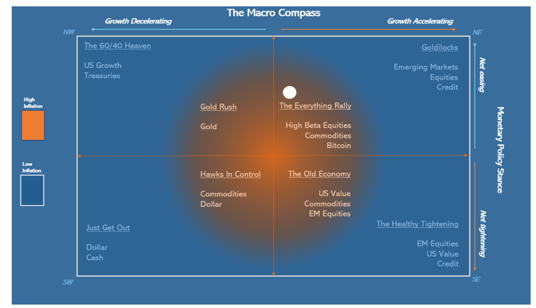
Policymaking Protest Assets (PPAs)
Jul 15, 202500:04:51Tap to summarizeAmidst all the noise, markets haven’t had time to digest 5 key macro news:1) Elon Musk announces formation of ‘’America Party’’2) Speaker Mike Johnson: "We're gonna have a second reconciliation package in the fall, and a third in the spring of next year..."3) President Trump: ‘’ “Stock markets are now at all-time high -- we’re going to maintain it, believe me.”4) Bessent: We could appoint new Fed chair in January, nominating in October5) OMB Director Vought sends official letter to Powell saying ''Chairman Jerome Powell has grossly mismanaged the Fed''Musk’s America Party might as well cost the Republicans both the Senate and House in the 2026 mid-terms. That’s a big political risk for Trump.The response from the Trump administration is very clear - run the economy hot. More fiscal stimulus with reconciliation bills on the table again, and dovish pressure on the Fed.The interference with the Fed independence is increasing by the day, with clear attempts to find ''cause'' to fire Powell (e.g. ''gross misconduct'' mentioned by Vought).If you run the economy hot with inflation already above target and force a dovish reaction function at the Fed, our asset allocation model moves towards the ''Everything Rally'' Quadrant:Historically, the best asset mix for this scenario is to get rid of USDs and underweight long-end bonds and buy:1) Assets denominated in USD that produce inflation-proof cash flows;2) PPAs: Policymaking Protest AssetsWhy do these assets perform well in such a macro environment?Trump's plan with tariffs, fiscal and lower front-end real rates means that real growth remains ok as the tariff passthrough hits consumer spending, but rounds of fiscal stimulus preserve real purchasing power for consumer and capex for companies. It holds fine.Nominal growth is instead more robust in the 4-5% area as inflation remains sticky due to tariffs and fiscal. And you make sure that real yields remain compressed.Basically: you run it hot.In such an environment, specific stock markets composed of companies with strong pricing power (e.g. tech) fare very well as it happened in 2003-2006 and 2013-2019 ''Run It Hot'' experiments. But the two prior experiments were run with inflation at or below target, no tariffs, no attacks on the Fed independence, and no hostile policymaking against the rest of the world.Today, I believe a mix of such investments and PPAs (Policymaking Protest Assets) would work better.PPAs are assets denominated in USD that represent a release valve against unorthodox policy mix such as forcing real rates too low vis-à-vis the level of nominal GDP, manipulating long-end yields via reducing issuance or encouraging banks to buy (SLR reform), or incentivizing foreign countries to diversify away from USD investments.Gold and metals in general are the longest-standing PPAs, and needless to say Bitcoin is also a valid contender for PPA properties:The questions we should all be asking ourselves are:A) How long the USD am I in my portfolio? (Probably too much)B) Do I have enough assets producing inflation-proof cash flows? (Probably not)C) Do I have enough PPAs in my portfolio? Gold, metals, Bitcoin? (Probably not)If you enjoyed this piece, please share it with a friend you know will enjoy it too.For questions/remarks/grandma pizza recipes, feel free to drop me an email at themacrocompass@gmail.comStay humble in markets,Alf This is a public episode. If you would like to discuss this with other subscribers or get access to bonus episodes, visit themacrocompass.substack.com
Transcribe →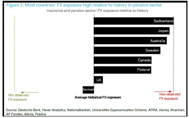
Null Komma Null
Jun 18, 202500:06:51Tap to summarizeHi everyone - this is Alf.I hope you're having a great day.Alongside with running my hedge fund, I work as a consultant and external advisor for some of the largest pension funds, asset managers, banks and funds in the world.Arrangements are flexible: from access to my institutional research + daily access to me all the way to monthly or quarterly calls and sitting through your investment committees.If you think I could add value to your firm, simply reach out at:alf@themacrocompass.comPlease state your name, company, and how you think I could help.And now, to today's macro research piece.Let’s start this macro piece with a little game.Below you find two tables representing 3 consecutive prints of core CPI in the US including its subcomponents: core goods and core services (with a separate mention for ‘’supercore’’ CPI).Without using Bloomberg or Google, are you able to tell which 3-month core CPI streak belongs to the pre-pandemic period and which one to today?I wasn’t, and some of the hedge fund PMs I asked the same question ended up making a mistake.In both cases, core CPI MoM prints were averaging 0.15-0.20 which is broadly in line with the annual 2% inflation target and the subcomponents painted a picture of 0% goods inflation with core and super-core responsible for the quite muted inflationary pressures.The answer: section 2 covers the Jun-Aug 2019 period, and section 1 shows Core CPI for Mar-May 2025.I think we should take some time to reflect on this.In early 2019, Powell pivoted dovish with a clear speech highlighting the tightening cycle was over and the Fed was all about accommodating financial conditions.Core inflation averaged 0.2% MoM in summer (higher than today), unemployment rate was 3.7% (lower than today, and stable), and the Fed moved on to cut rates from 2.25% to 1.50% in Q3 2019.Fast forward to today: the last 3 core inflation prints averaged 0.14% MoM with weaker services inflation, unemployment rate is steadily climbing up at 4.24%, and Fed Funds sit 200 bps above summer 2019.The Fed might soon capitulate dovish.Also, amidst this tariff noise it’s helpful to take a step back and remember core goods only represent ~20% of the core CPI basket.The real action lies in services and housing (dis)inflation.The guys at WisdomTree developed a real-time core inflation metric that uses actual housing inflation rather than the lagging shelter CPI metric:Core CPI using real-time shelter inflation (blue) has been around 2% for 18 months already, but the lagging nature of shelter CPI (grey) pushed official core CPI higher limiting the ability for the Fed to cut.The lagged disinflation in housing seems set to continue, which means the official core CPI measure might keep declining based on official shelter inflation dropping (it’s 35-40% of the core CPI basket: it matters).Notice how using real-time shelter inflation works both ways.The red circle highlights the mid-2021 period when the housing market was ultra hot but shelter inflation didn’t yet show up in the official core CPI – which tricked the Fed into mistakenly delaying the hiking cycle.The opposite has happened in 2024, but the last 3 core CPI prints are now decisively dovish.It’s time to follow the Fed very closely to grasp when the dovish turn might come.The title of this piece is ‘’null komma null’’, a German expression which means 0.0 and we can say the excess inflation today compared to pre-pandemic periods is actually null komma null.But there is another ‘’null komma null’’ which is crucial for markets and asset allocation.A close friend, mentor and hedge fund PM recently had a chat with a German pension fund manager and asked him how much additional USD hedging they have done given the correlation break between EURUSD and risk assets.‘’Null komma null’’. Nothing, no additional hedging has been done.Basically, pension funds and insurance companies remain very long (and hurting) the US Dollar:The reason is very simple: FX hedging costs are still high, and pension funds/insurance companies have return targets to meet.Picture this: the standard return requirement for a pension fund is 6.5/7.0%, and if you are in Switzerland or Japan hedging your USDCHF and USDJPY exposure for the next 12 month costs 3.5-4.0%.That’s quite a hefty negative carry to pay, and this deters pension funds managers from hedging.But.In a scenario where:* The Fed turns dovish and starts delivering cuts* USD hedging costs start to drop* The USD depreciates further, reminding foreign pension funds of their losing long USD positionWe could see a fast acceleration in USD hedging demand from foreign whales around the world.Such hedging activity would compound USD weakness very rapidly.If such an outcome unravels, the market implications are pretty straightforward.Short the denominator, long the numerator.The US Dollar remains the denominator of most financial assets out there, and the combo of a dovish Fed turn + Trump policies + hedging activity would definitely ‘’weaken the denominator’’.When it comes to the ‘’numerator’’ (i.e. what asset you go long vs the USD), my view is:* FX: prefer currencies potentially involved in hedging flows (EUR, CHF, JPY, AUD, CAD etc)* Equities: prefer sector/countries with high pricing power (tech, large cap) or commodity exporters* Commodities: long metals (gold, silver etc)This was it for today, thanks for reading!Alongside with running my hedge fund, I work as a consultant and external advisor for some of the largest pension funds, asset managers, banks and funds in the world.Arrangements are flexible: from access to my institutional research + daily access to me all the way to monthly or quarterly calls and sitting through your investment committees.If you think I could add value to your firm, simply reach out at:alf@themacrocompass.comPlease state your name, company, and how you think I could help. This is a public episode. If you would like to discuss this with other subscribers or get access to bonus episodes, visit themacrocompass.substack.com
Transcribe →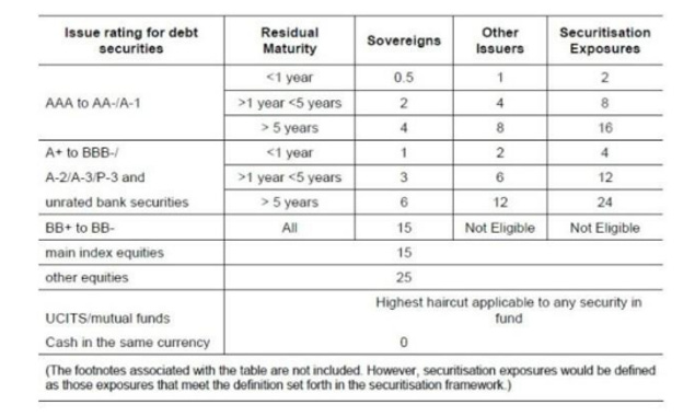
On The US Downgrade
May 19, 202500:07:55Tap to summarizeHi everyone - this is Alf.I hope you're having a great day.On Friday, the credit agency Moody’s downgraded the US rating by one notch to Aa1 (equivalent to AA+).By now, you’ve probably read tens of opinion pieces arguing this is the beginning of the end, and that there will be dire consequences for the US Treasury market.In this piece, you’re going to read a more sober and data-driven approach to this downgrade.The first thing to understand is why Moody’s downgraded the US: ‘’ Successive U.S. administrations and Congress have failed to agree on measures to reverse the trend of large annual fiscal deficits and growing interest cost’’.The mainstream take here is that this makes sense because the US will never be able to repay its debt and because interest costs have now exceeded $1 trillion per year.Once you understand the monetary system, both these assertions don’t make any sense:Any government doing deficit spending and issuing bonds in its own currency (like the US) is not walking into an abyss of doom – it’s just choosing to stimulate the economy by printing money for the private sector.It doesn’t have to repay anything – if it tries that via budget surpluses it will cause the opposite effect and end up hurting the private sector (via higher taxes).The process of fiscal deficits creating money for the private sector is explained in the T-Account chart.Step 1 is the government blowing a hole in its balance sheet to print money for the private sector (aka deficits), which adds net worth for households and corporates which see their net bank deposits increase. These deposits end up at banks, which in turn also see their assets (reserves) increase.Banks will then swap these reserves for bonds at auctions where the US governments funds its deficits via issuing bonds and primary dealers (banks) plus foreign investors show up to buy bonds – step 2.Ok fine, ‘’US debt levels are too high now’’ is a groundless worry touted by rating agencies and mainstream commentators but surely paying $1+ trillion in interest costs must be a scary proposition?Not really: for every $ the US pays for interest on debt, there is an investor making $ on risk-free interest rates she is collecting by owning Treasury bonds.Repeating this concept is useful to demystify the monetary system: yes, government debt and US interest payments are rising but it’s not like the US needs to ‘’choose’’ between spending on interest and spending money for healthcare – the government balance sheet doesn’t work like ours.The real limitation to uncontrolled deficit spending is inflation and scarcity of resources (2021-2022 prime example) and not some budget constraints typical of a household.Ok, but how does the Fitch downgrade affect investors and market participants?The key point is that US Treasuries are now rated AA+ instead of AAA.US Treasuries are the most widely used form of collateral in the world due to their high rating, liquidity, deep repo market and solid democratic foundations/rule of law.Does the downgrade affect that?Commercial banks are huge buyers of Treasuries: they use them as regulatory liquid assets (HQLA), as collateral and also sometimes as an asset to hedge interest rate risk on their liabilities.The Basel regulatory framework introduced 10 years ago has 0% capital requirements for government bonds rated between AAA and AA- for its standardized approach: the downgrade to AA+ wouldn’t make any difference. Most banks actually choose an internal-rating based (IRB) approach based on internal models and in that case most jurisdictions apply an exception for any investment-grade rated domestic government bond which automatically assigns them a 0% risk weight.Bottom line: for banks this downgrade makes no difference at all.Treasuries are also widely used as collateral in repo transactions: for instance, pension funds and insurance companies lend their unsecured cash parked at a bank against collateral to upgrade the safety of their ‘’cash’’ deposits in a so-called reverse repo transaction.A secured loan with UST as collateral (e.g. reverse repo) is safer than parking cash unsecured at a bank.Does a downgrade affect the collateral status of US Treasuries?The table above shows the Basel committee recommended haircuts for repo transactions.As you can see, bonds rated between AAA and AA- fall in the same bucket (little haircut required).The Moody’s downgrade doesn’t affect the role of US Treasuries in the financial plumbing world: banks still face 0% risk-weights when buying Treasuries, and the role of US bonds as the main collateral underlying the global repo market remains intact.People will now try to compare the short-term bond market reaction to 2011, the last time when US Treasuries received a surprise and significant rating downgrade. Yet, the comparison makes no sense.Remember that 10-year government bond yields can be decomposed as:The downgrade can only directly impact the third component – term premium, which measures the compensation investors demand for various uncertainties attached to owning long-dated US Treasuries (generally growth and inflation volatility, but occasionally also other type of uncertainties).We have shown how the downgrade doesn’t affect the role of US Treasuries in the global plumbing system, hence unless investors initiate a self-fulfilling fire-sale there shouldn’t be much impact from Moody’s action.Yet, Moody’s is right on one thing: persistent primary deficits (3%+/year and growing) do require a different approach to bond markets than we had during the 2012-2019 period.If you check the simple equation above, you will see that fiscal stimulus serves as a boost for cyclical growth which turns growth expectations higher – or alternatively, it limits the extent of economic weakness.By constantly creating money for the private sector at a sustained pace, 3%+ primary deficits also contribute to stickier inflation – hence also affecting the second part of our equation.The Fed still believes the neutral nominal rate (the rate at which the economy doesn’t cool off or overheats) sits at 3%, but it’s fair to assume that persistent fiscal deficits combined with a de-leveraged US private sector have pushed it higher. The bond market instead prices the US neutral rate at 3.50%, and it maintains a steep curve in the 10-30 year area as investor demand compensation to own long-end bonds.Bonds are fairly priced here. I would start accumulating more 30-year Treasuries >5.25%. This is a public episode. If you would like to discuss this with other subscribers or get access to bonus episodes, visit themacrocompass.substack.com
Transcribe →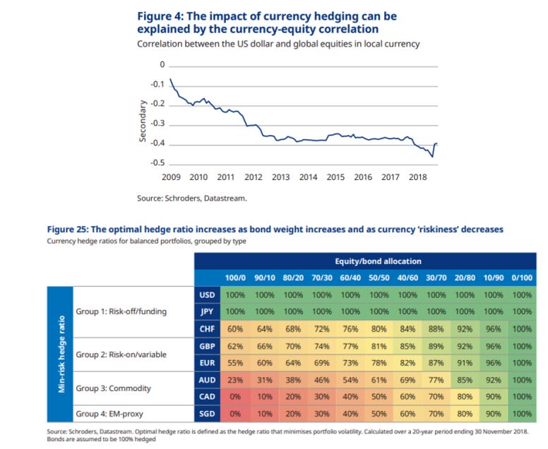
How The Whales Could Dump More US Dollars
Apr 25, 202500:05:13Tap to summarizeHear, hear: the US Dollar is going down. Investors love to attach an ex-post narrative to any price action, and this time the blame was on Trump’s erratic policies, the reduced attractiveness of US assets, and ‘’China dumping’’. Two of these actually make sense (you can easily guess which ones).But there is a much bigger catalyst for the USD to sell-off more: FX hedging flows from proper ‘’whales’’. These whales control $30 trillion (!) in USD-denominated assets, of which 13 trillion in equities and the remaining portion in fixed income instruments. You may know these whales by their common names: GPIF, Norges Fund, CPPIB, APG, SuperAnnuation… Foreign pension funds, insurance companies and asset managers are the true whales that could dump more US Dollars in an attempt to correct their sizeable and secular ‘’under-hedging’’ of USD risk:In this article I will try to explain why these FX hedging flows (sell USD) could be triggered, quantify how big these flows could be, and assess which countries and currencies could represent the bulk of it. The analytical process requires us to identify how big their USD asset pool is (in % of their domestic economy) and how much under-hedged they are. But first – why do foreign whales actually ‘’under-hedge’’ their USD risk exposure?Imagine you are the CPPIB – Canada’s biggest pension fund with $500bn+ in AuM.You have to generate a consistent return of ~6-7% to be able to service your liabilities (future pensions), which means you’ll invest in a portfolio of stocks, bonds, real estate and alternatives. Your liabilities are in CAD (as you’ll pay pensions to Canadians) but your assets can’t only be CAD-denominated because to satisfy your investment needs you’ll need to look into the US stock markets, $- denominated hedge funds, Treasuries etc. But by investing in USD-denominated assets, you are also implicitly getting exposure to USDCAD risk. So – how much USD risk should you hedge? Or namely, how much USDCAD should you sell as a hedge? The study above from Schroeders details the industry-standard approach: the top chart looks at the correlation between USDxxx (e.g. USDCAD) and your investment asset class (e.g. equities). Recently, the USD has ‘’always’’ rallied when stocks sold-off as the world scrambled towards the safety of US assets backed by sound policymaking (= USD smile), and therefore being ‘’under-hedged’’ was great. On top of it, given a currency like CAD (table below) is commodity/risk-on cyclical, during equity sell-offs having an active ‘’long’’ USDCAD exposure through under-hedging worked even better – and so the suggested USDCAD FX hedge ratio for a 60/40 portfolio is 40%.But what happens when the USD does not rally (!) during risk-off environments, exactly as we are witnessing recently?In that case, being under-hedged (= actively long USD) becomes painful as it compounds negatively alongside equities (and perhaps also bonds) losing value.And that’s when these foreign whales would be forced to hedge, and kickstart a substantial USD firesale process.Let’s dig into the data and find out:A) How big these USD selling flows could beB) Which currencies would be involved the most and whyThe full macro research piece is available to the TMC institutional tier subscribers - a subscription costs several thousands of dollars per year.But you don’t have to pay that - if you act now.As we are getting a large influx of institutional demand for The Macro Compass research, we might be soon closing to subscriptions at retail-friendly prices.This is why today I am telling you: go for it today.The first 20 Substack TMC readers who will use the code USD20 for our All-Round tier will get 20% OFF the (already retail-friendly) subscription price.You’ll end up paying only EUR 999/year.That’s only ~19 EUR/week to read my institutional-grade research every week.The offer is valid only for TODAY!Use the link below. Be amongst the 20 who get in: This is a public episode. If you would like to discuss this with other subscribers or get access to bonus episodes, visit themacrocompass.substack.com
Transcribe →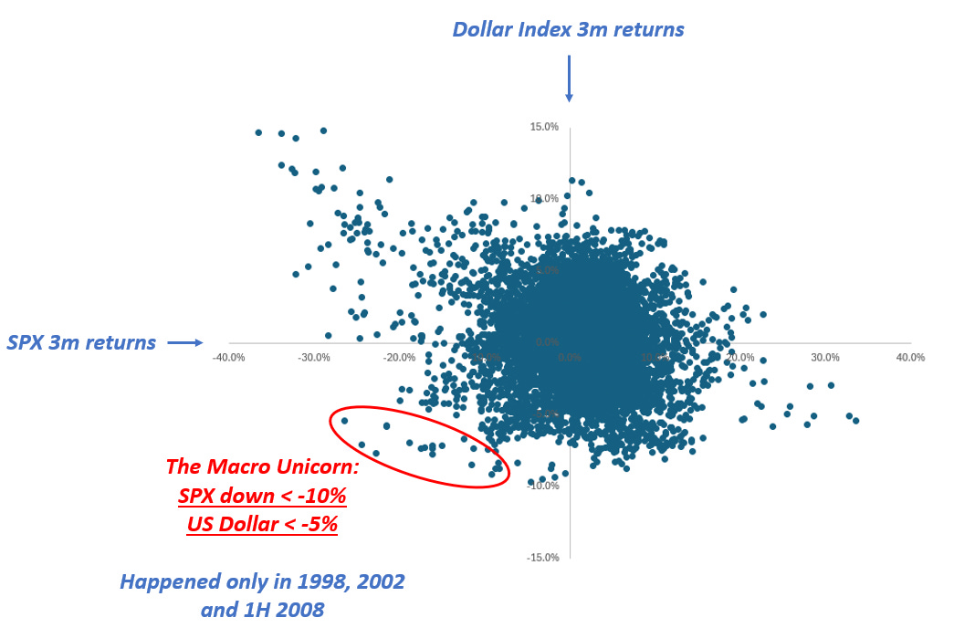
The Macro Unicorn
Mar 31, 202500:07:18Tap to summarizeHi everyone - this is Alf. I hope you're having a great day.‘’There are decades where nothing happens; and there are weeks where decades happen’’ – Vladimir Lenin.Markets were sleepwalking into April 2nd before we had a decent sell-off in US stock markets on Friday.But the size of the YTD sell-off (a mere 5%) masks a very interesting pattern happening below the surface.For the first time since the first half of 2008, we are observing a rare macro pattern – almost a unicorn.The S&P 500 and the US Dollar are going down at the same time:The chart at page 1 shows the 3-month rolling returns for the US Dollar Index (DXY) and the S&P 500.Historically, large SPX drawdown (left part of the scatter) tend to see the USD rallying heavily: the most convex USD appreciation (upper side of scatter) tends to coincide with bad equity drawdowns.This also implies that the upper-left quadrant (SPX down a lot, USD up a lot) experiences the most elongated tail of all the quadrants.The ‘’Macro Unicorn’’ bottom-left quadrant with SPX drawdowns happening alongside a weak USD is not very populated. It’s crucial to remember the last Macro Unicorn dot goes back to July 2008.Why was it so hard for the USD to weaken while the S&P 500 was going down?This is because of three reasons:1) After 2008, the Eurodollar system blew up in size and never looked back;2) The US aggressively swallowed global trade surpluses, and in exchange became the epicenter of all global financial flows into Treasuries and US stock markets;3) Policymakers applied growth-friendly disinflationary policies and politicians postured towards defending Pax Americana on the geopolitical frontWith such a combination of factors, the USD tends to appreciate during risk-off events.A portion of the 12+ trillion dollars of USD debt issued by foreign entities has to be refinanced in any given year, and a risk-off environment which threatens to slow down global trade means all foreign entities rush to buy USDs to service their debt.Foreign investors buy Treasuries because the Fed has your back and it will cut rates if financial conditions materially worsen – cross-border buying of US Treasuries strengthens the USD as money flows in the US.The same foreign investors are reluctant to wind down their US equity exposures because Fed cuts will ultimately restore confidence.Net-net, the USD goes up in risk-off events.The only periods when the USD weakened alongside the SPX were 1998, 2002 and H1 2008.These are all periods where US bubbles ended up deflating rapidly: think of the Dot Com bubble burst in 2001 or the US housing market crash of H1 2008 – before it turned into a global financial crisis.These episodes all have one thing in common: a US idiosyncratic crisis.And today, US policymakers seem to be doing all they can to generate one.On the macro front, the US administration is injecting a large amount of uncertainty.The ‘’no-visibility’’ approach from Trump on tariffs brings big unpredictability – and it’s also nearly impossible for US companies to plan capital expenditures and hiring given there is no visibility on tariffs.To that business uncertainty, you need to sum up the leaked White House memo to the Washington Post (here) which aligns with the recent Musk interview highlighting a 25-35% cut to the federal workforce to achieve budget savings close to $1 trillion/year by the end of May.Former Linkedin Chief Economist Guy Berger looks at a variety of high-frequency leading job market indicators, and I respect him as a non-biased non-alarmist economist.He just produced the chart you see below:Quoting him: ‘’The diffusion index of future headcount plans is now worse than it was immediately prior to the election. Additionally, and concerningly, that pessimism about the future is also affecting the present: the diffusion index of recent employment actions is trailing a year earlier by more than pre-election.’’And this is before the Trump administration starts slashing ~800k federal employees.To add to the potential ‘’Macro Unicorn’’ move which stems from a US idiosyncratic crisis, we are witnessing the very first signs of the unwind of the gigantic long US equity position held by foreign investors.As shown by my friend Brent Donnelly, it is very rare to experience a month when the DAX is up while the SPX down – and we just experienced it:If you take a step back, you realize that foreign investors have accumulated a gigantic amount of US securities since 2010. Trade surpluses came with a USD surplus for countries like Germany or Norway, which then recycled these excess USDs back into US Treasuries and US stock markets.Canadian and Swiss investors own US securities to the tune of 100%+ of their GDP:What if some of these foreign whales decide to reduce their exposure to US assets?It would make sense given the new US geopolitical stance, the non-supportive policy mix (non-proactive Fed and tighter fiscal stance), business uncertainty from tariffs and still elevated valuations.And what if markets get caught by surprise by a sudden change in correlations?Exactly like in early 2022 when the correlation between bonds and stocks turned positive after 10+ years of persistently negative correlation as the Fed embarked in a hiking cycle that also hurt stock markets.The Trump administration is trying to achieve an arduous trifecta: a weaker USD, lower yields, and a robust stock market.Historically, to achieve this rare trifecta you need very disinflationary policies (yields and USD down) and a supportive Central Bank that boosts stock market sentiment.The current policy mix of geopolitical shifts, tariffs and macro uncertainty risks achieving a weaker USD and lower yields but at the expense of the economy and the stock market.After 17+ years of absence, the Macro Unicorn of simultaneously weak USD and weak US stock markets could stage an unexpected comeback.Long-term macro investors should reduce their (implicit or explicit) exposure to the USD which has historically served well as a hedge against stock market drawdowns – if the Macro Unicorn appears again, a long USD long stock position could hurt twice.If you are a hedge fund or a more active institutional investor, there are very interesting derivatives trades that can be structured to take advantage of the Macro Unicorn – text me (Alfonso Peccatiello) on Bloomberg and I’ll be happy to discuss. This is a public episode. If you would like to discuss this with other subscribers or get access to bonus episodes, visit themacrocompass.substack.com
Transcribe →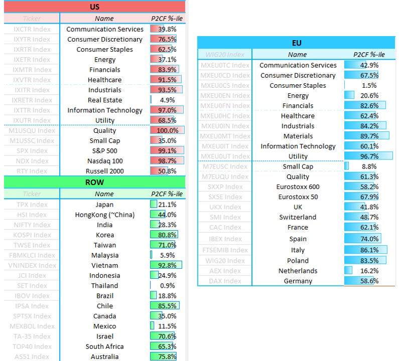
Here Are My Top Macro Ideas
Feb 23, 202500:06:02Tap to summarizeHi everybody, Alf here - welcome back to The Macro Compass!Before we go into today’s piece, a short announcement.I advise several institutional investors on a bespoke basis.Clients include Canadian pension funds, one of the biggest tech companies around, and top 3 multimanager hedge funds in the world.Services go from sitting on the investment committee as an independent advisor, to constructing specific macro portfolios/hedging programs and consulting on a day-to-day basis (i.e. act as their independent macro analyst).Are you are interested in my macro advisory services?Please shoot an email with your request at: alf@themacrocompass.comFair warning: it’s not cheap, and it’s only for institutional investors.Now, to the piece.The first 5 weeks of the year have seen international equities outperforming the S&P 500: European and Chinese stocks have rallied harder than US stock indexes, and certain emerging markets like Chile or Poland are doing even better. My main thesis for the first half of the year remains to be positioned with an ‘’International Risk Parity’’ portfolio: long US bonds, and long stocks around the world.Let’s take a look at why.The chart above shows that the US growth exceptionalism might be over. The Aggregate Income Growth series is a great proxy for nominal growth in real time: it includes private sector job creation, workweek hours, and wage growth – effectively reflecting the growth rate of nominal income US workers are bringing home. Today, it sits at 4.5% which is exactly the average level it recorded in 2014-2019.These are the Goldilocks growth conditions and controlled inflation that international stocks enjoy.Let’s now perform a data-driven analysis of what asset classes perform best during this prevailing macro conditions, and specifically when:* Core inflation is in the 1.75-2.25% range;* Real growth is in the ~1.50-2.50% range.Here is what we found:On a risk-adjusted basis, bonds do well - especially the long-end.Stocks perform well too, with international stocks performing slightly better than US stocks: in our sample, European stocks pop up very often with CEE countries (higher beta like Romania or Hungary) leading the table.To do well, international stocks need a combination of: * Goldilocks growth conditions (no US exceptionalism); * (On the way to be) controlled inflation and predictable Central Banks; * Reasonable valuations and a new narrative replacing the existing stale one.Which brings us to the other required conditions: friendly developments in inflation coupled with a reasonable Central Bank, cheap valuations and a new narrative prevailing. What are the best countries to look at today? Let’s have a quick look at valuations:The table above shows the forward P/E ratio for various international equity markets, and the most right column shows the 10-year percentile of valuations. Broader European equities are still reasonably valued (Stoxx 600 more than Stoxx 50 which tends to give more focus to large cap German and French companies), but the standout country remains Poland. Outside Europe, several countries in Asia and LatAm show cheap valuations.Price-to-earnings ratios alone are not enough as a metric for valuations, and to broaden up the valuation assessment I like to look at Free Cash Flow Yield too.FCF yield is the ratio between free cash flows and enterprise value, and you can think of it a measure of the amount of net cash genetated by the company and literally available to stock investors divided by the enterprise value.The table below shows the 10-year percentile of FCF yield for different US and EU sectors, and different stock indexes around the world - the lowest the percentile, the cheaper the valuation:If you consider valuations, policymaking and narratives my shortlist for international equity markets includes:* Developed markets: Europe, Japan, and Canada* Emerging markets: China and MexicoEurope, Canada and Mexico were ‘‘priced to die’’ under the tariff threat, but as time goes by without much being done there investors are slowly realizing that inflation is under control and Central Banks are acting dovish. That supports stock markets.In Japan, valuations are still broadly attractive because investors are growing nervous on how hawkish the BoJ will be - yet nominal growth is doing great (~5%+) and Ueda already verbally intervened to put a cap on bond yields. Strong nominal growth and a cap on excessive tightening will benefit Japanese stocks.Despite the big rally, Chinese stocks are still reasonably priced - the PBOC remains ready to ease, some fiscal spending is happening, and investors are largely underallocated.In short: our analysis suggests that an ‘‘International Risk Parity’’ portfolio built with long US bonds and long international equity markets will perform well in H1 2025.Thanks for reading!If you enjoyed this piece, please share it with a friend:Before you go, don’t forget this.I advise several institutional investors on a bespoke basis.Clients include Canadian pension funds, one of the biggest tech companies around, and top 3 multimanager hedge funds in the world.Services go from sitting on the investment committee as an independent advisor, to constructing specific macro portfolios/hedging programs and consulting on a day-to-day basis (i.e. act as their independent macro analyst).If you are interested in my macro advisory services, please shoot an email with your request at alf@themacrocompass.comFair warning: it’s not cheap, and it’s only for institutional investors. This is a public episode. If you would like to discuss this with other subscribers or get access to bonus episodes, visit themacrocompass.substack.com
Transcribe →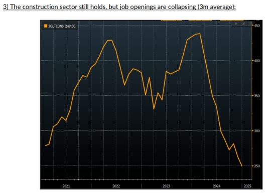
Bond Market Rally Next?
Feb 7, 202500:04:57Tap to summarizeHi everyone, Alf here - welcome back to The Macro Compass!And now, to the piece.Our main macro thesis for the first half of 2025 is that another disinflationary wave will hit the US.We expect core PCE to annualize at or below 2% in H1 2025.Our Leading Inflation Indicator suggests we might be due for one last wave of disinflation in the first half of 2025:To add some substance, this Leading Inflation Indicator is built using the 7 most statistically significant forward looking indicators for core US inflation.The most recent dip is mostly attributable to leading indicators of shelter inflation, which represents 30%+ of the core US inflation baskets.As you know, official shelter inflation tends to incorporate on-the-ground rent growth with a delay due to its methodology and series like the Zillow Rent Index have been used to predict where shelter inflation will go.The CoreLogic single family rent index is one of the best predictor of shelter inflation, and it just printed at the lowest level in 14 years:Some weakness in the housing market is starting to emerge - as evidenced by other leading indicators as well.One of the main reasons why the housing market held up so well despite high mortgage rates was the gigantic backlog to work through.During the pandemic, the demand for housing was super hot but supply bottlenecks and labor shortages lengthened the housing construction cycle - and this led to large backlogs which kept the housing market afloat.Big US homebuilders like D.R. Horton are now reporting their backlogs have returned to 2019 levels, so this tailwind seems exhausted:Additionally, yesterday's JOLTS report shows that the job openings for the construction sector are shrinking fast (see chart below).The construction sector is key to the US business cycle, and cyclical weakening there has always been an early signal of a broader softening in US growth conditions.Just to be clear: construction workers aren't getting laid off yet.But it seems that the conditions are in place for a slowdown in the housing sector, which also leads to disinflation through the rent of shelter component:Incoming data on inflation, growth and the housing market suggest a disinflationary slowdown in growth could be ahead of us. In that case, the Fed could quickly switch to a quarterly pace of cuts and reassert the Fed Put. This ‘’proactive risk management’’ dovish stance would ease financial conditions = stocks and bonds rally:Looking at the relative valuations across stocks and bond markets, the best risk/reward lies in fixed income.At the moment, this is what the market is pricing the Fed to do over the next 2 years:The Fed is priced to be on hold in March, deliver maybe 2 cuts in total this year, and pretty much stop there.The terminal rate is priced around 3.90% - and that’s where the Fed cutting cycle stops.Given the odds of Fed hikes are relatively small as long as Powell remains Fed Chair until May 2026, bonds offer an interesting risk/reward if my disinflationary thesis proves correct.This was it for today, thanks for reading.If you enjoyed the piece, please share it with a friend: This is a public episode. If you would like to discuss this with other subscribers or get access to bonus episodes, visit themacrocompass.substack.com
Transcribe →