← All TWiT.tv Shows (Audio)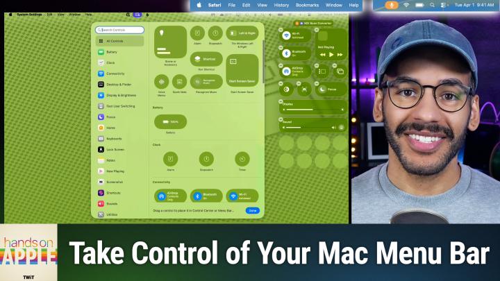
All TWiT.tv Shows (Audio)
Hands-On Apple 207: Ultimate Menu Bar Control
00:13:53
A Longtime Limitation Finally Fixed!
Loading summary
Transcript13 lines
- [00:01]
Cohesity Narrator
Resilience isn't just about bouncing back. It's about being ready. It's how you show up every single day. Because every name in your system is a person who trusts you, and every password is a door you're responsible for locking. And when the threat comes, and it always comes, you hold back the chaos. Learn more at cohesity.com/resilience AI agents are.
- [00:32]
Rubrik Narrator
Everywhere, automating tasks and making decisions at machine speed. But agents make mistakes. Just one rogue agent can do big damage before you even notice. Rubrik Agent Cloud is the only platform that helps you monitor agents, set guardrails, and rewind mistakes so you can unleash agents, not risk. Accelerate your AI transformation@rubrik.com that's R U B R-I K.com this holiday give the.
- [01:01]
MeUndies Narrator
Gift that says let's cancel plans and just lounge. Meundies has dropped a new holiday collection and it's made for maximum cozy. We're talking soft as snow, ultramodal fabric, festive prints, and loungewear so comfy your couch might get jealous. Onesies, hoodies, joggers, even delightfully quirky holiday designs. You're welcome. Knock out all your holiday gifting needs with deals up to 60% off@meundies.com comfortenerpoint promo code comfort. That's meundies.comfortcode comfort coming up on Hands.
- [01:32]
Micah Sargent
On Apple, let's take a look at what I feel is a very exciting change to the way that you manage your control center and your menu bar on macOS. Stay tuned.
- [01:45]
Chris Gethard
Podcasts you love from people you trust.
- [01:50]
Micah Sargent
This is TWiT. Welcome back to Hands on Apple. I am Micah Sargent and today we're taking a look at a feature that I am I think it's been a long time coming because for the longest time people have had to turn to third party apps to do any level of management of true management of their menu bar. On macOS, you had to use an app like Bartender, for example, or Ice, or another third party tool that would let you say, I want this to show up in the Mac menu bar. I don't want this to show up in the Mac menu bar. I want this to be over here. I want it to be over there. That's kind of annoying. And so in Kos Tahoe, things have gotten even better and given you more control over your menu bar. And so we're going to take a look at that. There's also the fact that in macOS Tahoe by default the menu bar disappears. And I don't mean fully Disappears, but instead does not have a background. So for some people who start using macOS, Tahoe, they go, okay, what's happening here? And it's kind of hard. It's like when someone changes a very subtle feature about themselves, right? And you know something's off, but you're not quite sure what it is. That's kind of how you might feel when it comes to this. So let's head over to macOS and take a look at what we've got going. All right, here we are on macOS. And of course, the first thing that we're going to do is look at the screen up at the top. You can see that the menu bar is there, but it is not. It's not translucent and it is not fully formed out. It's not opaque. Instead, there's no opacity at all. It is transparent, save for kind of a little line at the bottom. So let's talk about what we can do if we want to change that. We're going to launch the System Settings app and we are going to click on menu bar. This will give us the information and controls that we need for making adjustments here. So the first thing to understand is that there's a control that we've seen for a long time automatically hide and show the menu bar. This tool, this setting rather lets you decide when the menu bar is hidden. Currently, it's set to in full screen only. That's how I have it. You can set it to always. So right now the menu bar is completely hidden. And the way to beckon to it is to kind of push your cursor up towards the edge of the screen and then push a little bit more. You can set it to on desktop only, which means that when you are on the desktop, it's not there. And when you're in other views, then it appears in full screen only, which says that when you are in a full screen mode. So if you have an app open in full screen, then it disappears, which is the way that I like to have it, and then never, which says that no matter what, always display it. So I'm gonna change mine back to in full screen only to keep that how I have it. Now, here is the feature that I was talking about. Show menu bar background. If you are launching Tahoe and you're going, something's off here. It could be this. Toggle this on and see if that makes a difference for you. Now I suggest letting it run for a little while without the menu bar background, just to see. It kind of gives A visual sense of the screen. The display being a little bit bigger, even though it's not technically. And you can kind of toggle on and off to get your brain used to it. If it's show menu bar background is turned on, then you'll see that hyper blurred menu bar at the top that is still pulling in color from whatever your wallpaper is. But it does not completely disappear. And you'll notice that that little line that was showing up earlier has gone away. So now it's just a completely transparent menu bar, fully able to see that the wallpaper is showing up behind it. The next option, interesting that it shows up here, but it's Recent Documents, Applications and Servers. This just says Mac os. I want you to hold on to my history of recent documents I've opened, recent applications I've opened, and recent servers I've connected to. And you can choose how many you have. So that way anytime you are attempting to open something you can choose File, open recent and this is what determines what shows up in that list. Or when you're connecting to a server, it'll show you by if you don't remember by on with Finder Open, you hold down command and hit K and that will automatically connect to servers and you can see the previous servers to which you've connected. So that's easy for accessing network attached storage. Now the next section is called Menu Bar Controls and this is a way to add controls to the menu bar or Control Center. So if we choose Add Controls here, we'll see that the screen completely changes and that's because it's specific to the controls that we have that's new to macOS. This is akin to Control center on iOS and gives you the ability to control different apps that you might have, but also to access certain features like starting a screensaver, for example, being able to control your home. All of these features are able to be placed in Control center. That many of them also able to be placed in the menu bar. So you'll notice that while I have that selected, I've hit Add Controls. I am able to remove or add to my Control center on the right, but there's also a plus icon up here at the top and I am able to then select some features that I can add to Control center up at the top. Excuse me, to the menu bar up at the top as well. So a really nice way of making it possible to get at different controls. So we'll go ahead and remove that from our menu bar and you can see I've Got one for music as well. We'll choose Done to hop out of this. So now, if we wanted to, we could add controls to the menu bar, but that's not what we're aiming to do today.
- [08:16]
Odoo Narrator
So when I ask, what is Odoo, what comes to mind? Well, Odoo is a bit of everything. Odoo is a suite of business management software that some people say is like fertilizer because of the way it promotes growth. But, you know, some people also say Odoo is like a magic beanstalk because it grows with your company and is also magically affordable. But then again, you could look at Odoo in terms of how its individual software programs are a lot like building blocks. I mean, whatever your business needs, manufacturing, accounting, HR programs, you can build a custom software suite that's perfect for your company. So what is Odoo? Well, I guess Odoo is a bit of everything. Odoo is a fertilizer. Magic beanstalk. Building blocks for business. Yeah, that's it. Which means that Odoo is exactly what every business needs. Learn more and sign up now@odoo.com that's.
- [09:14]
Rubrik Narrator
O d o o.com AI agents are everywhere, automating tasks and making decisions at machine speed. But agents make mistakes. Just one rogue agent can do big damage before you even notice. Rubrik Agent Cloud is the only platform that helps you monitor agents, set guardrails, and rewind mistakes so you can unleash agents, not risk. Accelerate your AI transformation. @rubrik.com that's R U B R-I K.com.
- [09:46]
Chris Gethard
Hi, I'm Chris Gethard and I'm very excited to tell you about Beautiful Anonymous, a podcast where I talk to random people on the phone. I tweet out a phone number. Thousands of people try to call, talk to one of them. They stay anonymous. I can't hang up. That's all the rules. I never know what's gonna happen. We get serious ones. I've talked with meth dealers on their way to prison. I've talked to people who survived mass shootings. Crazy funny ones. I talked to a guy with a goose slab, somebody who dresses up as a pirate on the weekends. I never know what's gonna happen. It's a great show. Subscribe today. Beautiful Anonymous.
- [10:16]
Micah Sargent
Are you ready to grow in 2026? Let me tell you why. Advertising on Twitter is the way to make that happen. I'm Micah Sargent. I'm the host of Tech News Weekly and several other shows on the network. And if you've ever listened to our shows, then you know what makes what we do different? It's trust. When we introduce a new partner on the show, the audience knows we believe in what they offer. They because we're only taking on partners that will actually benefit our audience. And they know that when I'm waxing ecstatic about your product or service, I'm doing so with authenticity. Some other reasons why you should join the network? It's all about the numbers. 88% that's the number of listeners who've made a purchase based on a twit ad. 90% those are the people who are involved in their company's tech and IT decisions. Oh and by the way, 99% is the number of people who listen to most or all of the episode. Every host read ad we offer is authentic. It's unique, it's embedded permanently. So that means that your brand is going to get exposure even after your campaign concludes. Because yes, our nerds, our listeners, our viewers, they go back and check out the stuff we've done in the past. Every ad is simulcast across our social platforms. It's always available in both audio and video formats. So if you want your brand woven into conversations with tech experts and the world's most tech savvy audience, I mean, where else are you going to turn except right here at TWIT? So let's make 2026 your most substantial reach yet. Get in touch with us. Email partnerWIT TV or visit TWiT TV advertise first and foremost under menu bar controls you can see the defaults if it is if it has a checkbox next to it that means it shows up in the menu bar. Obviously if you have it deselected it won't show up in the menu bar. So Spotlight We've talked a lot about Spotlight. Whether you want Spotlight to show up or not, that's going to determine if it appears there. WI Fi I always recommend having that left in there. Bluetooth if you have Bluetooth connected devices then it's good to have that there battery and then you'll notice there are battery options. So you can choose whether it shows a percentage of the charge and if it shows when you have an energy mode active. So if you were put it into low power mode that's when it would show up there as well. Focus so we can choose to always show our focus or show when active. That means that if we have a focus mode running then it's going to appear. Screen mirroring Always show the option to do screen mirroring or only show when active display we can choose always show or show when active. That is, that could be potentially confusing because isn't your display always active? Think of it is when you're using some of those display controls like having an iPad that is running in sidecar or having a having an external display attached. That's when display you would want to show. Same for sound. Always show or show inactive. So if you are actively playing sound out or you're pushing sound to an external device, then it could appear. Now playing I like to have that set to show inactive. Fast user switching. If you have more than one user on the account or on the then you can set that up as well. Time machine whether that shows or does not vpn, that's a great one to have if you have a VPN connectivity and you can either show or hide weather in the menu bar. Now here's the great thing. This is the part that I was talking about before with macOS Tahoe. There's a section called Allow in the menu bar. And this lets you determine whether an icon and an app actually show up in the menu bar. Very nice, right? Because what I can do is say and this is not one that I would do, I would not disable one password. I always like to have my password manager there in the menu bar. But let's say that this is an app that really I only need to use when I have the app itself open. Turning that off means that it will not show in the menu bar. It will still be able to be accessed. It still runs exactly as you expect, but it's not in the menu bar taking up space. Backblaze perhaps. I don't want showing in the menu bar. Malwarebytes perhaps Script monitor if you have something there. All of those in my case I can get rid of and have those not display in the menu bar because they're just taking up space. Now I'm going to turn one password back on. And another thing you can do is hold down the command key and click and drag on these icons in the menu bar to rearrange them. So that's another way to kind of edit your menu bar. As you are using macOS Tahoe now, at any time you can choose to reset Control center back to the defaults if you don't like how it's been set up. But for me, this is exactly the way that I would want it to appear. I also want to mention clock options. I did forget to talk about that. And this lets you decide. Do you want to show the date whenever you're showing the time. And in this case I say when space allows. Which means that if there are enough icons in the menu bar, don't show the full date. But or rather, yeah, if there are too many icons, then don't show the full date. If there aren't too many icons, then do show the full date and also whether or not it shows the day of the week. You can choose to have a digital or analog clock. I like a digital clock. Whether or not AM and PM are displayed, whether the time separator, the colon in this case flashes, and if it has the seconds. If you really like to know. On my Mac Studio, the one that I use for doing all of my shows, I have the seconds displayed. I need that stress here. I don't need that stress. So I have it turned off. And then you can also set it up to announce the time, which is a great way to annoy anyone around you. So that's the clock options as well. But overall this is a look at again the menu bar and this new ability to really decide how things appear not only in your menu bar but also in Control center and kind of decide between the two places and how they're arranged. So that's a look at this really well designed and updated feature set that I think is just kind of a quality of life improvements to macOS. Folks, thank you so much for tuning in to this week's episode of Hands on Apple. If you have questions or other topics you want me to cover, be sure to reach out. You can get in touch with me micahwit TV and I'll see you next time for another episode of Hands on Apple. Bye bye.
- [17:24]
T-Mobile Narrator
Introducing Family Freedom from T Mobile. We'll pay off four phones up to $3200 and give you four free phones all on America's large 5G network. Visit t mobile.com family freedom.
- [17:37]
Micah Sargent
Up to.
- [17:37]
T-Mobile Narrator
$800 per line via virtual prepaid card. Typically takes 15 days. Free phone via 24 monthly bill credits with finance agreement. Example Apple iPhone 16128 gigs $829.99 eligible trade in. Example iPhone 11 Pro for well qualified credits end and balance due if you pay off early or cancel contact us.