← All TWiT.tv Shows (Audio)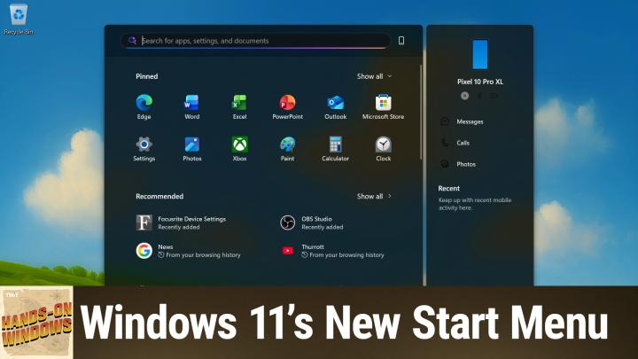
All TWiT.tv Shows (Audio)
Hands-On Windows 169: Windows 11's New Start Menu
00:16:04
The Windows 11 Changes You'll Actually Notice
Loading summary
Transcript24 lines
- [00:01]
Cohesity Resilience Announcer
Resilience isn't just about bouncing back. It's about being ready. It's how you show up every single day. Because every name in your system is a person who trusts you and every password is a door you're responsible for locking. And when the threat comes, and it always comes, you hold back the chaos. Learn more at cohesity.com/resilience Today's show is.
- [00:31]
Progressive Insurance Announcer
Brought to you by Progressive Insurance. Fiscally responsible financial geniuses, monetary magicians. These are things people say about drivers who switch their car insurance to Progressive and save hundreds. Visit progressive.com to see if you could save Progressive Casualty Insurance Company and affiliates. Potential savings will vary. Not available in all states or situations.
- [00:58]
Odoo and T-Mobile Advertiser
Imagine you're a business owner relying on a dozen different software programs. Each one is expensive, overly complicated, and worst of all, none of them are connected. It can be incredibly stressful right now. Picture Odoo CRM Accounting, Inventory, Manufacturing, Marketing, HR and more. Odoo brings all the tools your business needs into one simple platform and all seamlessly connected. Everything works together, giving you the peace of mind that your business is running smoothly from every every angle. Odoo's open source applications are user friendly and designed to scale with your business, saving you time and money. Say goodbye to juggling multiple platforms and hello to efficient integrated management. Stop wasting resources on complicated systems and make the switch to odoo today. Visit odoo.com o d o o.com and discover how Odoo can simplify and streamline your business operations. Odoo Modern Management Made Simple Coming up.
- [01:58]
Paul Thurrott
Next on Hands on Windows, we're going to take a look at a brand new Start menu for Windows 11.
- [02:05]
Progressive Insurance Announcer
Podcasts.
- [02:06]
Odoo and T-Mobile Advertiser
You love from people you trust.
- [02:09]
Paul Thurrott
This is Twit. Hello everybody and welcome back to Hands on Windows. I'm Paul Throt and as you probably know, Windows 11 version 25H2 is out. It should be broadly available. I think by the time you see this, chances are pretty good you will have gotten it automatically through Windows Update. If not, obviously you can force that update if you want to, but one of the more interesting things that's changed over the past year, year and a half is that Windows versions kind of don't matter anymore. So 24H2 is still fully supported. 25H2 is the latest version. They've already announced 26H1 is happening. We'll look at that eventually. But 24H2 and 25H2 are functionally identical. So on this particular computer, if I look at actually I'll just Bring up the Run dialog. You can see I am in fact running 25H2. But it doesn't really matter because if this was 24H2, I'd have the same features, basically with the caveat that some features are rolled out at different times and every computer is a little bit different. And that's another one of the fun things about Windows these days. But when I look back at the past year, a lot of big updates, a lot of big months of updates this year, including in December, by the way. So we're going to round out the year with another big set of updates. But of all the things that we've gotten, I think maybe the one that will impact the most people, because it's not just for copilot plus PCs. It's something that everyone's going to get and it's something that will be on every computer is this new Start menu. And like I said, it should be available on your computer by now. I, I, as I record this, have computers that still do not have it. So it's kind of hard to say. But to understand what's new here, I should go and look at. I took some screenshots of this earlier because actually on this computer I had to force this update today. And this was taken with light mode, unfortunately. But this is the Start menu as everyone kind of knows it. The big update you see here is that slab on the right side for the phone. That was something that Microsoft added in the past year. So you get that with the old Start menu, which this is. The other thing that's new here is kind of interesting. You see this Google link here? So it's Google News from my browsing history. So the recommended section is starting to show things that are not just recently installed apps or apps you might want to install or recently accessed documents, but now it's also displaying stuff from your browsing history. So that kind of stuff is just irregardless of whether you have the new or older Start menu. The big thing to look at here is just that this all box here, when you click it goes to the all view, which is all apps. And this is that list of apps. And you could click here on like the A or the B or any of the letters and get that semantic zoom effect. And then you could, you know, move quickly down to XYZ or whatever letter you want to get to, etc. If you want to get back to the main Start menu, you would click back, right? And then the other, you know, I don't know, major change but the other thing that changed over the course of the past, I guess 3 ish years, 3, 4 years with the original Start menu was they added different layouts to kind of address some of the complaints about wasted space. And some people prefer to have more pins, some, some people have preferred have more recommendations etc. So you can see the various options that you would get there and then this is just a continuation of that. But eventually someday you will get the new Start menu. So we'll look at that next. But quick or first? Here's a quick word from our sponsors.
- [05:52]
Cohesity Resilience Announcer
Resilience isn't just about bouncing back. It's about being ready. It's how you show up every single day. Because every name in your system is a person who trusts you and every password is a door you're responsible for locking. And when the threat comes, and it always comes, you hold back the chaos. Learn more@cohesity.com Resilience Guys, thanks for helping.
- [06:23]
Odoo and T-Mobile Advertiser
Me carry my Christmas tree.
- [06:24]
Paul Thurrott
Zoe. This thing weighs a ton. Drew Ski, lift with your legs, man. Santa. Santa, did you get my letter? He's talking to you, Bridges. I'm not.
- [06:31]
Odoo and T-Mobile Advertiser
Of course he did.
- [06:32]
Paul Thurrott
Right Santa, you know my elf Drew Ski here. He handles the nice list. An elf.
- [06:37]
Odoo and T-Mobile Advertiser
I'm six' three.
- [06:38]
Paul Thurrott
What everyone wants is iPhone 17 and at T Mobile. You can get it on them. That center stage front camera is amazing for group selfies, right, Mrs. Claus?
- [06:46]
Odoo and T-Mobile Advertiser
I'm Mrs. Claus much younger sister. And AT T Mobile there's no trade in needed when you switch, so you can keep your old phone or give.
- [06:53]
Paul Thurrott
It as a gift.
- [06:54]
Odoo and T-Mobile Advertiser
And the best part, you can make the switch to T Mobile from your phone in just 15 minutes.
- [06:58]
Progressive Insurance Announcer
Nice.
- [06:58]
Paul Thurrott
My side of the tree is slipping.
- [07:00]
Odoo and T-Mobile Advertiser
Kimber the holidays are better. AT T Mobile switch in just 15 minutes and get iPhone 17 on us with no trade in needed. And now T Mobile is available in US cellular stores with three full monthly bill credits for well qualified customers plus tax and $35 device connection charge credits and imbalance due if you pay off earlier. Cancel Finance Agreement 256 gates $830 eligible Ford in a new line, $100 plus a month plan with auto pay plus taxes and fees required. Check out 15 minutes or less per line.
- [07:20]
Odoo Business Software Narrator
Visit t mobile.com so when I ask what is Odoo? What comes to mind? Well, Odoo is a bit of everything. Odoo is a suite of business management software that some people say is like fertilizer because of the way it promotes growth. But you know, some people Also say Odoo is like a magic beanstalk because it grows with your company and is also magically affordable. But then again, you could look at Odoo in terms of how its individual software programs are a lot like building blocks. I mean, whatever your business needs, manufacturing, accounting, HR programs, you can build a custom software suite that's perfect for your company. So what does Odoo? Well, I guess Odoo is a bit of everything. Odoo is a fertilizer, magic beanstalk building blocks for business. Yeah, that's it. Which means that Odoo is exactly what every business needs. Learn more and sign up now@odoo.com that's o d o o.com hey there, it's.
- [08:22]
Progressive Insurance Announcer
Leo Laporte, host of so many shows on the Twitch Network Thinking About Advertising In 2026, we host a network of the most trusted shows in tech, each featuring authentic post trait ads delivered by Micah Sargent, my co host and of course, me. Our listeners don't just hear our ads. They really believe in them. Because we've established a relationship with them. They trust us. According to Twit fans, they've purchased several items advertised on the Twit network because they trust our team's expertise in the latest technology. If Twit supports it, they know they can trust it. In fact, 88% of our audience has made a purchase because of a twit ad. Over 90% help make it and tech buying decisions at their companies. These are the people you want to talk to. Ask David Coover. He's a senior strategist at ThreatLocker. David said TWIT's hosts are some of the most respected voices in technology and cybersecurity, and their audience reflects that same level of expertise and engagement. It's the engagement that really makes a difference to us. With every campaign, you're going to get measurable results. You get presence on our show episode pages. In fact, we even have links right there in the RSS feed descriptions. Plus, our team will support you every step of the way. So if you're ready to reach the most influential audience in tech, email us PartnerWIT TV or head to TWiT TV Advertise. I'm looking forward to telling our qualified audience and about your great product.
- [09:52]
Paul Thurrott
Okay, so the new Start menu, this is in dark mode, so you're actually seeing something a little different again as well. Sorry about that, but I just don't want the light shining in my face as I look at this thing. So from a high level doesn't look Too different. But there's a lot going on here. So the search box, search bar is here as before. This is a Copilot plus PC. So you get those kind of pink and purple, blue, sparkly colors up there. And that's because it has additional AI based searching functionality built in. But this is new. So this is a way to hide or display this mobile device. Slice or slab or whatever you want to call it, the little sidebar at the, at the top. And that's kind of a cool feature because this was something you had to go into Settings to find, to enable or not. And it's actually in kind of a strange place. There's a mobile devices interface inside the Settings app. But this is nice because you can just do it on the fly. The other thing that's not super obvious from this display, because this is just 1920 by 1080, it's not particularly high res or anything. This will scale really nicely to high DPI or high resolution displays or large displays. So as you go bigger on your display, this thing will actually spread out and take up more room and that will give you more icons for each of the different sections. So it's kind of cool. You don't really like I said you don't see that here, but that's something I've seen on a lot of different computers. It's actually really nice. The PIN section works as before, but you'll notice there is no all button anymore. Instead what you get is this little toggle where you can show more or show less or show all or less I guess in this case. And so I actually have three rows of icons here. For whatever reason, by default it's going to split the screen pretty evenly between those two top sections. But you can toggle this on and if you do, every time you go back, that's just going to be on. And actually that is the way I prefer to display that. So that's a change. I'll get to what happened to all in one moment. But if you look at recommended not too much here, it works the same as before. It has show all as it did before and you can go into this secondary view as you could before. So this actually hasn't changed. But because of this display I actually see more items than I did on the old Start menu. Right. So I have four items here instead of two. And now you can see there are two items from my browsing history. But the biggest change in some ways is this addition down here at the bottom. And this is that new all view, but brought into the front page or the front screen, the homepage, if you will, of the start menu. So instead of this being a secondary screen, it's now here as a third section on the primary start menu. So this is very custom. Well, or somewhat customizable, I guess. The default view is this category view. If you have an iPhone, you might recognize this. It looks very much like the app library view that Apple uses on the iPhone, but. And it's automatic and there's nothing you can do here. You can't really drag and icons around and make your own groups or anything like that. This is automatic, but you can change it. Right? And I'm going to jump to the third one only because this is the most familiar one. If you go down to list view, this is the view that you used to see in the old all view or all apps view from before. And if you like that view, if that's the one you want, you can have it. It's still here and, you know, like the other option I was showing you with the expanded pin section, if you leave that there and come back later, it's going to retain this view. Right. So it will always have whatever that view is that you chose. And so this is familiar. And I mentioned semantic zoom, but that's what that looks like. So you can click P, say, and then go down to whatever apps I have installed that become a P. So very nice. So that's good. And then there's the third view, which is grid. And grid is actually very much like list, except that each of the apps under each of the letters is now in an icon view right next to each other. Right. And so it saves a little bit of screen space. This is, I guess, arguably maybe one of the better of the. Maybe the best of the three views in a sense, because it's alphabetical. You get more in the screen. It doesn't, you know, you have to scroll so far to see everything, etc. I like the way that the category view looks, but it's. It makes you think, you know, you have to say, well, you're like, I'm looking for an app. So you're like, okay, entertainment apps, Is it a utility or. I don't know, it's. You have to kind of do some work to get into your app. So I'm not quite sure, you know, what the point of that is. This slab on the side here for the phone hasn't changed. This is something that will change or not change depending on how Microsoft updates the phone link app. And that functionality et Cetera, but that's most of it. Right. And so if you interact with the Start menu, if this is how you launch apps, this is something you're absolutely going to notice. And then this most used apps option is not new. This was available in the old version of the Start menu. If you turn it on, you will see it, but only if you are in List or Grid view. Right? It's this top view at the top. So the list view, which is that version from the old Start menu is exactly the same as it was before. If you go into category though, you actually don't get that. So they just cut that off there. But so if you want that on, you're going to want to use one of the other views, but like I said, I kind of think you should be using one of the other views. And then we have this global option to turn on or off that mobile device, Slab, Slice, sidebar, whatever it's called. So if that thing is off and we open the Start menu, you'll see you don't get that toggle anymore. Right. I think most people, especially people are using Phone link are going to want this on. And if for some reason I'm going to have to reboot to make that come back. But if for some reason you want to toggle off, you'll be able to do that. And so I just turned it off. So now I can't see that anymore. But that will typically work normally, of course. And then account related notifications always turn that off because they're always terrible. And those are the notifications that you see in here, in this little flyout. These are the things that will say, hey, it's time to back up again, or maybe you should buy some more OneDrive storage. No, thank you. So I just turned that off personally. But you know, a lot of these things, like I said, is kind of personal choice. The other thing I don't ever use, this hasn't really changed over the years, but it is still available in the new Start menu is the ability to add folders to the Start menu. Now it's not your arbitrary choice of folders, but these system folders that you get. So if you want say the Settings app and File Explorer, then maybe you go to the Downloads folder a lot, whatever it might be, and you turn this on and those will appear down here at the bottom of the screen alongside the power button. Right? And so those can be handy if you like that. Kind of a shortcut. I always leave the Settings app up there actually. But you know, this is Useful also File Explorer, as it turns out, but, you know, good to have or good to know about. And if you don't want that, just leave it off. Those are all off by default, but that has not changed and that's pretty much it. And so again, I think the big deal here is the ability to customize a lot of it in line, which I really like. You're not seeing it here, but the scalability of this thing. So if you have different size displays, etc. You will definitely notice it. If you have a couple of different computers with different screens, but also if you have the same computer and sometimes you dock it and sometimes you don't, you'll notice it then, of course. But this thing really expands out and fills more of the screen, which I do really like. Is this a big, big deal? I mean, in the scope of things? No. I mean, it's the same basic interface we've had since Windows 11 debuted. A lot of the options are the same. There's clutter in here you can turn off, which is good, which I like. Whether or not you find any of these kind of recommended type things to be useful is, you know, again, personal preference. I. I don't know. It's. I think it's the. I think it's going to be a big visual change for most people. I think it's the type of change most people are going to note. We did an episode recently about power toys and one of the. The great tools in there is this thing here, which is PowerToys Command Palette. And this is the new PowerToys run. This is another way to run applications, right? And so I have all my apps that I use the most pinned to the taskbar. I feel like a lot of people do work this way. I tend to only go to Start for secondary reasons. In fact, I don't really even look at Start. And so I'll go to Start and just start typing. So if I wanted to run Notepad, which is in my taskbar, but let's say for some reason I wanted to do it this way, I would do it like that. I wish that in some ways Microsoft would give me the ability to just replace Start with this thing because it gives me that same capability, but it does all these other things as well, which I find to be very powerful, I. This is a really nice interface. You know, by default it's Alt plus spacebar to bring that up, I change it to Start plus Space, but same basic effect. And this does what Start does for me. All of the things that I just showed you, aside from the phone stuff, I suppose are things I don't actually use myself all that much. And so I don't spend a lot of time customizing this. I don't really care what it's recommending. You know, I don't often scroll through a list of apps. Like I said, I. I know what's on the computer. So if I want to find, say, you know, Zoom or something, I just start typing and then it comes up and that's how I access it. So it's going to depend on how you use the computer. But like I said, it is something you're going to notice. So even if you don't, you start that much, the first time it comes up, it's like, oh, that's. It's a little different. So, anyway, probably the big one. We'll do a. We'll do an episode soon that'll be about some of the biggest features of the year. This would definitely be one of them. But like I said, I think it's the one most will absolutely notice. So there you go. Anyway, I hope you found this useful. We will have a new episode of Hands on Windows every Thursday. You can find out more@Twitt TV. H thank you so much. Thank you. Especially to our club Twitter members. We love you. If you're not a member, please do consider it. You can learn more about that program at Twitt TV Club. Twit. Thank you. See you next week.
- [20:33]
Cohesity Resilience Announcer
Resilience isn't just about bouncing back. It's about being ready. It's how you show up every single day. Because every name in your system is a person who trusts you. And every password is a door you're responsible for locking. And when the threat comes, and it always comes, you hold back the chaos. Learn more@cohesity.com Resilience.