← All TWiT.tv Shows (Audio)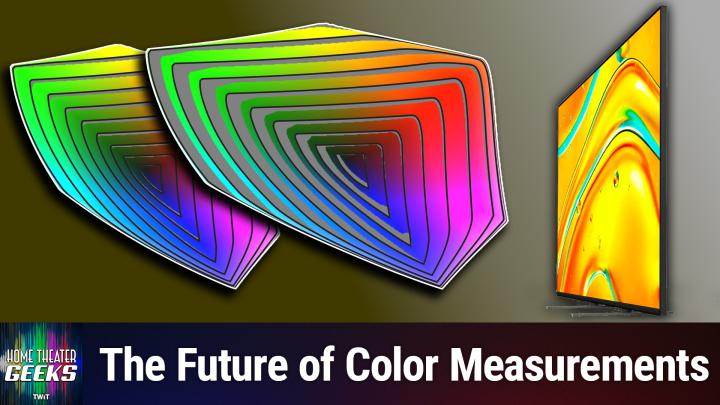
All TWiT.tv Shows (Audio)
Home Theater Geeks 491: Gamut Rings
00:18:27
A new way of looking at color representation!
Loading summary
Transcript8 lines
- [00:00]
Scott Wilkinson
In this episode of Home Theater Geeks, I talk about a new way to represent color reproduction. It's very cool and very geeky, so stick around.
- [00:11]
Leo Laporte
This episode brought to you by Red Canary when cybersecurity threats hit fast, you need an MDR partner that moves faster. Red Canary delivers 24.7expert MDR support, total visibility, and actionable insights. Plus it helps you detect four times more threats so you can stay ahead with without burning out. Red Canary clears the noise and has your back every hour, every incident. Get the backup you deserve. Visit redcanary.com difference to learn more podcasts.
- [00:44]
Chris Chinnock
You love from people you trust.
- [00:48]
Leo Laporte
This is Twit.
- [01:00]
Scott Wilkinson
Hey there, Scott Wilkinson here, the Home Theater geek. In this episode I'm going to talk about something that gets pretty geeky. But hey, this is Home Theater Geek. So totally appropriate. I want to start by thanking my colleague and friend Chris Chinnock, who is the president of Insight Media, an information and service company for the professional and consumer display industries, as well as cinema and broadcast and all sorts of things like that. Chris wrote an excellent white paper on the subject that I'm going to be talking about today, and he has graciously allowed me to use the graphics that he included in that white paper. We're going to include a URL link to the to his website, insight media.info where there's all sorts of interesting information. He and I have been colleagues for many, many years and he really knows his stuff, so I'm really glad that he allowed me to use his material as the research basis for what I'm going to talk about today. Now, most video geeks have seen what is commonly called a color gamut graph or diagram, also known as the CIE chromaticity diagram, which we can see in graphic number one. So this horseshoe shape that you see here represents all the colors that someone with normal vision can see. The curved boundary that you can see there represents single wavelength or monochromatic colors which only lasers can reproduce. All the colors that are inside that horseshoe shape are combinations of various amounts of different colors. Now, within this horseshoe shape you can see three triangles and a dot. They represent different color what are typically called color gamuts. The dashed line is the BT 2020 color gamut, which is the one used in HDR content, although that's the extreme and it's not usually used to its full extent. The dotted triangle, the smallest one is what's called REC709, more correctly, BT709. That's the color gamut of HDTV. And now we have UHD TV or 4K, which is between those two. The solid line, solid lined triangle that you see there is some display that is the actual representation of what that particular display can reproduce. And I'd say it looks fairly close to DCI P3, so it's probably a 4K TV. Now there's a problem with this diagram. It represents color reproduction at only one brightness level, which is roughly half of the display's capability from darkest to brightest. At much lower or higher brightness levels, the range of colors, this solid triangle you see here would be very much smaller. Now, a better way to represent colors from a video display is using what's called a color volume, which is a three dimensional shape, kind of an odd shape that includes brightness information. We can see that in the next graphic. You can see this is an odd sort of shape. The brightness is represented in the Z axis, the vertical axis. And it's been. The brightness values have been what's called normalized to extend from zero, which is the darkest the display can go to 100, which is the brightest the display can go. Regardless of what the actual nits of the display are. The brightness, which is represented with a parameter called L star, goes from 0 to 100. The X and Y axes, the horizontal axes are called A star and B star and they represent the red green axis and the blue yellow axis. So that's a very accurate way to just to describe or represent how the colors of a video display are reproduced. But it's cumbersome to work with. For one thing, it's three dimensional. To really see it, you need to have to hold a physical object in your hand. Now, it's difficult, it's also difficult to compare two displays. How does this display compare to that one? If you're looking at this three dimensional thing, especially if it's in, you know, represented as it is right here on your screen in two dimensions. So that's really hard to do until now. This is what I want to talk about today. It's very, very cool. It's a new way to represent color volume in two dimensions. It was developed by Dr. Kenichiro Masaoka, who is the principal research engineer at NHK, which is Japan's public broadcasting system. He's also the inventor of the BT 2020 color gamut, which is the gamut that's used in high dynamic range HDR content. Ultimately, for the most part, the color space or range that's used in HDR is a little bit less than BT 2020. That is the absolute maximum that A color range could achieve, and the only way to do that is with lasers. But in any event, he's the inventor of BT 2020, and he's also the inventor of what are called gamut rings. So we start with a color volume in this graphic. It's letter A. So it looks like sort of what we saw just there before. Next, it divides the shape into 10 slices, which you can see in B. And each of those slices is 10 brightness units thick. Okay, so we go from 0 to 100 in brightness, and we slice it into. Into 10 slices. And then as we see in letter C, those slices are squished into one unit of brightness. So I guess they're average. I don't know the exact math of this. Okay, then we take in letter D, the bottom left, we take the second lowest slice and cut a hole in it so that the lowest slice can. You can see through the second slice, you can see what's in the lowest slice. And you do that all the way up. You do that with each of the slices, and each. So each higher slice is stretched with a hole in it to wrap around all the lower ones. And that includes the. The top one, number 10, if you will. You have to really stretch it out a lot so that you can see it with all the previous ones sort of inside of it. And that's really what we see in letter F. On the lower right is what are called gamut rings. Each of these lines is. Is a ring. It's not really circular, but it. It. It is a ring. And so each band, if you will, represents 10 units of brightness. So at the center of this figure in number F, letter F, that's zero brightness. And that makes sense because it's black. There's no light there at all. And then as you go out from the center, it gets brighter and brighter and brighter until you get to the very most outermost one, and that's at 100% brightness, or the brightest the display can be. And so that lets you see a color volume in two dimensions. It's not unlike a topographical map. If you've looked at maps of. Of an area on the earth, you might notice that in some cases, there are lines that are drawn on that map, and those lines represent a given elevation. And so you can see how the elevation changes on a topographical map, just like you can see how color representation changes at different brightness levels in this gamut ring representation.
- [10:26]
Chris Chinnock
Ever notice how ads always pop up at the worst moments, when the killer's identity is about to be revealed? During that perfect meditation flow. On Amazon Music, we believe in keeping you in the moment. That's why we've got millions of ad free podcast episodes. So you can stay completely immersed in every step story, every reveal, every breath. Download the Amazon Music app and start listening to your favorite podcasts ad free included with Prime.
- [11:00]
Scott Wilkinson
So this here we have a graphic that's an example of BT 2020 gamut ring. So the, the widest, largest color range that can be, can be represented, at least currently that is defined, I should say, and the ability of a displ particular display to represent those colors. In this example, the displays fall far short of being able to reproduce all the colors in BT 2020 at almost all brightness levels. So you can see in each of these bands there are some gray areas. And those gray areas are colors that this display cannot represent or cannot reproduce, I should say, at that brightness level and as we get brighter and brighter. So you can see for example, at near the top, near the outermost, the next outermost band, it does pretty well in yellow and green, but then in the blues and cyans and the oranges and so on, there's a reds, there's an awful lot of gray area, which means it can't, this particular display cannot reproduce those colors. So in graphic five, we can see the measurement of a particular display. It's conventional color gamut. What we normally look at, what we have for many years, decades in fact, the CIE diagram, we can see that it covers 98% of DCIP3, which is the professional color range that's used in commercial cinema and in most high res, high dynamic range displays. But notice the, the gamut rings. There's an awful lot of colors that it does not reproduce at high brightness. It's only about 51% of DCIP3 color volume. And we wouldn't have known that if we'd only looked at the chromaticity coverage or the CIE diagram. So this is a really, really big advancement in, in the, in the representation of what a display can do. In the next graphic, we'll take a look at another display and look at this one. This one has essentially the same DCI P3 chromaticity coverage at roughly half brightness. But look at the color volume coverage at the gamma rings. It's covering Almost all of DCI P3, 98%, which is essentially all. So this is really, really good. It's a great leap forward in representing the color capabilities of video displays. Now, gamut rings have been incorporated into portrait displays. Calman calibration Software, which is one of the standard calibration software packages that reviewers and companies use. And ratings.com my favorite TV review site, is now including Gamut Rings measurements in its TV reviews. So for example, I took a look at the Sony Bravia 5, which is this one here. This is the. Let me make sure I got this right. This is the gamut rings for DCIP3 and it shows it achieves 90.34%. And when we look at its coverage, the gamut rings for BT 2020, which is the next one, we will see that it doesn't cover everything, which we wouldn't expect it to. Very few displays can actually cover all of BT 2020. It shows that it achieves about 68.15% of BT 2020. By the way, in a few of the most recent past episodes, I've been talking about the Bravia 5 and 7 TVs. People have been asking me about them and I, I've been responding as I can. And at the time of those episodes, Ratings had not posted its Bravia 5 review. But now they have and I can tell you it's not very good. It got a 7.2 overall, which is, is not really great, as you can see here. You know, it's in the yellow, which is, I mean, if scores in the green are good scores that are, you know, shaded yellow or. Yeah, they're okay, but not great. We'll include a link to these reviews in the show notes as well. This one is of the Bravia 5. The Bravia 7 did much better overall. It's got an overall rating of 8.2, which is a full point over the Bravia 5. And the gamut Rings are slightly better in, in the case of the Bravia 7, we can see that the PCI, I'm sorry, DCI P3 is 91.82. Okay, so that's a little over a percent and a half better than the Bravia 5. Not, not really significantly different. And, but the BT 2020 coverage is a little less, a little more, I should say, for the Bravia 7, 71.28% as opposed to 68.15. So that's, you know, that's 3 points, 3 percentage points better. Which is why even back then, before I had the, the review of the Bravia 5, I, I have been saying that the Bravia 7 is probably the way to go, even though it doesn't come in a. I don't think it comes in a 55 inch. Oh, it does. I think it does. The Bravia 9 does not. Okay, that's what I remember. Anyway, I wanted to share Gamut Rings with you because they are so cool. Super geeky, no question about it. But it's a big leap forward in how we evaluate and represent the color capabilities of a display in a two dimensional graph. So I want to thank again Chris Chinnock for allowing me to use his graphics and providing such a great white paper that explains the topic. And to Kenichiro Masaoka for inventing Gamut Rings. I actually met him at Sid Display Week last year 2024. Very nice fellow and really smart. Anyway, I hope you enjoyed that, as I certainly did learning about it. Now. If you have a question for me, send it right along to htgwit TV and I'll answer as many as I can right here on the show. And as you know by now, all of Twitch shows are on YouTube for free but with ads. If you want to go ad free, join the Club. Go to TWiT TV Club TWiT and join up for all of TWiT's programming. Ad Free. Until next time. Geek out.
- [18:37]
Leo Laporte
Get tech news at your pace with TwitTV's perfect pair of shows for quick, focused insights. Tech News Weekly brings you essential interviews with a journalist breaking today's biggest stories. But maybe you need more. That's why I'm here. Dive deep with me on this Week in Tech. Your first podcast of the week and the last word in tech. Industry. Insiders dissect everything from AI to production, privacy to cybersecurity in tech's most influential and longest running roundtable discussion. Short or long, streamlined or comprehensive, Twit TV keeps you well informed. Subscribe to both shows wherever you get your podcasts, and head over to our website TWiT TV for even more independent tech journalism.