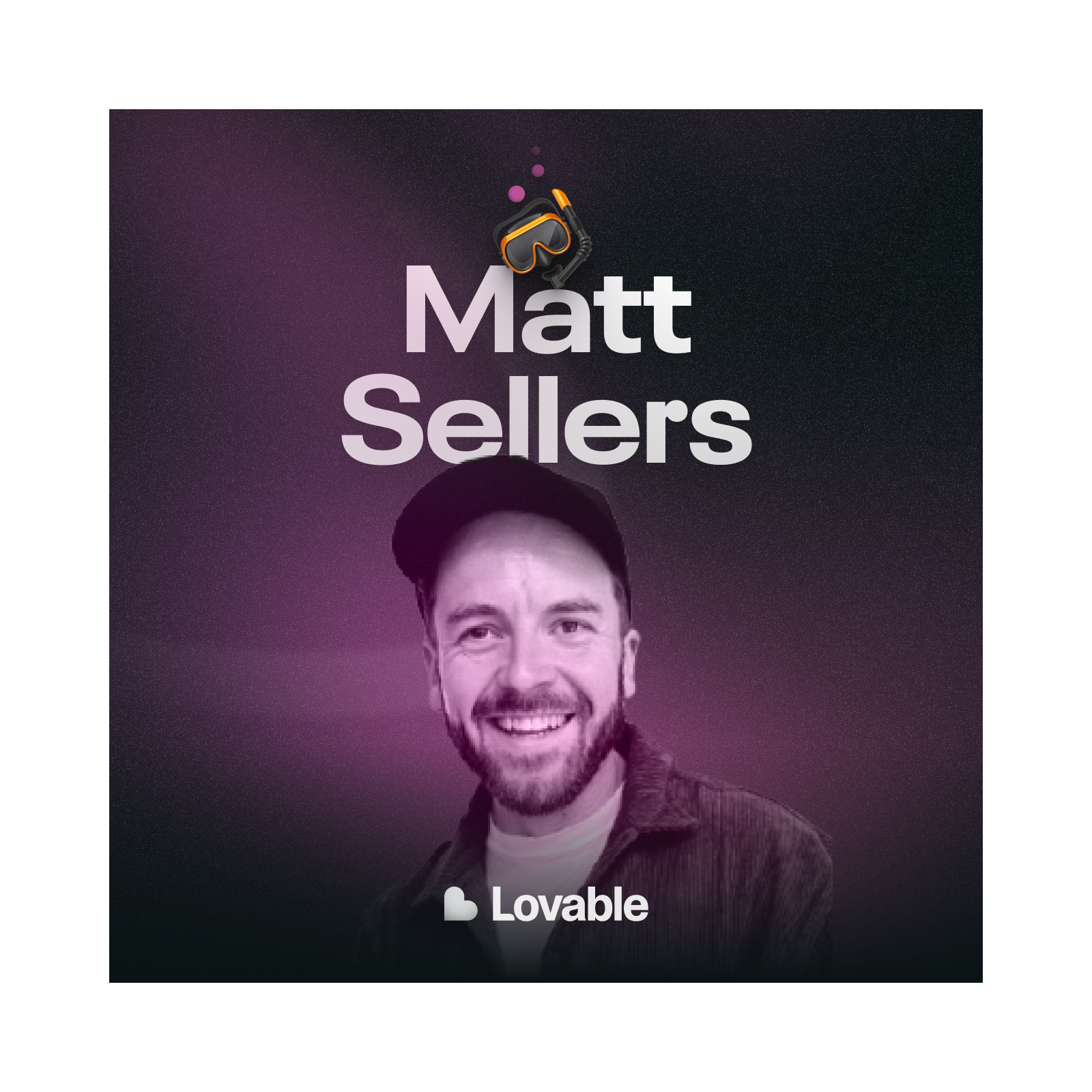
Loading summary
Transcript66 lines
- [00:00]
Rid
What does it take to create a portfolio that gets you hired at one of today's top startups?
- [00:06]
Matt Sarah Sellers
I had this, like, general, quite blurry idea about what I wanted this to look and feel like. And then it was just a case of iterate, iterate, iterate, iterate, and then come back and see what feels right.
- [00:18]
Rid
How can we challenge the way that we've historically thought about personal websites in order to create an experience that truly stands out?
- [00:26]
Matt Sarah Sellers
I don't even really show, like, how to get to the case studies necessarily. It's more just like I want you to explore, I want you to have this experience and I want you to feel the level of, like, care, you know, even if you don't go to any of these, like, case studies, right? Like, even if you don't click on this thing and go and visit the Docify case study, like, I'm okay with that.
- [00:46]
Interviewer (possibly a host of Dive Club)
Welcome to Dive Club.
- [00:48]
Rid
My name is Rid and this is where designers never stop learning. Last month, Nad Shishti, the head of design at Lovable, walked us through the portfolio of one of his recent design hires, Matt Sarah Sellers. So I wanted to catch up with Matt and get a behind the scenes.
- [01:04]
Interviewer (possibly a host of Dive Club)
Of how he brought his website to life.
- [01:06]
Rid
He shares some really practical mental models that I think every designer can benefit from, but also just listening to him talk, it's so clear that his website is an expression of who he is as a designer. So to start, I wanted to ask Matt what he intentionally did differently with.
- [01:24]
Interviewer (possibly a host of Dive Club)
This version of his portfolio.
- [01:26]
Matt Sarah Sellers
So I think if I can go back to my previous portfolio, it was mainly, you know, extremely functional. It was just a landing page, like a single page, a little bit about me at the top, and then just some, some different blocks which were outlining my projects with a button that would take the viewer to the case study. So there was no micro interactions, there was no animation. Imagine a kind of like printed portfolio, right? You're going like one page, second page, you know, and so on. Whereas, like, my go goals for this portfolio was to really treat it like an experience, you know, Like, I wanted visitors of this portfolio to see the level of like, care and attention and the focus on the craft. And I also wanted to. To make sure that I focused on the work that I was most proud of. I think my previous portfolios have kind of always been stuff as many things as I can into those, you know, I might have had work that was from like a job from 20 years ago, you know, you know, which, like, is it relevant to today? Probably not, you know, And I think with this new portfolio, it was really about how much can I remove? You know, like, I would say it was a strategy of, like, subtracting. So, you know, I cut probably 75% of my work before I even thought about what was going to exist in the portfolio. And then of that kind of 25% that remained, I probably cut half again. Right. So you're seeing 12, 13% of what I could have shown. The math is kind of brutal, but I feel like it's necessary. You know, the process details completely gone. You know, deliberately left out, the metrics, you know, like around, like, impact gone. Right. Even though some people would say, how are you showing the value that you created then? You know, but it was a conscious decision that craft was, like, the only thing that I wanted to showcase in my mind. I was thinking, if I can't show you, like, beautiful, thoughtful work, then no amount of, like, process explanation is going to save me. You know, it's like I wanted the, the people visiting my portfolio to, like, immediately get that feeling of, like, care, which, yeah, was probably one of the, like, core tenants or, or goals.
- [03:48]
Rid
I would say real quick message and.
- [03:50]
Interviewer (possibly a host of Dive Club)
Then we can jump back into it.
- [03:51]
Rid
If you're like me, then, you know, adding motion to your designs is the easiest way to make them feel premium. The thing is, I'm not a motion.
- [04:00]
Interviewer (possibly a host of Dive Club)
Designer, but that's why Jitter's new AI.
- [04:03]
Rid
Brainstorm feature is a game changer.
- [04:05]
Interviewer (possibly a host of Dive Club)
I just drop in my design and.
- [04:07]
Rid
Then get instant motion ideas that I can tweak, refine, and make my own.
- [04:11]
Interviewer (possibly a host of Dive Club)
It's seriously so easy to animate your work with Jitter.
- [04:14]
Rid
I cannot recommend it enough. Just head to Dive Club Jitter to.
- [04:19]
Interviewer (possibly a host of Dive Club)
Try it out today.
- [04:21]
Rid
You probably already know about paper shaders. It feels like every time I open up Twitter, I see somebody creating some new beautiful halftone effect. But did you know Paper uses real CSS as you design? That means your layouts are already code, so you can just one click, copy as react and paste into your coding agent of choice. Paper is shipping more of their core editor every single week. And it's becoming so clear to me that this is what the future of design tools should look like. So if you haven't tried it yet, head to Dive Dot Club Paper and start designing today.
- [04:55]
Interviewer (possibly a host of Dive Club)
Okay, now on to the episode.
- [04:58]
Matt Sarah Sellers
In my previous portfolios, I might have had, like, the case studies with, like, an image and, like, a paragraph explaining it. And, like, it might have been the process, the strategy, like, the value. Like, I spoke to users and they Found out XYZ thing. And this is how we acted on it. And this is like, you know, the. The solution that we created and. And stuff. But, like, you know, for this new portfolio, there's just an intro paragraph for each case study. Right. They were, like, extremely intentional, and I obsessed over these. Right. But after that, it's literally just work, you know, there's no text, like, beyond that intro paragraph. And that was, like, an intentional choice. You know, in my previous portfolios, I would have had, like, a piece of text underneath this image. And maybe it was explaining the metrics that we found via, like, user testing as to, like, why we built this page and why we focused on these particular cards and so on and so forth. But, like, only the cream of the crop made it onto these pages. You know, every image was selected with this question of does it raise the bar or does it, like, lower the average. Right. I think yourself and Nat had mentioned something around not creating surface area that might disqualify yourself.
- [06:12]
Guest or Design Expert
I think for a portfolio, you want the work to be the hero rather than the process behind the work. I think you can give signal on the wrong things if you. If you show too much process.
- [06:20]
Interviewer (possibly a host of Dive Club)
I'm still kind of stuck on what you said about how you almost don't want to create surface area for people to poke holes in. It's not more is not always better. I think that's like, a really interesting takeaway from this conversation.
- [06:32]
Matt Sarah Sellers
And I think that's like, super important. Right. Like, every extra thing that you add to your portfolio is like a chance for someone to think. Yeah, not quite. For me, that didn't quite, like, meet my expectations or something, you know, So I wanted, like, zero fluff, essentially just like, pure signal. Like, these are the things which matter to show in the portfolio, you know.
- [06:53]
Rid
That was like, the main thing that.
- [06:55]
Interviewer (possibly a host of Dive Club)
I came out of that conversation with Ned with was the importance of thinking about the average of your work rather than the sum of your work. And so hearing how intentionally you cut things down twice, it's amazing because I definitely have had old websites too, where.
- [07:12]
Rid
I'm like, I gotta communicate the gravity.
- [07:14]
Interviewer (possibly a host of Dive Club)
And scale of the body of my work. But what Nad was saying was talking about how you can pretty easily give a negative signal. And so, like, obsessing over the quality of each signal that you're putting out. It obviously worked. And now to hear how intentionally you did it is definitely, like, the main thing that I'm coming away with in terms of how I would strategize, like, a new portfolio.
- [07:36]
Matt Sarah Sellers
Something else that I'd like to like, point out as well is like, this paragraph, this little intro section.
- [07:42]
Interviewer (possibly a host of Dive Club)
Let's talk about it.
- [07:42]
Matt Sarah Sellers
Just to put into perspective, like, this was like a labor of love, this entire portfolio. Like, I spent probably three to four weeks, like, absolutely obsessive over this thing. I was explicitly designing for, like, a particular type of person here, you know, Like, I wasn't designing for like, a random person from HR or like a recruiter. Like, I was designing for someone like an experienced designer or like a design hiring manager, like someone who would just get it. And I think, like, this intro paragraph is a core piece of that, right? Like, I obsessed for nights over this main, like, bio paragraph on the homepage and especially the line around like, you know, 12,800% zoom. And I knew I wanted something that was like sort of tongue in cheek, like if, you know, you know, like type thing, you know, because I think it's. It's deeply specific to like, a type of person that I resonate with and someone who's been in the weeds, like in a design tool, like, would totally get it. And I went around the houses with like, different variations of this, you know, 12,008, 800% zoom. Like the safe for Web claw that, like, if you're a Photoshop user from back the day, you certainly will remember that, you know, layer style karma, like smart object inception. Like, there were all of these things that were, like, bubbling away. But ultimately I think, like, I went with this one because it still has that vibe of like, if, you know, you know, but it could be like, extrapolated to any design tool. It's like, specific enough to be meaningful, but not so, like, inside baseball that it feels like, you know, exclusionary. But the fact that someone can immediately visualize, like, the Adobe UI when they read is like such a, like, funny thing to me. But I think, like, it's an example of like, what great, like, microcopy does because it, it creates like, those connections, right? It's not just like, clever for clever sake. It's like a signal of some kind of shared experience. So every word that you see in this bio, it's embarrassing how long I spent, like, you know, tweaking it. And also, like, another reason why it's even the length that it is is because there's a very specific size that exists as, right? And like, for sure that's because everything had to line up. Like the bento grid is like a specific way. Like. So, yeah, there were lots of aspects to this and, you know, this Kind of stuff where I'm like, you know, using a strike through again is another little, like, tongue in cheek thing, which, like, others might just change that word, right? Just get rid of passion and leave obsession. But I think this is like, not. It's kind of like self censoring. But, like, at the same time, I'm using that as another way that someone might be like, okay, I get this. Yeah, you can be passionate about something, but there's like another level where you are, like, obsessed with something, you know, And I think, like, designers that can, like, resonate with them, right? So I think, like, this whole paragraph is supposed to be a conversation with the person reading it and the people that get it, get it.
- [10:51]
Interviewer (possibly a host of Dive Club)
It probably felt so good then to see nad talk about it, because that was like, the very first thing that he mentioned as resonating with him.
- [10:59]
Guest or Design Expert
The aesthetic is super clean. And so this is a design that serves the content, and the content is on point as well. And so, like, I remember even reading through and it was the 20 years of experience spent at 12,800% zoom. I just have this, like, I can picture the Adobe suite and Photoshop and just literally the UI like, printing 12,800% in my head as soon as I saw that. So the fact that the content is great and it's completely not fluffy, it's to the point, super high signal.
- [11:28]
Interviewer (possibly a host of Dive Club)
Which then makes me kind of wonder, how much did you narrow down the type of company that you were even designing this to appeal to? Was that something that you were thinking.
- [11:37]
Rid
About and did that tie in with.
- [11:39]
Interviewer (possibly a host of Dive Club)
The decision to go very craft and work forward, or was that not really a factor and you were still kind of trying to appeal to everybody?
- [11:47]
Matt Sarah Sellers
No, I think, again, this was something that was extremely intentional. Right. I think when I was putting together this portfolio, it was for a very specific, like, type of person and a very specific type of company. Like, I was hoping that this would be something that I would share to people that care about craft and quality and attention to detail. And it's not just something that it's like, okay, yeah, like, we care about design. No, it's like design is a core value of our business. And, you know, it's kind of like the linears and the vercels and so on of the world that, like, I was imagining when creating this portfolio, this could be of that kind of level. You know, I think, like, sweating every detail was, like, super important here. And I think I was kind of like, putting myself in the shoes of a designer that was already embedded in a company like that and sort of like wondering what might they do, right? I come from. It's going to age me a little bit. But I come from like the early days of like design. Like for example, you know, late 2000s on. On Twitter, right? James McDonald, Benjamin de Kock, Daryl Jinn, like Skull Face, like all of these people that I completely resonate with. I feel like those early days of like dribble and forest and like stuff like that, that's like so much part of my design personality. And I draw a lot of inspiration from people like that. Even like today, you know, for example, this portfolio, you know, I'm pulling from all of these different sources of inspiration. You know, like some might look at this and see Daryl with his like endless like stuff or like godly website or whatever, or like James McDonald with the attention to detail around like shadows and gradients and so on. And you can see here just from the homepage, right. I don't even really show how to get to the case studies necessarily. It's more just like I want you to explore. I want you to have this experience and I want you to feel the level of care even if you don't go to any of these case studies, right? Even if you don't click on this thing and go and visit the docufy case study. I'm okay with that. I wanted to have the same level of care and attention to detail like that I put into the work on the homepage.
- [14:01]
Interviewer (possibly a host of Dive Club)
You know, hey, real quick, if you.
- [14:03]
Rid
Want to get hired at companies like Lovable 11 Labs and some of my favorite startups, the talent network is free to join. Just head to Dive club slash talent.
- [14:12]
Interviewer (possibly a host of Dive Club)
All right, back to it. I think that's why I appreciate that you've used the word experience a few times because this homepage is truly an experience. Like the container for your work is kind of the show in a way. And that's a trait that I always notice in some of my favorite portfolios where too many people still, still are working off of this old mental model where your website has to almost be like this static catalog of all of your individual portfolio projects. And that's the main aspect of what you're making, where you said, no, I'm gonna make a page that encompasses who I am as a designer. And I love that there's no CTAs. I love it. It's one of my favorite parts because it is encouraging this exploration and really getting into the details of the experience that you've curated. And for me, like At a very high level. I think that would kind of be the North Star for how I would want to approach a portfolio. And I think you nailed it here.
- [15:07]
Matt Sarah Sellers
Yeah, I appreciate that. Design isn't what I do necessarily. It's, like, who I am. My solo studio is called Life is Good or lfsgd. I come from the era of, like, it's cool to, like, basically have no vowels. So it's just Life is good without vowels. Right. But that's genuinely how I feel. Right. Every single day I wake up and I get to do what I love, and. And, you know, somehow I get paid for that. So. So Life is Good, you know, but, yeah, I think to go back to what you were saying, like, this portfolio isn't just, like, a professional artifact. It's something deeply personal, and it's a reflection of, like, my philosophy and my values and my obsessions. And I. I wanted this to emanate that, you know, whether it's, like, a hiring manager or a potential client or someone that finds me on social media. So that's why I spent, you know, 90% of my time, let's say, on. On details. People might not even notice, but I just can't help myself. The act of creating something with that level of care is just, like, very fulfilling.
- [16:10]
Interviewer (possibly a host of Dive Club)
Okay, this is your chance, then, to shine a flashlight that thousands of designers will use to view this portfolio and talk about some of the details that you think people might totally miss. But they are a good sign of what it looks like for this to be an expression of yourself. Let's just get nerdy. Like, where were you spending an almost unnecessary amount of time on this site?
- [16:32]
Matt Sarah Sellers
Yeah, for sure. This selected work piece, you know, like, just hovering on this and seeing, like, the list of projects. And I'm creating this nav with this kind of, like, magnetic effect. There's a lot of detail in here that you immediately wouldn't notice. Like, you know, I think the general person might just, you know, visitor of the site might just, like, hover here and say, okay, this, you know, title changed to blue. But if you look extremely closely, like, these icons here, like, are changing. You know, the stroke around them is, like, the brand color, and there's a really subtle gradient which has, like, you know, white to the brand color. There's these, like, inner shadows that are all reflective of that. That hover state color. So super intentional. I obsess probably way too long over those things. But, like, you know, that's just one example of somewhere where I think all of that attention to Detail, like all of those minute things help to sell this, like, overall feeling of quality. And then when we see this interaction here, unfortunately, there's some bugginess here. Red with this. I don't know why this animation is broken, but this is another example of that where I spent a lot of time perfecting this state that you're seeing right now where it's essentially mimicking a document scanner, where the documents go in, they get scanned, and they come out as some kind of fancy particles of data. And I probably spent three days getting this right. Just this scanner alone, like, took me a super long time to. To draw, like in figma. And this is like before design pages came along. In fact, maybe I can show you that. Ritz?
- [18:12]
Interviewer (possibly a host of Dive Club)
Yeah, please. I'd love that. Was actually going to be my next question was kind of how you brought some of this stuff to life, because it's super impressive. And it then makes me wonder, you know, what tools, what processes did you use?
- [18:22]
Rid
I've been designing products every day for the last 15 years, but in the last six months, everything has changed. With AI in the mix, I'm cranking out ideas faster than ever. But none of that matters if I can't get the feedback that I need to get the team aligned. And right now, getting Async feedback still kind of sucks. So I'm building the product I've always wanted, and it's called Inflight. I use it every day to share ideas and get feedback from the team. It's totally changing the way that I work. So I'm excited to show you. Right now I'm only giving access to Dive Club listeners, so head to Dive Club Inflight to claim your spot.
- [19:04]
Matt Sarah Sellers
Yeah, so in the past, what I've usually done is to use the opportunity of the creation of a new version of my portfolio as a way to potentially learn a new tool or learn a new skill. So, for example, I can think back to, like, learning how to use WordPress to create a portfolio or learning how to use Webflow in the early days of Webflow to create my portfolio. And this time around, I wanted to, like, flex my framer muscle. So I used Framer to create everything from scratch. So I only designed, you know, 5% of this in FIGMA before kind of jumping directly into Framer. And everything's been created natively in Framer and this bear in mind, this is before design pages were a thing. So this was painful to say the least. So, for example, this scanner, you can see that every single piece of this illustration has been hand Done with its own values for like, shadows and meticulously named layers. So yeah, every single piece of this portfolio has basically been done in the same way. And then I've used framer to also create like components, right? So each of these components might lead to like a sub component. So you see here, like, you know, the actual laser that's like scanning is another component. And some of these even have code overrides on top of them. And this was like the early days of ChatGPT that I was using to create this, like just to frame when this was actually made. Like it was sort of like late 2023, early 2024 if I recall correctly. And that was when custom GPTs had come out. So I was like, okay, cool, I can make a custom GPT which has all the framer knowledge base. And from there I can then use that to help me create some like, custom like code overrides or react components and stuff that I can then sort of like use in the portfolio. So lots of copying, pasting, evolving, breaking, fixing things. But like, like, I think this approach like completely changed how I thought about the portfolio creation process. You know, kind of like prototyping experience at the same time. You can see here the particles that I showed for the animation of like the, the scanned pages, like turning into data, like these are all like individual components, essentially like this data component. And then each of these then has a code override which then produces this like particle effect of like, you know, maths and stuff. Like, like, I probably don't understand like 90% of what is here, but you know, it was just, again, it was me just like throwing stuff at the wall and I had this like, general quite blurry idea about like, what I wanted this to look and feel like. And then it was just a case of iterate, iterate, iterate, iterate, and then come back and see what feels right in this, like preview mode. I spent a lot of time like doing this and you know, this is true for like the majority of what you see in the portfolio, you know, even like these smaller anim pieces where it's just the logo of the product. But all of this is done using components using framer, you know, to create this like, feeling. So this one isn't animating correctly, but let's see if we can get it to work.
- [22:18]
Interviewer (possibly a host of Dive Club)
It's so cool though. I didn't realize how much of this you were hand making in framer. I mean, seeing this as a framer component, I did not see that coming.
- [22:27]
Rid
I mean, how.
- [22:27]
Interviewer (possibly a host of Dive Club)
What was Your Framer knowledge before this project, I mean, you're going really, really deep here. Like, had you done this type of component level animation before?
- [22:36]
Matt Sarah Sellers
Not to this level. I come from, like, a background of using Framer. Like, before it was a web builder tool, like the early days of Framer, when it was like a prototyping tool with TypeScript or CocoScript or whatever it's called, you know, like, so I had like, some background in Framer, but, like, prior to building my portfolio, I'd done a few simple kind of landing page things, but nothing to this level of like, a detail and really trying to push the boundaries of what Framer can do. So there were certainly some moments where I was like, tearing my hair out. For example, this one, this one was kind of intense. So what this actually is is the real app, the real flow that a user would have gone through. You know, this was like a ride sharing app. And, you know, you could interact with these, like, sheets and you could book a cab, essentially. But this is an entire flow, you know, it's the real app, but it's like a prototype built in Framer. So, like, when you visit my homepage, there's this, like, little cursor thing that shoots in and like, you use that to, like, interact with this. But you can see that, like, this is, this is like the real assets. This is like, you know, everything that's a product. Yeah, and this was, like, really, really tricky to do because when you prototype in Framer, you need pieces of the puzzle to, like, link to the rest. And like, then you want to start adding like, H states and click states and animations, and you quickly realize that, like, you have to have all of these, like, sub components which, like, essentially are like hit targets. And it just makes things, like, super complicated because then those hit targets are like in the way of other elements that you want to interact with. So there's a lot of fighting with Framer. And I, I think, like, you know, nowadays, like, Framer is a lot more. More robust. So I feel like some of this stuff would be simpler to create. But yeah, you can see here, you know, going from this state to this state with the confetti to this, it's just a frame with, like, delays on either side. But, like, so this confetti is constantly running. Right? So there was, like, lots of really interesting ways that I was trying to push the boundaries of what Framer, like, could do at the time. And that was like, a really great way to, like, learn where the edges were of the tool. But also After I'd created my portfolio here, like, I felt like I had like some kind of superpower when it came to actually, like building landing pages for my clients, you know?
- [24:59]
Interviewer (possibly a host of Dive Club)
Yeah. There's a phrase that Tommy Gioko says that I really like. He says, tool benders. This is tool bending, man, where you're like, you gave yourself the high level objective of a really well written piece of copy and then a bento grid, and each one of them are their own, like bespoke experiences. And then you just bent the tool of framer to your will. It's really, really cool to see you went way deeper than I even realized.
- [25:26]
Matt Sarah Sellers
I think that's just part of like the way that my brain works is. I know it's possible, but like, maybe just not in the traditional sense. Right. I think it's really interesting that we have these amazing tools and they're like incredible at what they do and they provide us like amazing ways to push the boundaries. But there's always like something that you're like, oh, I wish it did this and I wish it did that. It turns out like usually you can find a way to like have back the system, you know, and like, that was just an incredible way to use framer.
- [25:55]
Interviewer (possibly a host of Dive Club)
Before I let you go, is there anything that we haven't talked about or maybe something that you even expected us to maybe bring up in the interview with NAD that didn't get mentioned? Because I want to just cover our bases because the more that we keep pulling on your different creative strands, the more fun I'm having.
- [26:11]
Matt Sarah Sellers
One thing of that we didn't touch on, that's maybe like a shortcoming of what I've shown is like the experience is kind of different if you're hitting it from a mobile because it's very like hovering based. Right. Like a lot of these interactions on the homepage, like the micro interactions, like essentially require a user to like hover now on a mobile, like it's going to work in some way, shape or form. Like when you tap, it's going to trigger something to happen. But like, you'll notice that there are lots of breakpoints, but some of them aren't very pretty. And like some of them kind of like, you know, the content's cut off and like the experience is like very different. And that's something that, that wasn't necessarily like intentional. I think it was like the way that I created the project initially, like I hadn't necessarily thought all the way through exactly like what that might feel like or look like if it was on a mobile. So that's like something that I certainly feel I would do differently or if I had time to like spend like I would create a really powerful experience on mobile too.
- [27:12]
Interviewer (possibly a host of Dive Club)
I have a little bit of a hot take that I think I'm going to share, which is for years we've been vastly overestimating the importance of mobile first design and the mobile experience in general. Specifically within tech, you have to know who you are designing for. Obviously if you're designing for people where the assumption is they're going to be on their phone or you have data to back it up, then totally disregard this. But if your users are people in tech, definitely design managers who are viewing this through the lens of, of I'm trying to evaluate someone as a potential candidate.
- [27:46]
Rid
My gut is that this is definitely.
- [27:49]
Interviewer (possibly a host of Dive Club)
A desktop first experience and that like over 80% of the people are on their computers. And all of my sites, and I've had like five different sites over the last six, seven years and I look at it, it is always above 80, 85% desktop. And I never want to create something that feels like I don't hit the ceiling of creative potential because I want to use mobile as too much of a constra. And I think it's a hot take because every time that we post some kind of an amazing web based experience, there's always somebody in the comments that's like, yeah, but what about the mobile experience? And it's like, well, what's the goal of this website? The goal of this website is to connect you with amazing opportunities and win over a potential hiring manager to get a dream job that is a desktop focused flow and you freaking nailed it on the web and went all in on hover interactions and it worked. So I'm like, I hear you. But also I feel like this was, was probably a really good allocation of your time and creative efforts by sweating the details on web rather than more evenly allocating them across different breakpoints. Potentially a hot take, but I feel compelled to say it because I think it worked what you did.
- [28:57]
Matt Sarah Sellers
Yeah, no, I totally agree. I think you hit the nail on the head.
- [29:00]
Interviewer (possibly a host of Dive Club)
All right, so we've covered a bunch of grounds. Some of the takeaways that I'm coming away with again is the difference between prioritizing the average rather than the sum. I also think it's amazing how much you've obsessed over this, this intro paragraph. And I know for myself at least, and I'm sure other designers listening, a lot of people kind of overlook the importance of really Effective microcopy, that's one piece. And then thinking about your homepage as an experience, I want to kind of just give you the opportunity to share. Any other advice speaking directly to the person who maybe they're starting on a portfolio or rethinking their approach and, you know, they don't want to just copy you exactly. And they're trying to figure out, like, what's. What's my unique angle, what's the experience that I want to create? Do you have any parting words for that person who's listening before I let you go?
- [29:51]
Matt Sarah Sellers
When you're starting out on the journey of creating a new version of your portfolio, or just like your portfolio for the first time, right. It can be quite a daunting process. And it's kind of like the designer's curse, you know, never quite happy with what you've created, you're never quite happy with what you've shipped. And there's always a thousand things which you can point to that you would probably change or that you dislike and so on. And I think that's just like the nature of putting your own work out there and creating something that is, like, purely just. Just you. If you feel like you can't execute at, like, a certain level of craft yet, or you're not comfortable with where your skills are, like, my honest advice would be don't try and fake it. You know, don't dress up like mediocre work with verbose, like, process explanations and so on. Like, instead, go deep on something that you can do exceptionally well. Or, you know, you can potentially build taste before you, like, build your skills. You know, like, find portfolios that you admire and try and, like, replicate them in some way, shape or form, right? Like, not. Not just like copying them, but like reverse engineering, like, the decisions. Like, you know, why that spacing? Like, why that color choice? You know, why that transition timing? Like, get really into the weeds, you know, to go back to my bio, like, Zoom in like 12,800%, get deep and really look book, because there's no, like, secret sauce. It's just obsession over attention to detail and willingness to study great design. And if you can demonstrate that you can see quality even if you can't necessarily produce it, that signal, like, show that hiring manager, show that recruiter, like, that you have taste and, you know, they'll hopefully trust that you can, like, develop your skills, you're coachable into that. And if you're really stuck, just be honest. You know, I growing my skills here, and, you know, this is where I'm strong today. I think hiring managers like respect that like self awareness like way more than they respect this kind of like inflated mediocrity let's call it. I think there's just so much like out there that you can draw inspiration from and if you really look, if you really focus on the details, you can hopefully create great things from that.
- [32:09]
Interviewer (possibly a host of Dive Club)
I love it. Matt. Well, I appreciate you coming on today and explaining some of your own thinking and process and even cracking open Framer. It's really awesome to see and I personally am inspired by what you've made and I hope others are as well. So appreciate you taking the time today.
- [32:25]
Rid
Before I let you go, I want to take just one minute to run you through my favorite products because I'm constantly asked what's in my stack. Framer is how I build websites. Genway is how I do research. Granola is how I take notes during crit Jitter is how I am animate my designs. Lovable is how I build my ideas in code. Mobin is how I find design inspiration. Paper is how I design like a creative and Raycast is my shortcut every.
- [32:54]
Interviewer (possibly a host of Dive Club)
Step of the way.
- [32:55]
Rid
Now I've hand selected these companies so that I can do these episodes full time. So by far the number one way to support the show is to check them out. You can find the full list at Dive Club Partners.